We can all agree there's more than one way of doing something.
For example, some people default to the "loop, swoop, and pull" method when they tie their shoes, while others swear by the "bunny ears" technique. Either way you swing it, your shoes get tied, right?
The trouble is, in some areas of life, different approaches don't always return the same results.
When it comes to presentation design, for instance, there's no shortage of avenues you can take. And while all that choice -- colors, formats, visuals, fonts -- can feel liberating, it's important that you're careful in your selection as not all design combinations add up to success.
We're not saying there's one right way to design your next PowerPoint presentation, but we are saying that some designs make more sense than others. Luckily, new versions of PowerPoint actually suggest ideas for you based on the content you're presenting. In this blog post, you'll learn how to create an awesome PowerPoint deck and then see 21 real presentations that nail it in exactly their own way.
PowerPoint Design Ideas
It's impossible for us to tell you which design ideas you should go after in your next PowerPoint, because, well, we don't know what the goal of your presentation is. But, as it turns out, PowerPoint can make these suggestions.
In PowerPoint 2016 and later, PowerPoint is filled with interesting boilerplate designs you can start with. To find these suggestions, open PowerPoint and click the "Design" tab in your top navigation bar. Then, on the far right side, you'll see the following options:
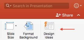 Click the "Design Ideas" option under this Design tab, as shown in the screenshot above. This icon will reveal a vertical list of interesting slide layouts based on what your slides already have on them.
Don't have any content on your slides yet? You can easily shuffle this vertical list of design ideas by clicking various slides themes inside the color carousel to the far left of the Design Ideas icon, as shown below:

As you browse and select from the themes shown above, your Design Ideas pane to the right will interpret them and come up with layouts such as:
Paint Splash

Covering a more creative subject for a younger or more energetic audience? On behalf of PowerPoint, might we suggest the cover slide design above?
Artistic Curves
 This design doesn't have the intensity of the first slide on this list, but it maintains a sense of informality that all PowerPoint presentations benefit from.
Wallpaper
 There's an old-fashioned feel to the design above that sets a fun but relaxing tone for its audience.
Warm Tiles

This design idea focuses on warm colors, helping to emphasize the black title tile on top of it.
Textured Backdrop
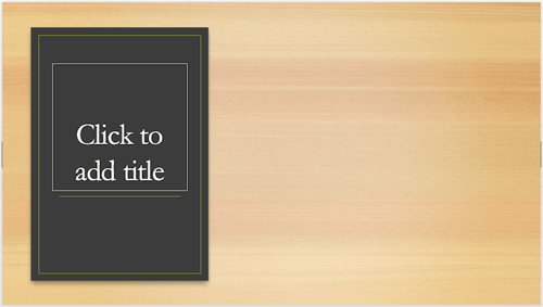 We're particularly fond of this PowerPoint design style. By using real textures -- like wood, as shown above -- you add depth to your slides. This can help your content capture and hold your audience's attention more easily.
To see some examples of the best PowerPoint presentation designs, check out the following decks.

21 Good Examples of PowerPoint Presentation Design
1. "The Search for Meaning in B2B Marketing," Velocity Partners
We've said it once, and we'll say it again: We love this presentation from Velocity Partner's Co-Founder Doug Kessler. Not only is the content remarkable, but the design is also quite clever. While each slide employs the same background visual, the copy in the notebook unfolds brilliantly through a series of colorful doodles and bold text. This gives the presentation a personal feel, which aligns with the self-reflective nature of the concept.
2. "You Don't Suck at PowerPoint," Jesse Desjardins
If the contrast used throughout this PowerPoint presentation design were a human, we'd marry it. This skillful presentation from Jesse Desjardins employs the perfect color palette: balancing black and white photos with pops of florescent pink, yellow, and blue. The cheeky vintage photos work to reinforce the copy on each slide, making the presentation both interesting and visually appealing.
3. "Build a Better Entrepreneur Pitch Deck," Center for Entrepreneurial Innovation
Balancing visual backgrounds with text isn't easy. More often than not, the text is formatted in a way that winds up getting lost in the image. This presentation from the Center for Entrepreneurial Information combated this issue by combining a blurring effect with a shaded filter to create contrast between the bulleted text and the busy background. Well done.
4. "40 Tools in 20 Minutes: Hacking your Marketing Career," Eric Leist
When you're tasked with presenting a lot of information in a little bit of time, things can get sort of messy. To simplify this type of presentation, it's a good idea to use a visual table of contents like the one shown above. This color-coded index clearly signifies the start and finish of each section to make it easier for the viewer to follow along and keep track of the information.
5. "How to Craft Your Company's Storytelling Voice," MarketingProfs
Do you love these hand drawn illustrations ... or do you love these hand drawn illustrations? I mean, c'mon, this is amazing. Certainly it would have been easier to generate these designs online, but this approach highlights MarketingProf's commitment to investing the time and thought it takes to create an out-of-the-box piece of content. And as a result, this presentation stands out in the best way possible.6. "2015 Travel Trends," Creative Lodging Solutions
If you're going to go the minimalistic route, take note of this PowerPoint presentation example from Creative Lodging Solutions. This clean design adheres to a simple, consistent color palette with clean graphics peppered throughout to make the slides more visually interesting. Overall there are no frills or unnecessary additions, which allows the informative content to take priority.
7. "Healthcare Napkins," Dan Roam
This presentation dates back to 2009, but the design is still as good as ever. The colorful, quirky doodles help tell the story while also serving as an interesting way to illustrate data (see slides 20 and 21). For visual learners, this approach is much more inviting than a series of slides riddled with text-heavy bullet points.
8. "Eco-nomics: The Hidden Costs of Consumption," Josh Beatty
This presentation employs both powerful images and playful graphics to illustrate the point. While many of the slides contain numbers, they are broken up in a way that makes them easily digestible. Not to mention all of the text is crisp, clean, and concise.
9. "10 Powerful Body Language Tips for Your Next Presentation," SOAP
This simplistic presentation example employs several different fonts, but instead of coming off as disconnected, the varied fonts worth with one another to create contrast and call out specific concepts. Also, the big, bold numbers help set the reader's expectations, as they clearly signify how far along the viewer is in the list of tips.
10. "Pixar's 22 Rules to Phenomenal Storytelling," Gavin McMahon
This presentation by Gavin McMahon features color in all the right places. While each of the background images boasts a bright, spotlight-like design, all of the characters are intentionally blacked out. This helps keep the focus on the tips, while still incorporating a visual element. Not to mention, it's still easy for the viewer to identify each character without the details. (I found you on slide eight, Nemo.)
11. "Digital, Social & Mobile in 2015," We Are Social
Here's another great example of data visualization in the wild. Rather than displaying numbers and statistics straight up, this presentation calls upon interesting, colorful graphs and charts to present the information in a way that just makes sense.
12. "6 Snapchat Hacks Too Easy to Ignore," Gary Vaynerchuk
This wouldn't be a true Gary Vaynerchuk presentation if it wasn't a little loud, am i right? Aside from the fact that we love the eye-catching, bright yellow background (which aligns with the SnapChat theme), Vaynerchuk does a great job of incorporating screenshots on each slide to create a visual tutorial that coincides with the tips.
13. "20 Tweetable Quotes to Inspire Marketing & Design Creative Genius," IMPACT Branding & Design
We've all seen our fair share of quote-chronicling presentations ... but that isn't to say they were all done well. Often times the background images are poor quality, the text is too small, or there isn't enough contrast. Well, this PowerPoint presentation from IMPACT Branding & Design suffers from none of said challenges. The colorful filters over each background image create just enough contrast for the quotes to stand out.
14. "The Top 20 Facts About High Fructose Corn Syrup," Corn Refiners Association
This is another great example of minimalistic design done right. There's nothing overly complicated about this presentation's design, which is why it works. The text is large and legible, the images are high quality and placed in a way that's not obtrusive, and the facts are called out from the rest of the text.
15. "Creating Powerful Customer Experiences," Digital Surgeons
This presentation offers up a lot of information in a way that doesn't feel overwhelming. Different colors are used to differentiate one set of numbers from another (see slide eight), and colorful graphics are used to make the information seem less buttoned-up.
16. "All About Beer," Ethos3
Not going to lie, it was the title that convinced me to click through to this presentation ... but the awesome design kept me there once I arrived. This simple design adheres to a consistent color pattern and leverages bullet points and varied fonts to break up the text nicely.
17. "Digital Transformation in 50 Soundbites," Julie Dodd
This design highlights a great alternative to the "text-over-image" display we've grown used to seeing. By leveraging a split screen approach to each slide, Julie Dodd was able to serve up a clean, legible quote without sacrificing the power of a strong visual.
18. "SMOKE: The Convenient Truth," Empowered Presentations!
All of the elements are working together here to create a compelling, unified presentation. From the font choice to the color palette to the dark visual background images, this design aligns perfectly with the context of the copy.
19. "Fix Your Really Bad PowerPoint," Slide Comet
When you're creating a PowerPoint about how everyone's PowerPoints stink, yours had better be terrific. The one above, based on the ebook by Seth Godin, keeps it simple without boring its audience. Its clever combinations of fonts, together with consistent color across each slide, ensure you're neither overwhelmed nor unengaged.
20. "How Google Works," Eric Schmidt
Simple, clever doodles tell the story of Google in a fun and creative way. This presentation reads almost like a storybook, making it easy to move from one slide to the next. This uncluttered approach provides viewers with an easy-to-understand explanation of a complicated topic.
21. "What Really Differentiates the Best Content Marketers From The Rest," Ross Simmonds
Let's be honest: These graphics are hard not to love. Rather than employing the same old stock photos we've seen time and time again, this unique design serves as a refreshing way to present information that's both valuable and fun. We especially appreciate the author's cartoonified self-portrait that closes out the presentation. Well played, Ross Simmonds.
Want more? Read How to Create Infographics in Under an Hour [15 Free Infographic Templates].

from Marketing http://bit.ly/2wy1wBo
via
No comments:
Post a Comment