Did you know that without a lead-capture form, your digital content can't generate leads?
The lead-capture form is the main focus of a lead-capture page -- better known as a landing page. The ultimate goal of this page is to get your visitors to fill it out with contact information in exchange for a piece of content, such as an ebook.
Because the formatting and design of your lead-capture form has a direct impact on your conversion rates, it's absolutely critical that you approach them wisely. Here are the five most critical components of successful lead-capture forms.
The Five Components of a Lead-Capture Form
1. The Lead Form's Positioning on the Landing Page
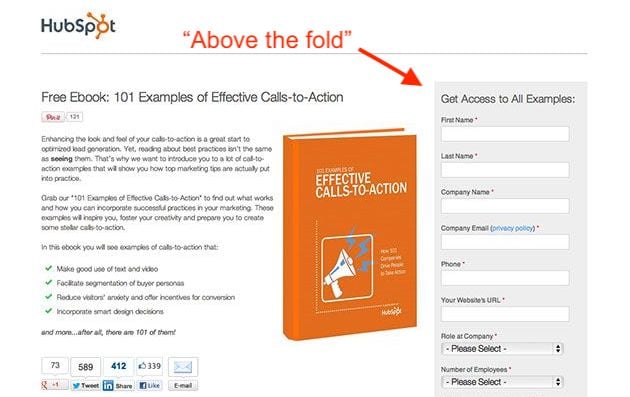
First of all, you should make sure your form appears above the fold or easily findable on the lead-capture page. In other words, the viewer should not have to manually scroll down the page in order to see it. Visibility is important, since you want to draw the visitor’s attention to the form.
However, you don't want this form to spook visitors who are less willing to disclose information at first glance. To ensure the content you're offering is the main appeal of your lead-capture page, consider two different form positioning techniques:
Next to the Content Offer's Picture
The form below might be above the fold, but it's not the most eye-catching object on the page -- the content itself is. Putting a picture of the content next to the form is an appealing reminder of what a user will get in return for his or her basic information.
At the Bottom of an Auto-Scroll Landing Page
Still many of HubSpot's forms have lead-capture forms at the very bottom of the landing page.
Why on Earth would you do that? This positioning ensures the content we're offering is center stage so a user can adequately determine if it's worth downloading. See what this looks like below:
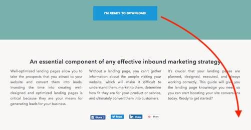
If they decide they want the content, clicking the Download button shown above automatically scrolls them down to a brief form at the bottom of the page:
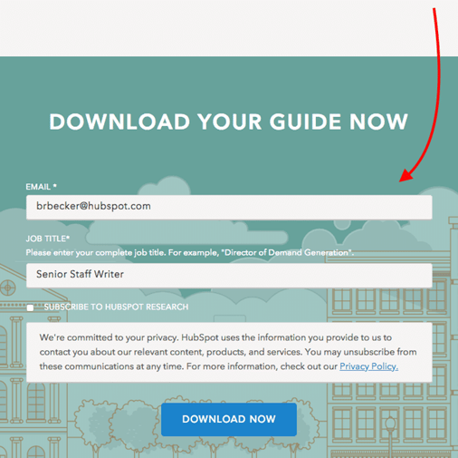
Once they fill out the form, they can confirm their download and retrieve their content.
2. The Lead Form's Length
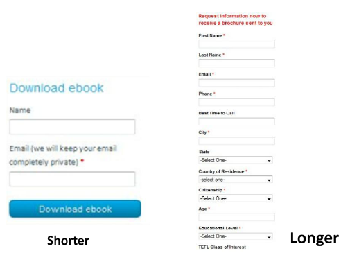
The next -- and probably biggest -- question when designing your forms is, how long should it be? This is a tricky question, because the length of your form inevitably leads to a tradeoff between the quantity and quality of the leads you generate.
A shorter form usually means more people will be willing to fill it out, so you’ll generate more leads. But the quality of the leads will be higher when visitors are willing to fill out more forms fields and provide you with more information about themselves and what they’re looking for. Therefore, shorter forms usually result in more leads, and longer forms will result in fewer, but higher quality leads.
The other critical factor to consider is the effect of the length of the form on the prospect’s willingness to fill it out. If the form is too long, prospects are going to stop and evaluate whether it is worth their time to complete all of those fields. So you need to find a good balance between collecting enough information and not asking for too much information that they’re not willing to give.
3. The Form Fields You Use
Of course the next question is, what should those form fields be? What information should I ask for? Oftentimes, companies have forms on their sites that ask for way too much information (or the wrong kind of information). Your goal should be to collect enough information through your form to enable you to both contact and qualify the lead.
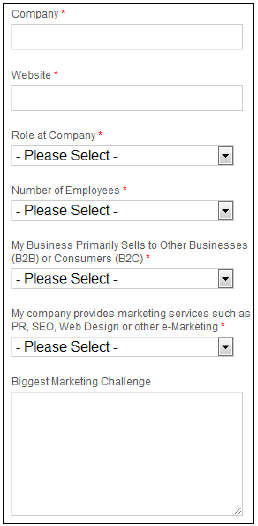
You can use fields such as name and email address to gather contact information about the lead. It is important to be able to follow up with your newly converted lead so you can put them into your sales funnel to try to convert them into a customer.
Lead-Qualifying Fields
Before you do that, though, you’ll want to be able to qualify the lead. To do this, include fields and questions in your form that will help you identify how strong that lead is – in other words, how likely they are to become a customer. You can include fields such as company, website, role at company, and number of employees to learn some basic background information. Then add in a question that will allow you to gauge their need for your product, their likelihood to purchase your service, or their fit with your company.
For example, HubSpot sells marketing software, and all of the forms on our landing pages include an optional field that asks visitors to describe their biggest marketing challenge. We use this information to learn more about and qualify our leads before putting them into our sales funnel.
Asking Only Essential Questions
When you’re deciding which fields and questions to include on your form, remember that you should only be asking for information that is essential to be able to contact and qualify them. You can always ask for more information later, and in fact, that is usually the better approach. Too often, companies request all kinds of contact information and ask tons of questions of their visitors, neglecting to realize that their 15-field forms are significantly lowering conversion rates.
4. Your Privacy Policy
This brings us to the next concern that prospects have with regard to filling out forms: security. Most people experience some sort of anxiety when asked to provide sensitive information, especially online. You need to show your visitors they can trust you with their information.
Link to your privacy policy next to the field that asks for the visitor's email address. Have your logo and a client testimonial visible. Use some sort of authority endorsement, third-party security certification, or guarantee seal. Just make sure that your website looks credible, and that should help to reduce friction for filling out your form.
On our lead-capture forms, we offer a brief preview of our privacy policy right above the download button. See what this looks like below:

5. The Lead Form's Submission Button
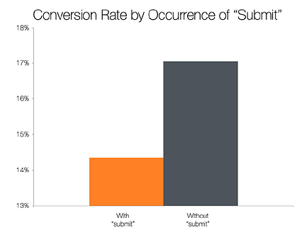
The last major component of your form is the button the visitor must press to complete the form and send you their information. The default text for this button is usually “Submit,” but studies show that landing pages with buttons labeled “Submit” actually have lower conversion rates than those that use other wording.
The top-performing variations in this study were “Click Here” and “Go.” Compared to “Submit,” these buttons feel much less committal and imply a lower investment of time and effort.
from Marketing https://ift.tt/2KspzsP
via



No comments:
Post a Comment