Having data is one thing.
Accessing it is another.
Understanding and analyzing it is yet another.
And visualizing it? Well, that's a level of mastery that most people never reach.
If you can make it to this stage, you'll be capable of unlocking invaluable insights for your business. You’ll have a serious advantage when it comes to getting competitive opportunities—whether that’s a cool project or promotion at your current organization or a brand-new role at a different one.
Most powerfully of all, you won’t need to rely on others (like a data analyst or ops specialist) to get the answers you need. You’ll have everything at your fingerprints.
Sounds pretty great, right? But how do you go from having data to understanding, analyzing, and visualizing it?
There are tons of resources out there. Luckily, one of my favorites, Google Data Studio, is completely free and accessible to all (even if you don’t have any data of your own!).
In this guide, I’ll walk you through the most useful Data Studio tools. We’ll start with the basics before moving into the intermediate features. Finally, we’ll go over the advanced options.
Like most Google tools, Data Studio can be hard to master, but it’s well worth the effort. Once you’ve gotten comfortable with its features, you can use it to create stunning and informative reports for your clients, coworkers, or leadership team.
Not only that, but you’ll have unlocked the final stage of data analysis expertise. From there, the world is your spreadsheet.
Google Data Studio Tutorial
- Use templates
- Publish your report
- Connect to 150+ sources
- Create your own report theme
- Embed external content
- Send scheduled reports
- Download reports
- Embed reports
- Add a date range
- Add filter controls
- Create interactive chart filters
- Add data control
- Add a dimension breakdown
- Use Data Studio Explorer (Labs)
- Create report-level filters
- Create blended fields
- Blend your data source with itself
- Create a basic calculated field
- Creating an advanced calculated field
- Create a calculated blended field
1. Log into Data Studio
To log in, you’ll need a Google account—I recommend using the same one as your Analytics, Search Console, and/or Google Ads account.
You’ll land on the Data Studio overview page. Click the “Home” tab to view your dashboard.
2. Explore the Data Studio Dashboard
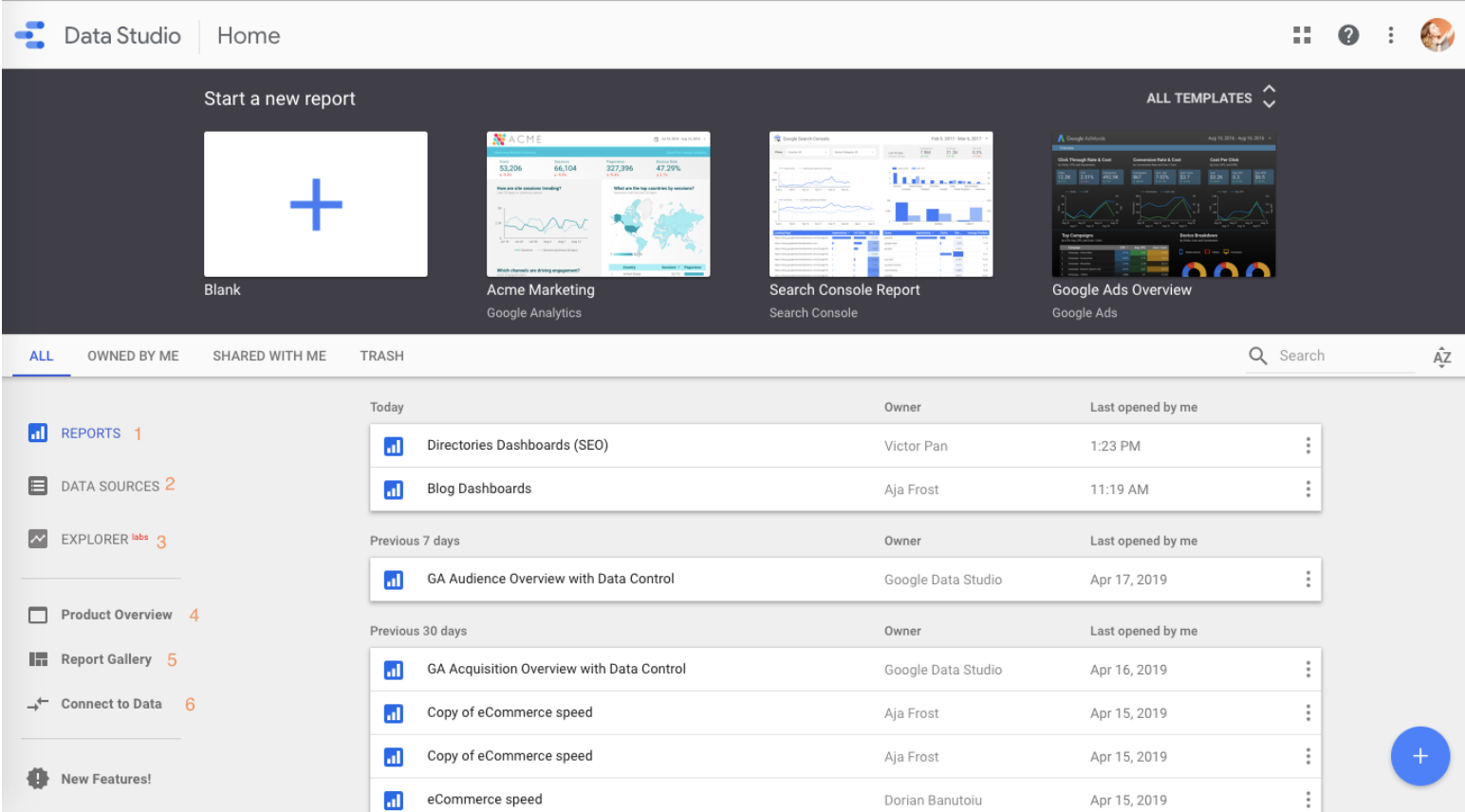 If you’ve used Google Docs, Sheets, or Drive before, this dashboard should look pretty familiar.
1. Reports
Here’s where you can access all of your reports (equivalent to a workbook in Tableau or Excel).
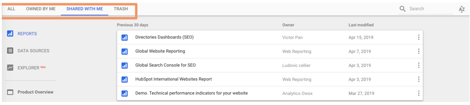
Notice that you can filter by who owns the report:
2. Data Sources
Data sources lists all the connections you’ve created between Data Studio and your original data sources.
Data Studio currently supports 500+ data sources (jump to the section where I show you how to explore the possibilities.)
Google Data Studio Data Sources
The most popular sources include:
- Google Analytics
- Google Ads
- Google Search Console
- BigQuery
- YouTube Analytics
- PostgreSQL
- Search Ads 360
- Display & Video 360
If you’re using Google Analytics and/or Search Console (which I highly recommend), you’ll need to individually connect each view and property, respectively.
So if you have three GA views for three different subdomains, you’ll need to set up three different data sources.
Fear not, this is an easy process.
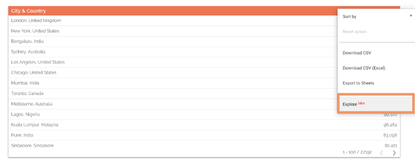
3. Explorer
Explorer is an experimental tool that lets you experiment or tweak a chart without modifying your report itself.
For instance, let’s say you’ve created a table in Data Studio that shows the top landing pages by conversion rate. While looking at this table, you think, “Huh, I wonder what I’d find if I added average page load time.”
You don’t want to edit the chart in the report, so you export it into Labs—where you can tweak it to your heart’s content. If you decide the new chart is valuable, it’s easy to export it back into the report. (Jump to the section where I explain how.)
4. Product Overview
This brings you back to that Overview tab. Not sure why it’s here; I never click it.
5. Report Gallery
This is a collection of templates and examples. More on the gallery in a bit.
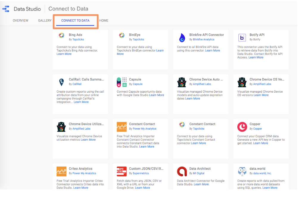
6. Connect to Data
And here’s where you add data sources. (You can also add sources within a report itself.) Let’s add our first source.
I recommend starting with Analytics or Search Console.
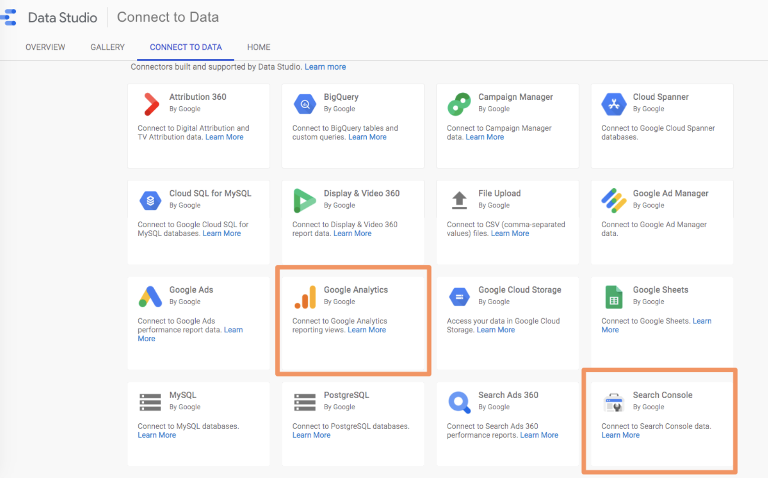 In this example, I’ll connect Analytics—however, the process is nearly identical for other sources.
If you want to follow along exactly with what I’m doing, connect the Google Analytics Demo Account for the Google Merchandise Store.
You’ll be prompted to authorize the connection. Once you’ve done that, you’ll need to select an account, property, and view.
To finish setting up the connection, click “Connect” in the upper left-hand corner.
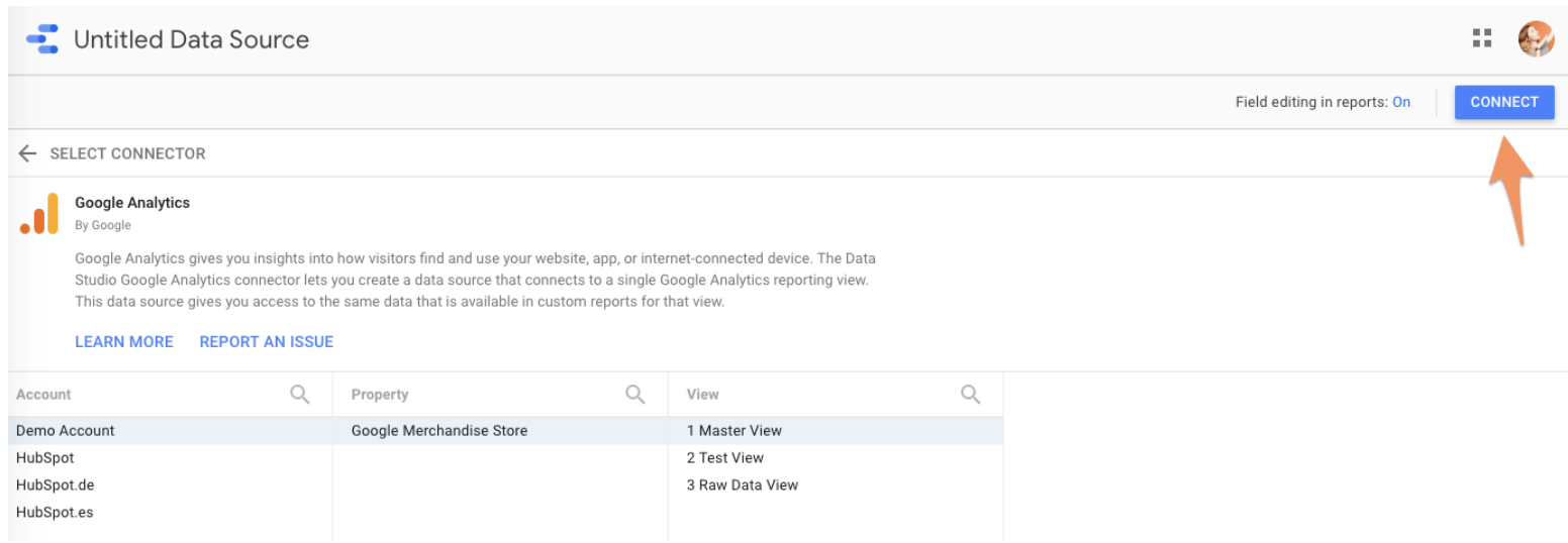 (Leave “Field editing in reports” toggled to “On.” If you’re creating a report for, say, a client or an intern, and you want to give them edit permissions without giving up complete control over your data, you can turn this off. Click here to learn more about editing fields.)
You’ll be presented with this menu: a list of every field in your Analytics account (both the standard ones and the ones you’ve added).
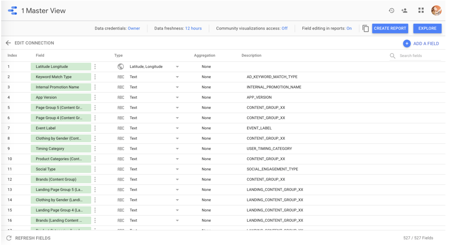 Does this feel overwhelming? Yep, same here. There’s a lot we could do in this step -- add new fields, duplicate existing ones, turn them off, change field values, etc. -- but we could also do all those things in the report itself, and it’s much easier there.
So let’s move along quickly. Click “Create Report” in the upper right.
Data Studio will ask if you want to add a new data source to the report; yes, you do.
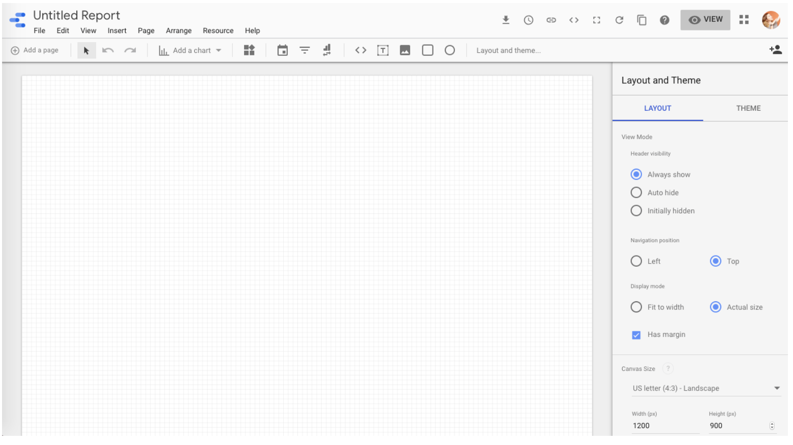 Here’s what you’ll see. It’s pretty spartan, but not for long!
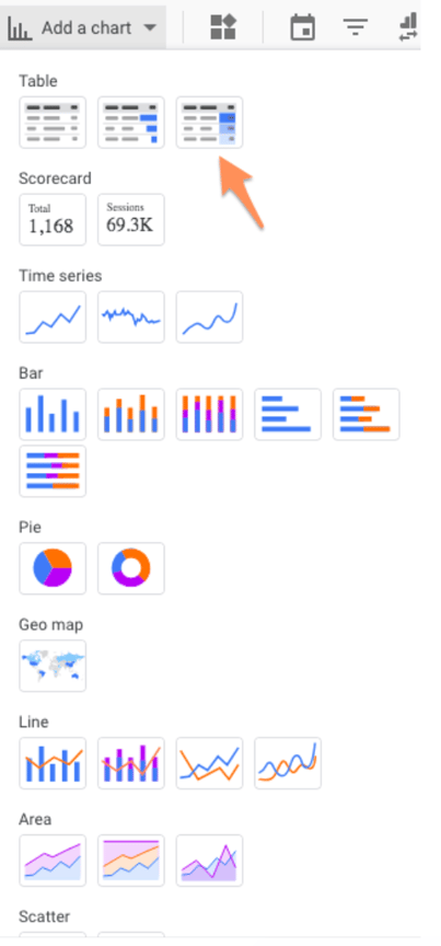
Click “add a chart” in the toolbar. Data Studio makes it easy to compare chart types with some handy illustrations.
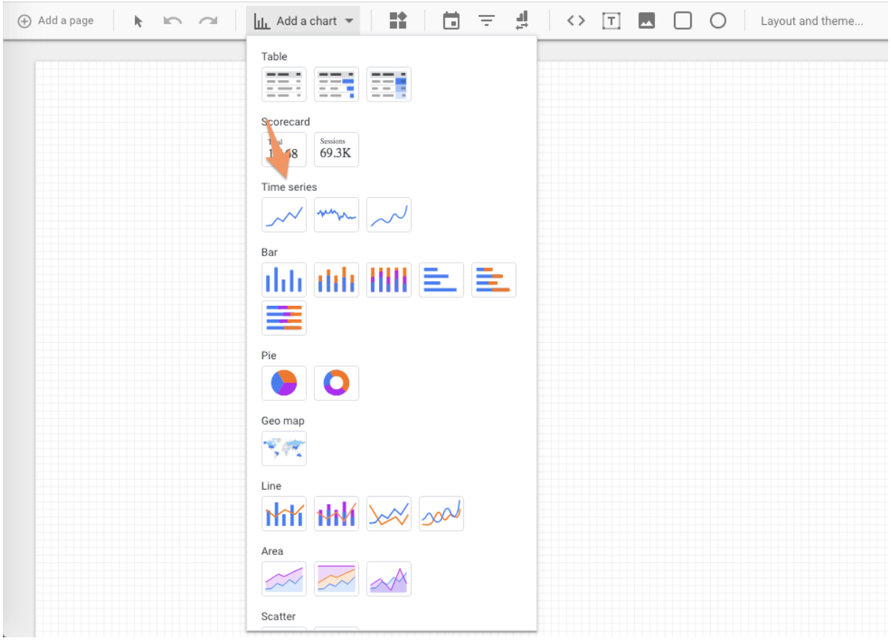 Choose the first option under “Time series.” This chart type shows change over time.
Once it appears on your report, the right-hand pane will change. Here’s what you should see:
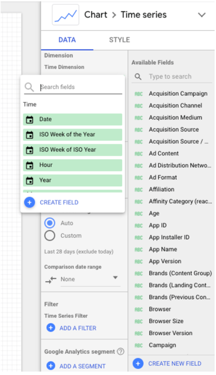 By default, the dimension is “Date”; you can change this to any of the time-based dimensions, including “Year,” “Hour,” etc.
I’m going to stick with “Date” because the Demo Account doesn’t have much historical data.
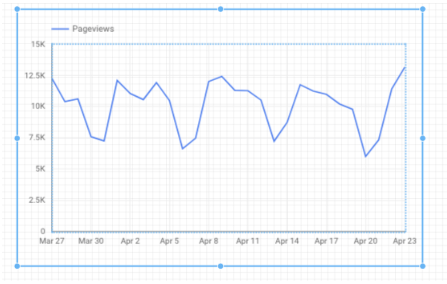
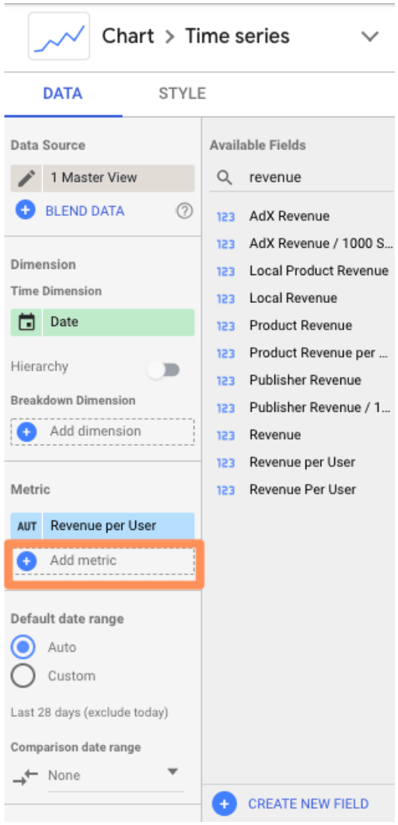
Data Studio will automatically select a metric (i.e. what’s displayed on the Y axis) for you. Feel free to change this; for instance, it defaulted to “Pageviews” for me, but I’d rather see “Revenue per user.”
Make sure you’ve selected the chart so you see the pane on the right:
 You have two options for adding a metric (or dimension). You can click the blue plus-sign icon—which will bring up a search box so you can find the field you want—or you can drag a field from the right into the metric section.
To delete a metric, simply hover over it with your mouse and click the white “x” that appears.
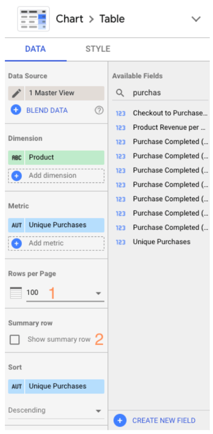
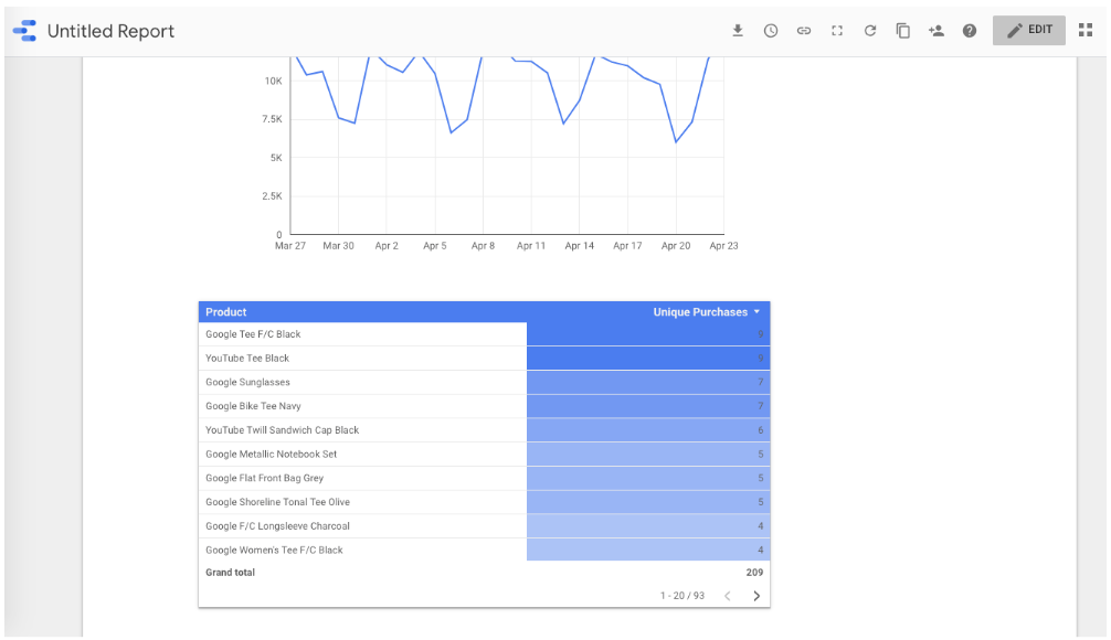
Now let’s add a table. This time choose the third option.
 My chart defaults to Medium (for dimension) and Pageviews (for metric) so I change it to Product and Unique Purchases.
And I think this table’s formatting could use some work. Change the “Rows per page” from 100 to 20 (much easier to read) and check the box for adding a Summary row.
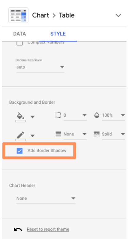
 Finally, click “Style” to go to the style tab. Scroll down and select “Add border shadow.” This is one of my favorite ways to make a data viz pop off the page.
 To see the finished product, click “View” in the top corner. This transitions you from Editor to Viewer mode.
Voila!
 To finish up, we need to give the report a name. Click “Edit.”
Double-click the title (right now it’s “Untitled Report”) to change it.
 And with that, the first report is officially done. To share your report, click that familiar icon above the Chart Editor and add some email addresses.
Okay, don’t really share the report, because I’m about to reveal the secrets that’ll help you seriously upgrade it.
Beginner tips
1. Use templates
There’s no need to reinvent the wheel. If you’re not sure where to start with Data Studio, I recommend browsing through their templates for inspiration.
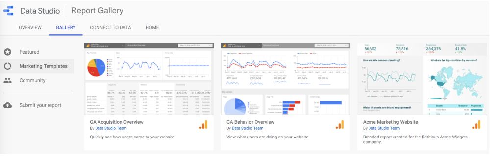 Pay attention to the report’s creator. Many templates were built by the Data Studio team; you can find them all in the “Marketing Templates” section. But there’s also 45+ user submissions, located in the “Community” section. A few of my favorite templates:
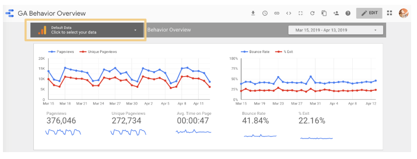
- GA Behavior Overview: This dashboard pulls out the most relevant information from the Behavior section of Google Analytics
- Paid Channels Mix Report: Use this template to understand how your ads are performing on Facebook, Twitter, LinkedIn, search, and more.
- Website Technical Performance Indicators: Get a quick overview of how your site is performing in real time, including JavaScript and 404 errors and page load times.
There are also a bunch of fun, non-marketing templates in the gallery (found in the “Featured” section), like F1: How Important Is the First Race? and Star Wars: Data from a galaxy far, far away. Definitely take a look if you’re curious to see the full potential of GSD unleashed.
2. Publish your report
Want to show off your superior analytics and data viz skills to the world? Submit your report to this gallery using this Google form.
Read over the full instructions at this link, but here’s what I’d keep in mind:
- Don’t share sensitive information. I recommend creating a report with publicly accessible data so there’s absolutely no chance you get in trouble for sharing data you don’t own. (Pro tip: recreate one of your existing company reports with dummy data from one of Google’s sample data sets!)
- Make it awesome. The public reports are impressive, so don’t hold back with design, features, and so on.
- Add context. Provide on-page explanations of what you’re measuring or monitoring with captions, instructions, maybe even a video of you walking through the report (more on how to enable that here).
3. Connect to 150+ sources
As I mentioned, you can bring data from Google-owned sources into Data Studio, including Search Console, Google Ads, YouTube, and Campaign Manager.
But that’s just the tip of the iceberg. There are also more than 120 partner connectors—essentially, third-party bridges between Data Studio and platforms like Adobe Analytics, AdRoll, Asana, Amazon Ads, and AdStage (and that’s just the As).
Check out all the options here.
4. Create your own report theme
Whether your report is meant for internal stakeholders, like the leadership team, or external ones, like clients, it’ll be more effective if it looks good.
To adjust the report’s style and formatting, click the Layout and theme option in the toolbar.
Any changes here will apply across the report—meaning you only need to pick fonts, colors, etc. once versus every time you add a new module to the report.

Data Studio comes with two built-in themes: simple and simple dark. But it’s easy to create your own -- and the results are way more impressive.
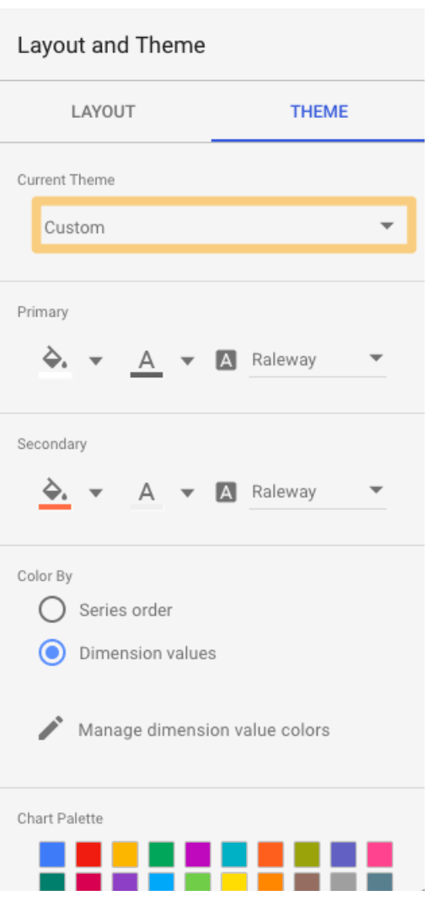 Change the “Current Theme” dropdown to “Custom.”
Use your brand style guide to choose primary and secondary colors, fonts, and text color. You might need to get creative here; HubSpot uses Avenir Next, which Data Studio doesn’t offer, so I went with its cousin Raleway.
If you’re creating a report for a client and don’t know their hex codes, Seer Interactive’s Michelle Noonan has an excellent tip: use a free color picker tool to identify what they’re using on their website.
In this tab, you can also create a custom chart palette and edit the border and background settings.
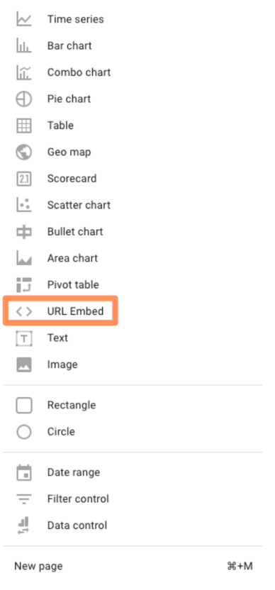
5. Embed external content
Just like you can bring your report to the wider world, you can also bring the wider world … to your report.
With the URL embed feature, you can insert Google Docs, Google Sheets, YouTube videos—even live webpages. Embedded content is interactive, so it’s far more powerful than a screenshot.
To add content, click “Insert” in the upper nav bar, then choose “URL embed.”
 From there, simply paste the URL. You may need to resize the box that appears to fit the entire length and width of your content.
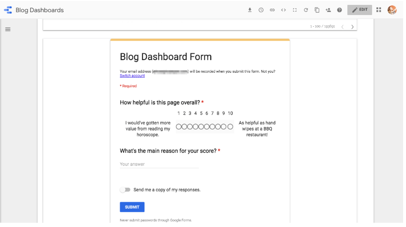
The options here are pretty endless. One of my favorite ways to use this feature is embed a Google Form gauging how useful the report was for my audience:
If a section of the report needs extra context (or my viewers aren’t that technical), I’ll add a short video explaining what they’re looking at and how to interpret the results.
To personalize a report for a client, I’ll add the URL of their website, blog, and/or whatever pages they hired me to create or improve.
And for the HubSpot blogging team, I’ll add the latest version of the Search Insights Report so they can compare our progress to the results.
6. Send scheduled reports
If you have a group of stakeholders that need to see your report on a recurring basis, considering using Data Studio’s “scheduled report” feature. Click the clock in the top menu to set this up.
 First, enter your recipients’ email addresses, then choose a schedule: daily, every Monday, or every month.
This is particularly handy when you’re working with customers, since you may not want to give them access to the live report.
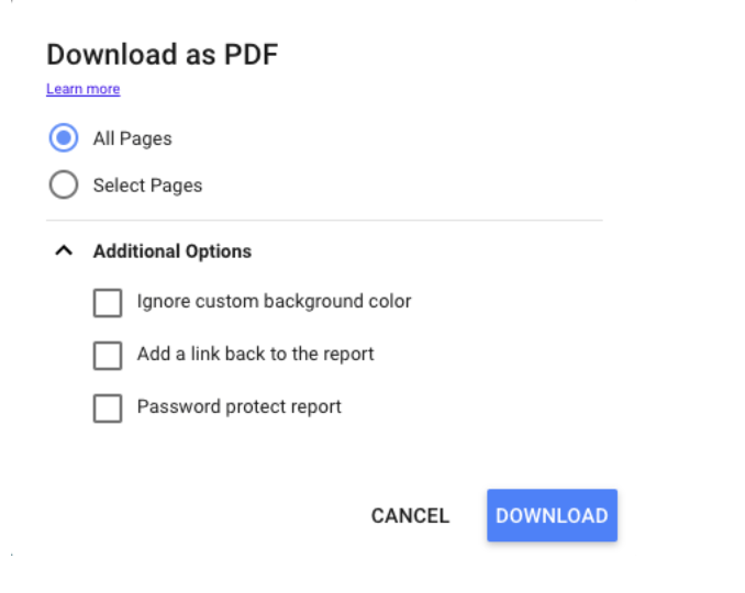
7. Download reports
Alternatively, you can download your report as a PDF. This is helpful for one-off situations, like if your boss asks for a status report or your client wants to know how an ad has performed so far this month.
To download the file, click the downward-facing arrow next to the clock.
 Data Studio gives the option of downloading your current page or the entire report. You can even add a link back to the report so your audience can dig in deeper if they’d like and add password-protection to ensure your data stays safe.
8. Embed reports
You can even display your report on your company website or personal portfolio—which can be a great way to highlight the results you’ve gotten for a client or project.
Click the brackets icon in the upper nav bar.

This box will pop up:
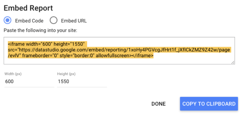
Adjust the width and the height as needed and you’re good to go.
Intermediate Tips
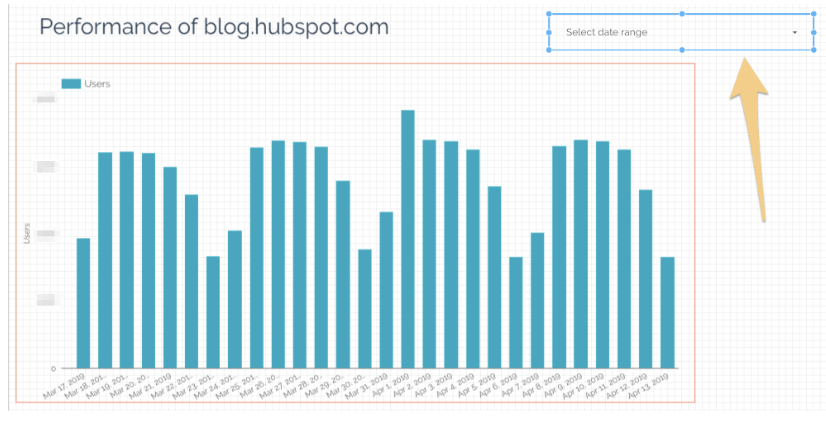
9. Add a date range
Give your viewers more freedom by letting them select which dates they’d like to see information for.
For example, my reports always default to the last 30 days, but if one of HubSpot’s blog editors wants to see how their property performed in the previous calendar month, the date range controls let them adjust the report.
They can choose from predefined options, like “yesterday,” “last 7 days,” “year to date,” etc. or pick a custom time period.
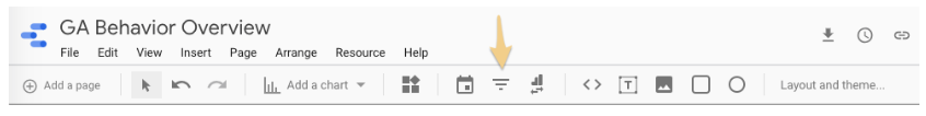
To enable this, first navigate to the page where you want to give users date control. Make sure you’re in “Edit” mode. Next, click the calendar icon from the toolbar.
 A box will appear on your report. Drag it into the position you want—I recommend somewhere in the upper right or left corner so your audience sees it first—and adjust the size if necessary.
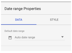
 Clicking this module will bring up a panel to the left of your report called Date Range Properties. Set the default date range to “Auto date range,” if it isn’t already.
 If your viewers select a date range using the date range widget, every report on the page will automatically update to that time period.
There are two ways to override this:
- Set a time period within a specific chart. That time period will always supersede the date range control.
- Group the charts you want to be affected by the date range control with the module. Select the chart(s) as well as the box, then choose Arrange > Group.
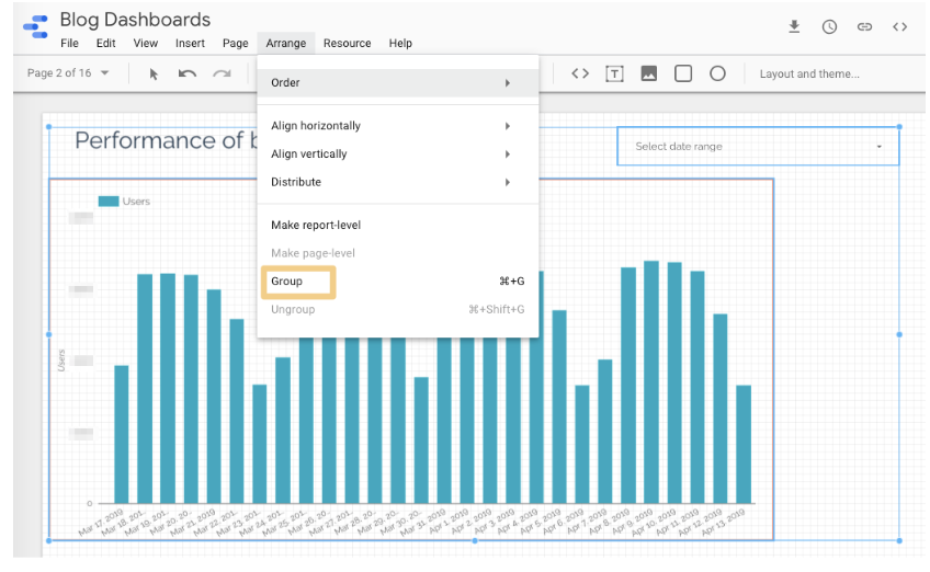 Now, only the chart(s) in this group will update when someone adjusts the date range.
Make sure this setting is clear to your viewers—otherwise they’ll probably assume all the charts they’re looking at on their current page are using the same time period.
10. Add filter controls
Give your audience even more flexibility with filter controls. Like the date range control, a filter applies its settings to every report on the page -- so if, for example, someone filtered out everything beside organic traffic, all the reports on that page would show data for organic traffic specifically.
Add a filter control by clicking this icon in the toolbar.
 The filter will appear on the report page. Resize it and drag it into the position you want. While it’s selected, you should see a panel on the left-hand side:
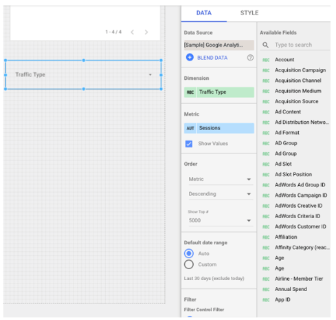 In the data tab, pick which dimension you want viewers to be able to filter. These dimensions come from your data source -- in this example, I’ve picked Traffic Type.
The metric part is optional. Basically, if it’s checked, viewers will see the values for each dimension sub-category in the filter. (This will make more sense once you see the screenshot below.) They can sort by these values, but they can’t filter by a metric.
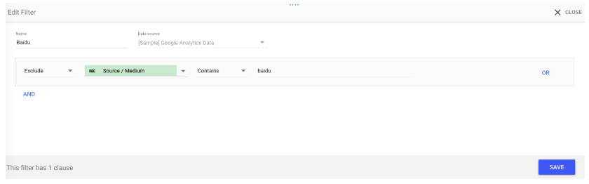
You can add an additional filter to your filter control. For example, if you’ve added a filter for Source / Medium, you may want to exclude the “baidu /organic” filter so your viewers don’t see that as an option.
 Customize your filter control’s formatting and appearance in the style tab. You have a few options: list/check all that apply filters, like this one:
 Or “search all” filters, which allow your viewers to search by numeric and text terms using operators like >=, and <, or “equals,” “contains,” etc., respectively.
This can be a hassle for the people reading the report—plus, they need to be somewhat comfortable with search operators. Unless your filter dimensions has 10,000 values (unlikely), stick with the list filter.
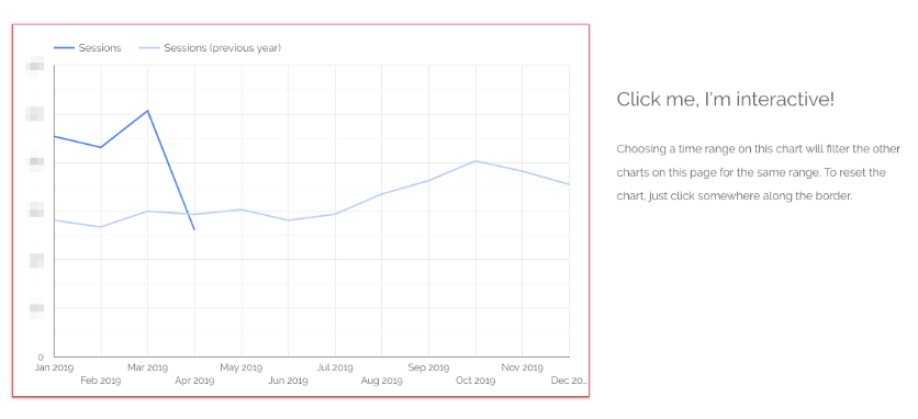
11. Create interactive chart filters
Want to make it even easier for your audience to filter the charts in your report? Create responsive chart filters.
This sounds fancy, but it simply means selecting a dimension in a chart will filter all the charts on that page for that dimension.
For instance, if you click on “organic” in this chart, the other charts on the page will update to show data for organic traffic only—just like you’d applied a traditional filter control.
 You can also create chart controls for time, line, and area charts. If a user highlights, say, January through March on a time chart, the other charts on the page will show data for January through March as well—just like date range control.
And also just like filter controls, you can group chart controls.
To enable a chart control, select the appropriate chart. In the right-hand panel, scroll to the bottom and check the box labeled “Apply filter.”
 Add a caption next to charts that support interactive filtering so your viewers know it’s an option:
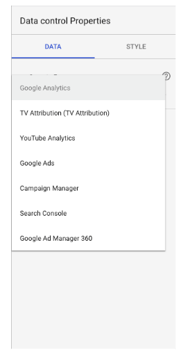
12. Add data control
Data controls may just be one of the coolest Data Studio features, full-stop. Place one of these bad boys on your report, and you’ll give viewers the ability to choose the source of the data being piped into your charts.
This is a game-changer for anyone managing a complex property or working with multiple different stakeholders.
For instance, imagine you’re the admin of HubSpot’s Google Analytics account. You create a Data Studio report monitoring key website performance indicators, like average page speed, number of non-200 response codes, number of redirect chains, and so on.
You share this report with the blogging team, who has access to the Google Analytics view for blog.hubspot.com. (Need a refresher on how views and permissions work? Check out our ultimate guide to Google Analytics.)
You also share the report with the Academy team, who has access to the GA view for academy.hubspot.com, as well as the Leads Optimization team, who has access to the view for offers.hubspot.com.
To see this report populated with the relevant data, these team simply need to select their view from the “data source” drop down and voila—all the charts will update automatically.
Pretty nifty, right?
 Not only does this save you from rebuilding the same report for different groups, it also means you don’t need to worry about accidentally sharing sensitive or confidential information. Each viewer can only select data sources they’ve been granted access to.
You can include multiple data controls in a single report.
Add the data control widget to your report by clicking this icon:
 Then choose which primary source you’d like viewers to pull from:
13. Add a dimension breakdown
Instead of telling you what a dimension breakdown is, it’s easier if I show you how it works.
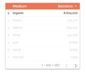
Suppose we want to see users by source. To find out, we create a simple bar chart.
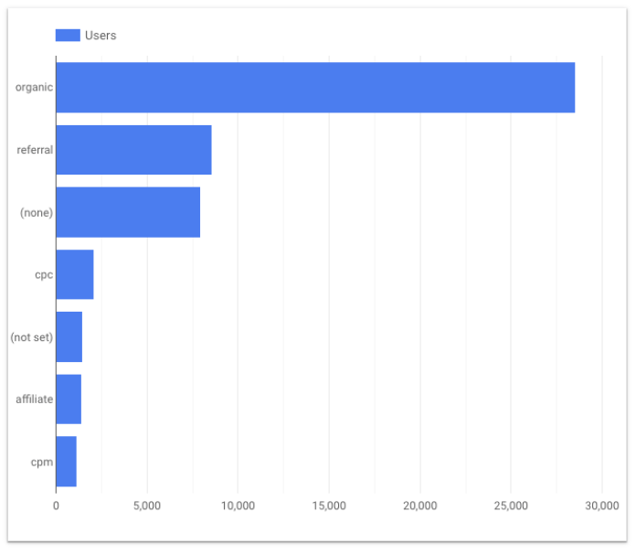
This is interesting -- yet there’s some context missing. Is all of that organic traffic coming from Google? (Since this is U.S. data, probably, but imagine creating the same chart for China or Japan, where Baidu and Yahoo have a far greater presence.)
What about referral traffic? Clearly we’re getting a significant number of users from referral links; is a single source driving most of them or is it distributed fairly equally across a wide variety of sources?
We could create separate bar charts for each source -- first filtering by medium and then making the dimension “Source” and the metric “Users.”
Or we could click a single button and have Data Studio do it for us.
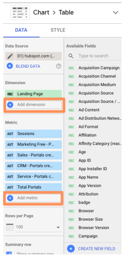
Under Breakdown Dimension, click “Add dimension.”
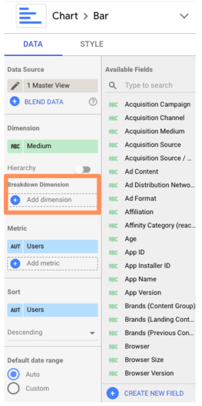 Add “Source.”
Here’s what you should see:
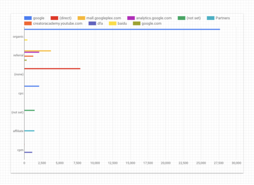 Pretty sure my former Data Analytics professor would cry if he saw this. Don’t worry, Vish, we’re not done yet.
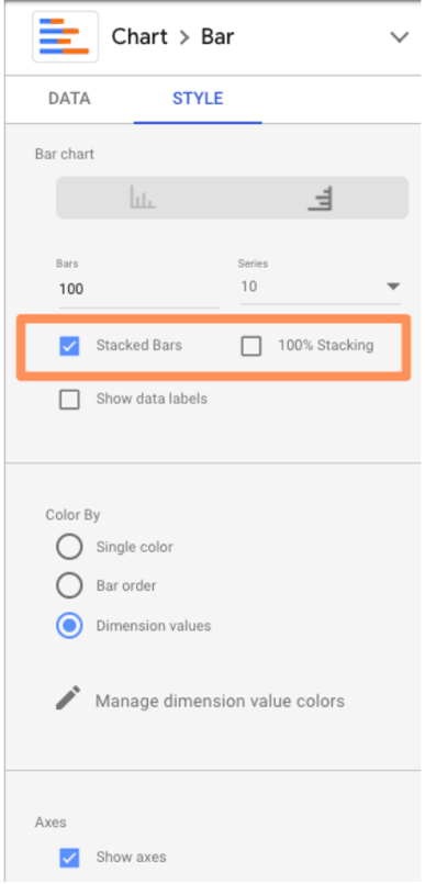
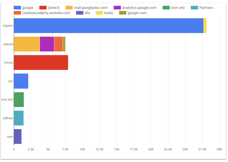
Jump over to the “Style” tab and check the box “Stacked bars.” This will turn your regular bar chart into a stacked bar chart (you should see the chart type update accordingly).
Data Studio will automatically make your bar charts “100% stacking,” which means that every bar will go to the top of the chart. This style is misleading—for example, here it suggests every medium drove the same number of users. Uncheck this box.
 Check it out:
14. Use Data Studio Explorer (Labs)
To bring any chart into Explorer, mouse over the space next to its top right corner. You’ll see three vertically-stacked dots appear; click them.
Select “Explore (Labs).”
You’ll see something like this:
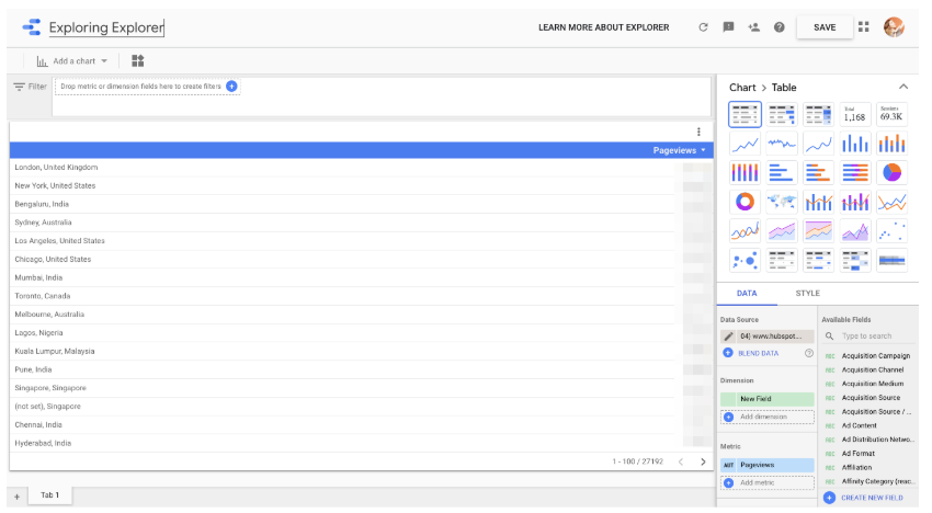 You can toggle between different visualizations; add and remove dimensions and metrics; change the date range; and apply segments.
Important note: Unlike every other Google tool out there, Explorer does not automatically save your work. To preserve your chart, click the “Save” button on the top nav bar (to the left of your profile icon). Once you do that, your Explorer “report” will be saved in the Explorer section of your dashboard. Every change you make will be saved by default.
Speaking of that dashboard, if you prefer, you can also start with Explorer (rather than a Data Studio report). Go to your Data Studio dashboard and select “Explorer (Labs)” in the left-hand menu.
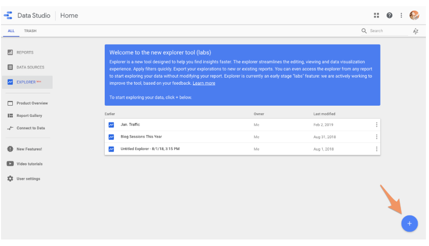 Add a new data source by clicking the blue button in the lower right corner.
At first, Explorer confused me. It feels very similar to the core Data Studio—what was the point of having both?
However, after spending some time in Explorer, I’ve come to appreciate its unique value.
Unlike Data Studio, any modifications you make to a chart in Explorer are temporary. That means it’s a great place to dig into your data and try out different ways of visualizing it without making any permanent changes. Once you’re happy with your chart, simply export it back into Data Studio.
To do this, click the small sharing icon in the top nav bar.
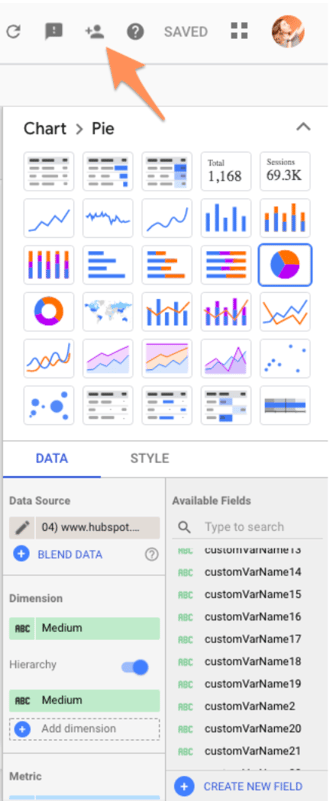 Then choose whether to add your Explorer work into a new or existing Data Studio report.
Advanced Features
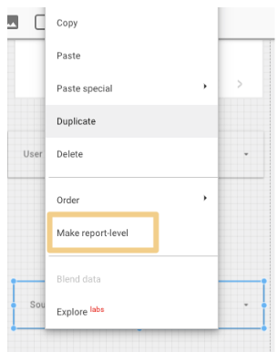
15. Create report-level filters
By default, a filter applies to every chart on that page. But what if the viewer goes to the next page? The filter won’t go with them.
This is confusing for non-technical folks and inconvenient for data-savvy ones. To bring a filter up from page-level to report-level, simply right-click on it and select “Make report-level.”
16. Create blended fields
Data Studio is powerful because you can bring in 400+ sources of data into a single report. Thanks to a new feature, blended sources, it just got even mightier.
Heads up: this will get a little technical. Stay with me and I promise it’ll be worth it.
If you’re familiar with JOIN clauses in SQL, you’ll understand data blending right away. No idea what SQL is? Not a problem.
The best way to think about blending data is with a Venn Diagram. You have two data sets. Each data set has unique information—e.g. the data living in the green and blue areas, respectively.
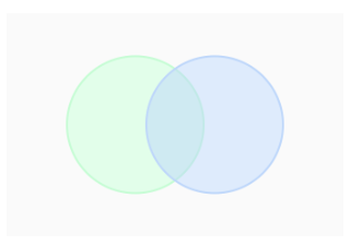 But they have (at least) one data point in common: the information in the blue-green overlap section.
This shared data point is known as a key. If your data sets do not have a key, they’re not blendable.
For example, suppose you want to compare how users behave on your website versus your app. The key is user ID, a custom dimension you’ve created in Google Analytics that your app analytics software also uses. (Note: The key doesn’t need to have the same name in both data sources; it just needs to have identical values.)
You blend your website behavior report from GA with your app usage report. This gives you all the records from the first report along with any matching ones from the second; in other words, if a user has visited the site and used the app, they’ll be included. If they only used the app but didn’t visit the site, they will not be included in the new blended data.
This is known as a LEFT OUTER JOIN. (To learn more, check out this W3Schools primer.) Why do you care? Because the order of your data sources matters.
Put your primary data source first—e.g. the one where you want all the values, regardless if there’s a match in your second source.
Now that we’ve gotten all that out of the way, let’s set up a blended field.
First, add a chart to your report.
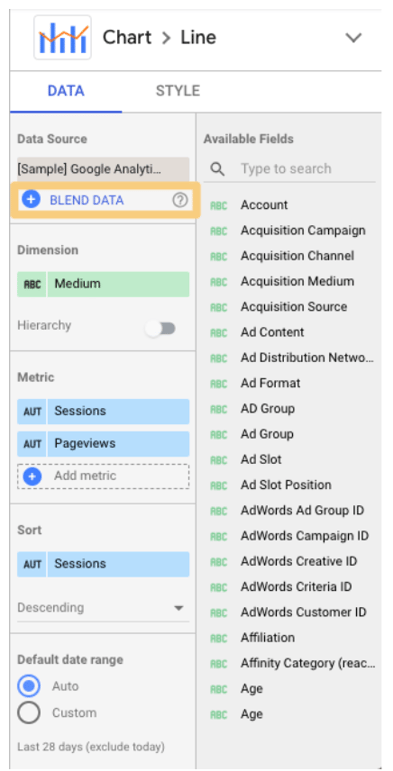 Click on “Blend Data.”
This panel will pop up:
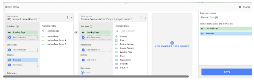 Select your first data source on the left. Remember, this is the primary data source. Then add your second data source. Data Studio lets you add up to five data sources in a chart, but for now, let’s stick to two.
Now pick your join key(s). If the field exists in both sources, it will turn green. If it doesn’t exist, you’ll see this:
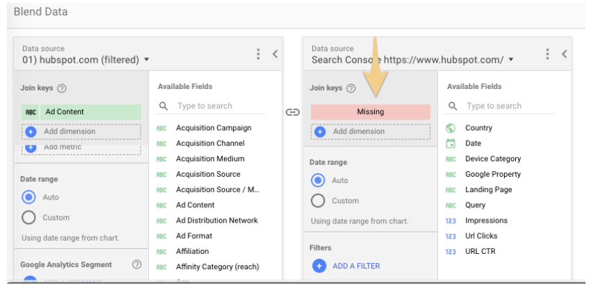 Remember that the key acts as a filter for the second data source. In this example, only records that match the landing page from the GA view for hubspot.com will be pulled from Google Search Console.
Choosing multiple keys will limit the number of records pulled from the second data source even further.
Once you’ve picked your join key(s), the rest of the process should feel familiar.
Pick the dimensions and metrics you want to see for your first data source. Then do the same for your second.
You can also limit the results by adding a filter or date range (or for GA sources, segments). Filters, date ranges, and segments applied to the left-most data source will carry over to the other data sources.
Once you’ve finished customizing the report, click “Save.” Congrats: you just created your first blended data chart!
If you find it easier to create two separate charts and then combine them, Data Studio offers a great shortcut.
Just select both charts, right-click, and choose “Blend data.”
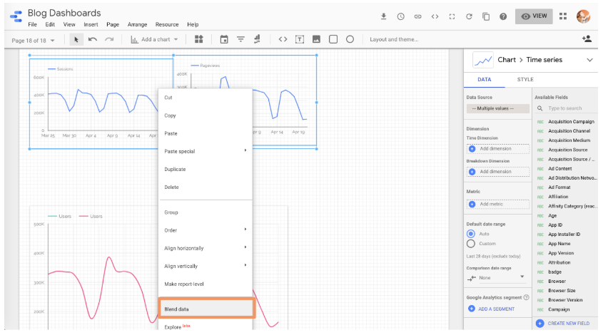 Unfortunately, Data Studio can get confused pretty easily, so I’d still make the effort to learn how to blend data using the right-hand pane.
17. Blend your data source with itself
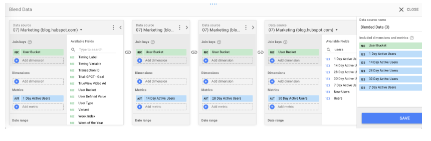
If you’re bumping into limitations with your data source connectors, try this workaround: blend a data source with itself.
To give you an idea, the GA data connector only lets you add one “active user” metric to a chart, so there’s no way to see 1 Day Active Users, 7 Day Active Users, and 28 Day Active Users on the same chart… unless you blend your Google Analytics data source with itself.
Follow the same instructions as above, but instead of picking a new source for your second data source, just select the first one again.
And since all of the fields are identical, you can pick whichever join key you’d like.
 This option is also perfect when you need to compare trends across two-plus subdomains or segments.
For instance, I wanted to look at organic users for the HubSpot Blog (blog.hubspot.com) and main site (www.hubspot.com) at the same time.
This helps me figure out if we’re growing search traffic across the board. It’s also useful when traffic decreases—have rankings dropped site-wide, or just for the blog (or the site)?
However, you can’t add two separate “user” metrics to a chart at once… unless, of course, you’re blending data.
To set this up, create a new blended data source (following the same process as above).
Add your first view to the left-most column, your second view to the following column, and so on.
Note: Make sure you’re choosing views with mutually exclusive data. In other words, I wouldn’t want to use “blog.hubspot.com” as my first source and “blog.hubspot.com/marketing” as my second source, because all the data for the blog.hubspot.com/marketing view is included in the blog.hubspot.com one.
Because of that overlap, we wouldn’t be able to clearly spot trends.
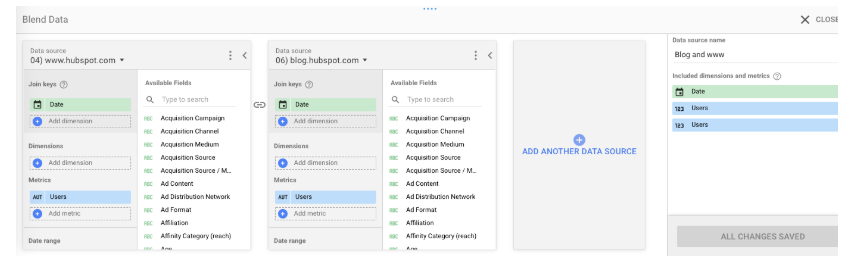 Use “Date” as the join key.
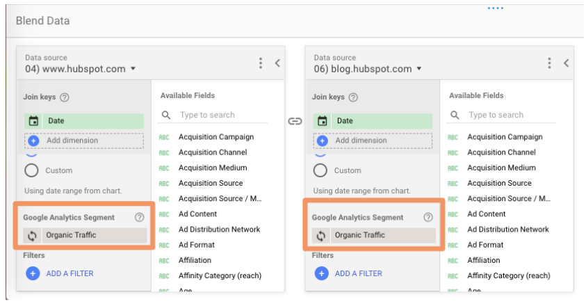 I added the organic traffic segment to both sources, but you can choose whichever segment you’re interested in (paid traffic, social traffic, etc.) Or leave it off entirely! Tons of possibilities here.
In fact, here are some additional ideas for blending a source with itself:
- Compare two-plus custom segments
- Compare two-plus landing pages
- Compare two-plus goal completions
18. Create a basic calculated field
When your existing data doesn’t give you enough information, it’s time to create a calculated field.
Calculated fields take your data and, as their name suggests, perform calculations on them.
It’s probably easiest to explain with an example. Let’s say you want to look at the average number of transactions per user. You can create a calculated field that takes the metric “Transactions” and divides it by the metric “Users.”
Once this field has been created, it’ll be updated automatically—so you can change the chart’s time range, dimensions, etc., and the average transactions per user data will update accordingly.
There are two ways to create a calculated field.
1. Create a data-source-level field, which will make that field available in any report that uses that data source.
It’ll also be available as a filter control or in new calculated fields (like calculated field inception).
Obviously, this is a good option if you plan on using this custom metric more than once. The only caveat—you must have edit rights to the original data source. You also can’t use a data source calculated field with blended data.
2. Create a chart-level field, which means you’ll only be able to use the field for that specific report.
All the limitations of the other type are reversed: while you can’t use a chart-level calculated field in another chart, filter control, or additional calculated field, you don’t need to have edit rights to the original data.
You can also use a chart-specific calculated field for data blending, which we’ll cover in the next step.
Create a data-source calculated field
Add a chart to your Data Studio dashboard, then choose the data source you want to derive your new field from.
Click “Add a new field” in the lower left-hand corner.
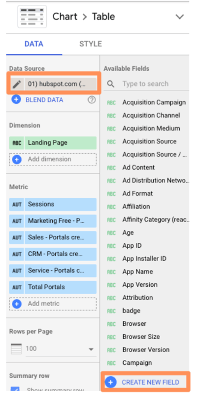 (You can also do this by clicking the pencil next to the data source and then selecting “Add a field” in the upper right corner of your field menu.)
 Use the left menu to search for the metrics you need; click one to add it to the formula.
If the formula has an error, a notification will appear in red underneath the editor explaining where you went wrong.
If your formula works, you’ll get a green checkmark.
 Click “Save” to add your new field to the data source.
And don’t forget to name yours—which I forgot to do. :)
Now you can add this calculated field to any chart just like a normal field.
Create a chart-level calculated field
This option is a little easier.
Simply click “Add a field” underneath the existing dimension(s) and metric(s) you’ve selected.
 Then choose add a new field. This pane will pop up:
 From here, enter the formula for your new field—simply typing in the name of your desired metric will trigger a menu of options—and click “Apply.”
Your new field will be added to the chart.
Loves Data’s Benjamin Mangold’s has an excellent round-up of sample calculated metrics, including:
- Average goal completions per user
- Non-bounce rate
- Pageviews per transaction
- Value per session
Check it out for inspiration.
If you want a little practice before you start going to town on your own data, Google offers a handy sample exercise.
19. Creating an advanced calculated field
Okay, so there’s a lot you can do with simple algebraic calculated fields. But there’s even more you can do once you introduce functions and RegEx.
Don’t be scared off! We’ll walk through these step-by-step.
If you’re comfortable with functions in Google Sheets and/or Excel, then you already know how to use functions in Data Studio.
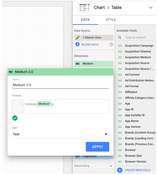
For instance, let’s say that you majored in English and it’s always bothered you “Source” in Google Analytics is lower-case. (No, I’m not talking about myself. Why do you ask?)
You can use the UPPER function to transform Source into all upper-case.
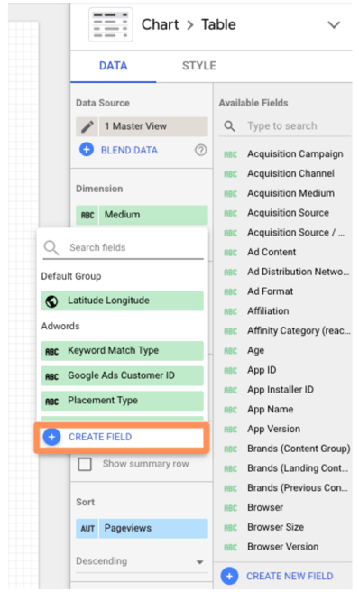
Simply click “Add dimension” > “Create new field.”
 Then enter the UPPER formula:
 As Google Sheets expert Ben Collins points out, this trick will also standardize any custom naming; for example, if some people on your team used “chat” for a campaign, and others used “Chat,” the UPPER function will aggregate both together.
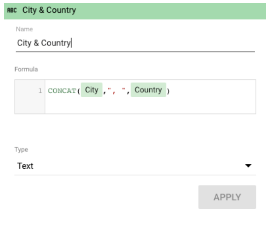
Perhaps you want to create a new field for city and country.
Just click “Add dimension” (since city and state are categorical, not quantitative, variables) > “Create field.”
Then use the CONCATENATE function to smush together the City and Country fields.
 Check out the full list of functions Data Studio supports.
One of the most nifty is CASE; if you’re unfamiliar, it’s essentially an IF/THEN statement. This function lets you create custom groupings.
For example, let’s say you’re looking at the table we created in the last step:
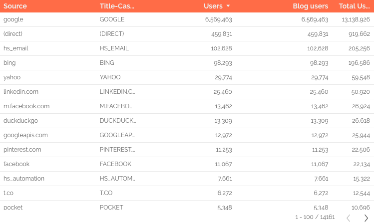 Data Studio is treating Facebook mobile traffic (m.facebook.com) and desktop traffic (facebook) as two different sources. There’s also l.facebook.com—desktop traffic coming via a link shim, which Facebook implemented in 2008 to protect users from potential spam. What if you want to combine all Facebook traffic into a single source?
A CASE formula solves this issue neatly. Here’s the formula:
CASE
WHEN condition THEN result
WHEN condition THEN result
ELSE result
END
You can have one condition (like the example below) or several. The ELSE argument is optional, so feel free to leave it out if you don’t need it.
Here’s the formula we’ll use to group together Facebook traffic:
CASE
WHEN REGEXP_MATCH(Source,"^(l.facebook.com|m.facebook.com|facebook.com)$") THEN "Facebook"
END
This formula tells Data Studio, “If the source matches l.facebook.com, m.facebook.com, or facebook.com, call it ‘Facebook.’”
To add a CASE formula, you must be able to edit the data source.
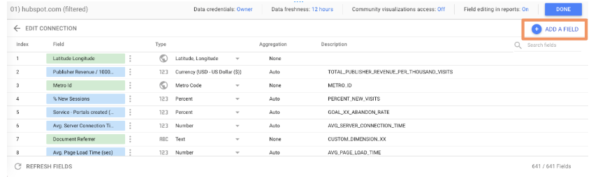
Click the pencil icon next to your source to bring up the data field editor.
Then click “Add a new field” in the upper right corner.
Enter your formula.
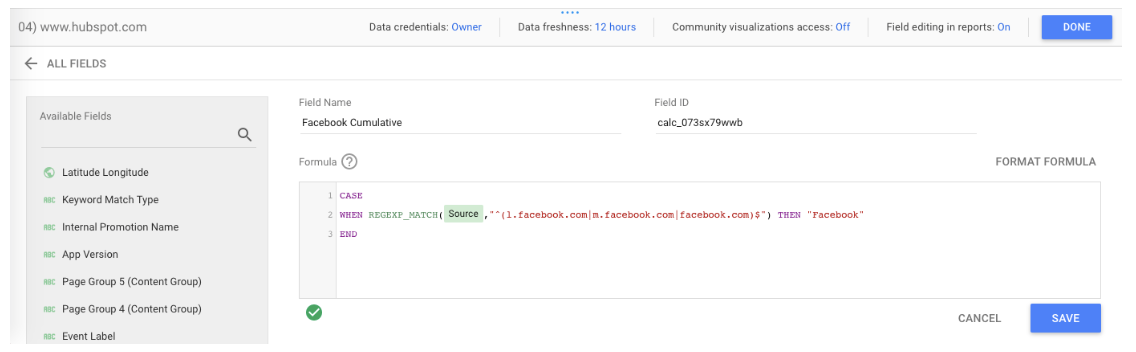 If the formula works, you’ll see a green check mark. Give your new field a name and click “Save.” Now you can add this field to any chart or data viz that uses this data source.
You might be thinking, “Okay, great, but was that formula written in Klingon? How do I come up with my own?”
Don’t know RegEx? No problem! This blog post has five formulas to get you started.
20. Create a calculated blended field
This is the pinnacle of Data Studio mastery, requiring all the skills you’ve already learned and a hefty dose of luck—just kidding, it’s super easy.
Create a blended data source per usual.
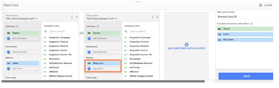
In this example, I blended together the GA views for www.hubspot.com and blog.hubspot.com.
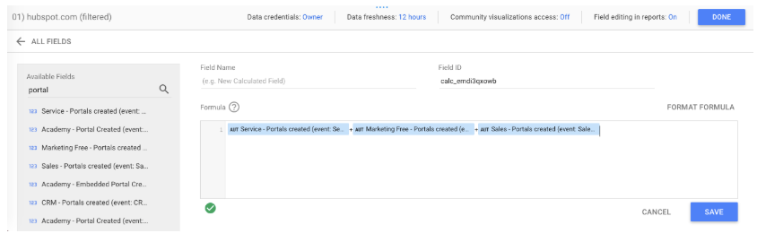
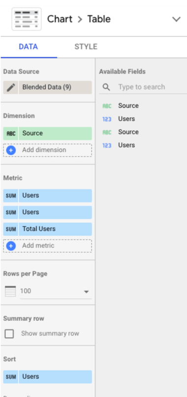 Then click “Add metric” > “Add new field” as you would to create a normal calculated field.
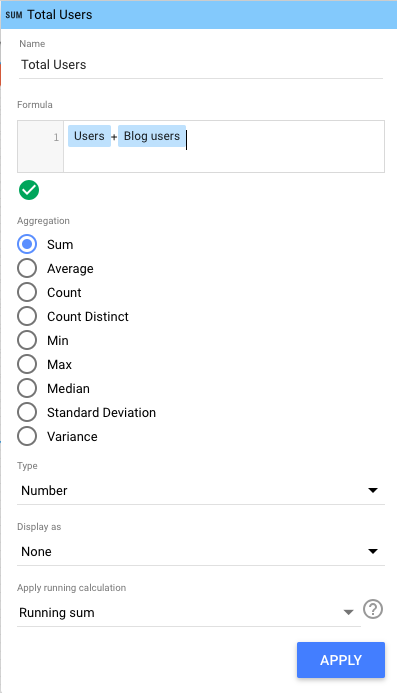
Enter your formula.
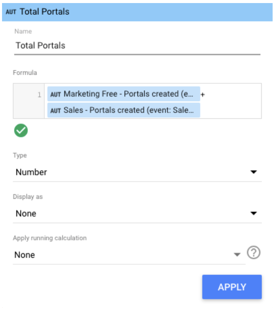
I wanted to see “Total Users” (i.e. users from www.hubspot.com plus users from blog.hubspot.com), which is a simple calculation:
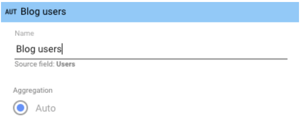
 Note: It can get a bit hairy here if you’re using two different fields with the same name, as I’m doing here. Sometimes Data Studio is smart enough to recognize the difference, sometimes it’s not. If you run into issues, I recommend editing the name of one or both fields in the original data source(s), which you can do at any time by clicking the pencil next to the blended data source.
Then click the pencil next to the field name you want to change.
 This pane will appear; edit the title accordingly.
 Then click “Save” and go back to your calculated field to update the formula:
 Ta-da.
Now that you know Data Studio inside and out, you’re well-prepared to create stunning interactive reports for your coworkers, clients, and executives. Good luck.
from Marketing http://bit.ly/2E7Hb9n
via
No comments:
Post a Comment