Monday, 30 September 2019

11 of the Best Meeting Scheduler Tools to Organize Your Day

We complain about spending countless hours in unproductive and mismanaged meetings.

But the greater crime is all the wasted time we spend scheduling the meeting.

The endless back-and-forth communication and steps -- reviewing calendars, finding out the best place to meet, setting up a call-in number, adding the meeting to the calendar, and inviting all the necessary attendees. The process makes your meeting a hassle before it even starts. 

Effortlessly scheduling meetings without the annoying back-and-forth emails. Get free access to HubSpot Meetings here.

Whether you're trying to find the perfect window of time to catch up with your busy team, or looking for the best way to coordinate with your clients, these meeting scheduler tools have you covered. 

1. HubSpot

A lot of meeting scheduler tools connect to your inbox, but what if you need your meeting schedule available in your CRM as well? HubSpot's meeting scheduling tool integrates with both your calendar and your HubSpot CRM, so setting up meetings with customers, prospects, or leads is a painless process.

The Meetings tool provides users with a personalized booking link they can share via email to invite people to view their availability and book time. When someone schedules a meeting, it will automatically be added to your calendar, and pushed to the CRM.
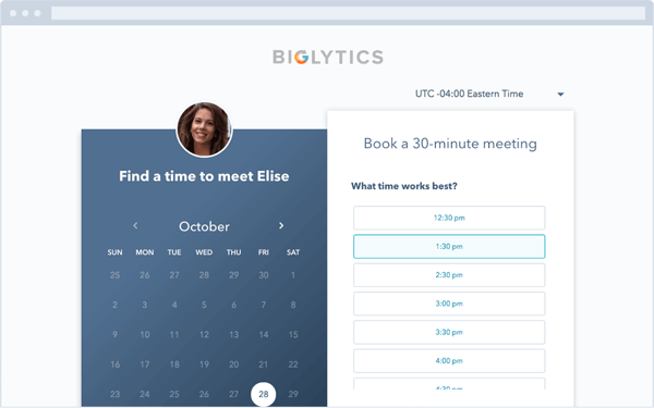
HubSpot Meeting Scheduling App and Website interface

2. Rally

Finding a time for a group of people to meet can be a nightmare, especially if your team is large or includes remote employees. Rally lets you create a simple, straightforward poll where attendees can vote on a day for an event that works best for them. It also includes an open comment section on the meeting page, so attendees can plan the meeting agenda or discuss details before the event.
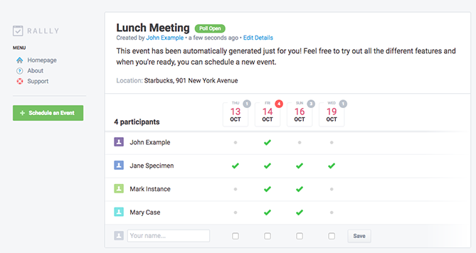
rally-meeting-tool

3. Assistant.to

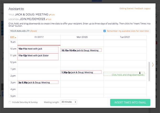
Assistant.to lets you work directly from Gmail and Google Calendar to select available meeting times and share those open slots with the person you're trying to schedule a meeting with.

From within the message compose screen in Gmail, you can select the meeting duration and location. This information is included in an email, allowing the recipient to click on the time that works best for them. Once you've agreed on a time, the app adds the meeting with all the relevant details to your calendar. Currently, group scheduling is not an option.
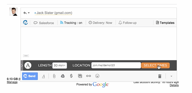
assistantto.png

assistant.to-meeting-scheduler

4. Calendar

Calendar, which recently acquired Timebridge, is a free service that integrates Google and Apple calendars. The app offers two ways to schedule meetings.

With the "outbound" method, hosts indicate their own availability, list the attendees they'd like to come to a meeting, and use the Calendar software to send out an email to collect everyone's preferred times. After Calendar determines the ideal time for everyone to meet, the app will schedule the meeting for you. With the "inbound" method, Calendar gives you a personal URL where users can check your availability and request times to meet with you.
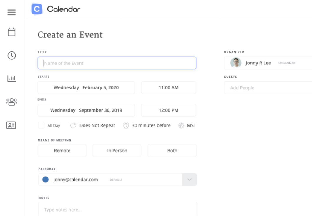
Create an Event page on Calendar website

5. NeedToMeet

NeedToMeet doesn't require you to sign up for an account to use their service. You simply enter a brief description of your meeting's purpose, block off your availability on a calendar, and send the link to attendees. The free version doesn't sync with your calendar, but they do offer a premium subscription which integrates with Outlook.

This tool differs from services like Rally and Doodle because it allows attendees to indicate their preferred date and times, rather than only choosing from a list of dates and times set by the meeting host.
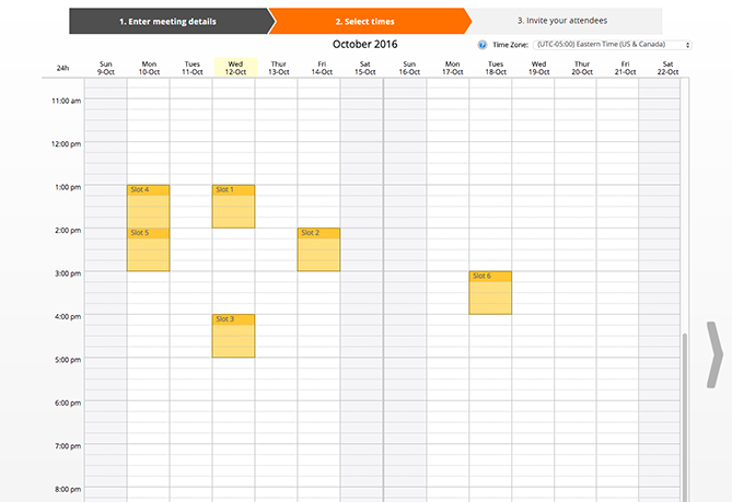
needtomeet calendar

6. YouCanBook.me

If you find yourself struggling to make your availability known to clients, try out YouCanBook.me. This freemium service offers users a custom URL where users can view free spots on your Google Calendar or iCloud Calendar and book time with you. 

The service allows you to customize your booking page with different layouts, colors, and your company's logo.
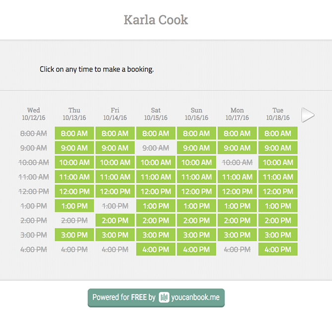
YouCanBook.me Scheduling tool

7. Pick

Pick automatically scans everyone's Gmail calendars to find open slots, and then delivers a list of mutually available times. You can then send a calendar invite to all attendees directly from the app.

All members of your team need to be on Pick in order to share their availability. The app also provides users with an individual URL so you can share your availability with people requesting a meeting.
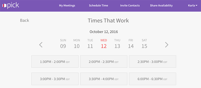
pick meeting app which highlights Times That Work for the user

8. Doodle

With Doodle, you can pick date and time options, and poll a group to see what works best for them. You don't have to sign up for a Doodle account to participate in a poll. You can also create a public Doodle URL, where individuals can request a meeting with you based on your listed availability. 
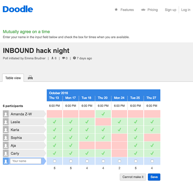
doodle scheduler allows teams to show availability

9. Calendly

Calendly integrates directly with your Google or Office 365 calendar, and gives you a personalized URL where people can view your availability and schedule times to meet you. They offer a basic free plan, and a paid premium plan that allows for group scheduling and other additional features.

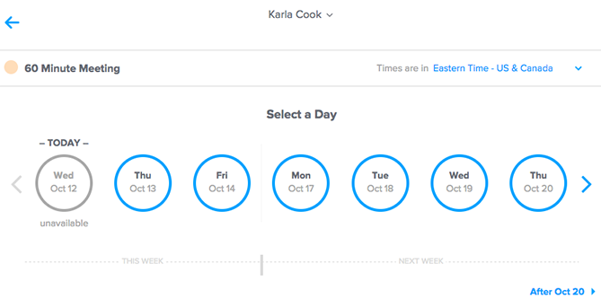
To help you stay organized, the app lets you set up custom meeting types and durations, e.g., "30 Minute Check-In" or "60 Minute Project Review." You can add also add custom questions to the form people use to sign up to meet with you, include a link to a document or web page people should review prior to your meeting, or even make events private. 
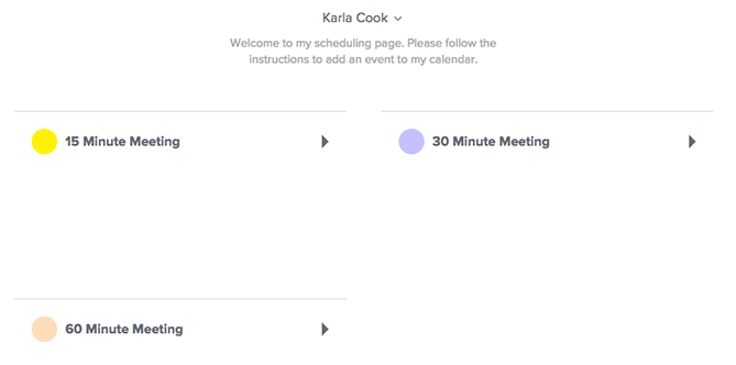
calendly-app dashboard

calendly time and day selection screen

10. Clara

Meet Clara, a virtual assistant fueled by machine learning who can schedule all your meetings and get acquainted with your scheduling patterns. Once you sign up, you indicate your preferences as to which days and times you are available for meetings and your favorite locations for coffee, lunch, or drinks.

If someone requests a meeting, you can CC Clara's email address (which can be customized to your company's domain), and the virtual assistant will determine a time, date, duration, participants, and location for the meeting. She also understands human commands like, "I'm sick, can you reschedule my meetings on Tuesday?"

It currently only works with Gmail, and it does have a hefty price tag, but it could be worth the cost if scheduling is a major pain point for your company. Especially considering it's still significantly cheaper than hiring a human personal assistant. 
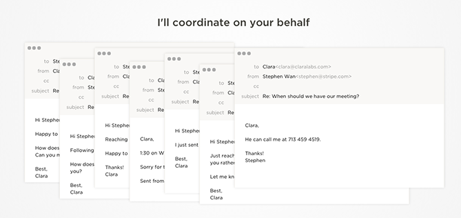
clara-labs calendar view of schedule

11. Google Calendar

If your team uses the GSuite and would like to streamline scheduling processes, you can schedule meetings with others through Google Calendar.

If your work email is already part of a GSuite membership, you can go to your calendar, search another team member under the "Meet with" tab on your left, and then click their name to view their calendar up against your own. If you click on a time slot on that calendar, you can schedule a meeting with both yourself and that teammate. 
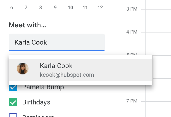
Meet with feature on Google Calendar

If your teammates aren't part of your GSuite, you can press the share button and share your calendar with their email address. From there, they can enter the calendar and schedule a meeting time with you.

Summary

The options are endless for meeting scheduler tools. The choice is ultimately up to you which one fits your personal workflow. 

If you're looking for a quick and easy way to book meetings faster without the back-and-forth emails ... check out HubSpot's meeting scheduling tool

Editor's Note: This post was originally published in July 2015 and has been updated for freshness, accuracy, and comprehensiveness.


from Marketing https://ift.tt/2kAutG2
via
How to Create and Use Twitter Cards to Maximize Your Social Media Traffic

If you’ve ever opened Twitter and watched a commercial, laughed at a YouTube video, or read an article, you’ve already interacted with Twitter Cards. Cards are a handy and essential function of using Twitter for business and driving traffic to your website.

In the example above, ABC Freeform, uses a Player Card to get their audience into the Halloween spirit.

Twitter Cards are easy to implement and can revitalize a social strategy with an app almost half its users open every day (that’s roughly 150 million people). Learn how to use them to your benefit, below.

Twitter Cards are media-enriched tweets that stand out to Twitter users, encourage engagement, and ultimately drive traffic back to your landing pages. There are four different types of Cards: Summary, Summary Card With Large Image, App, and Player.

The different types of Cards note the structure of the tweet. A Summary Card, for example, will include a small photo, a title, and brief summary of the content it’s teasing. Summary Card with Large Image has the same setup, just with a larger image.

App Cards pull the featured image and link of your app from the Play Store or App Store for the tweet. Player Card tweets will automatically play video and link to your website at the bottom of the tweet.

Cards are extremely versatile, like Twitter itself. There are a plethora of ways to use them to optimize your content. If you’re rolling out a new podcast or product update, Cards are a best friend for promoting them on Twitter.

How to Use Twitter Cards

The different types of Cards make it easy to decide how you want to use and promote them. Each Card type has specific requirements that optimize the content you intend to post. For instance, if you wanted to promote a video using Cards, Player Cards are specifically set up for the video to run at its most pristine level.

Summary Cards, for example, are a great way to highlight new blog posts or share articles, introduce a new sale on your products, and promote testimonials on your website.

This Summary Card by TechCrunch is promoting a recent blog article, using all of the attributions of a Summary Card: thumbnail image, description, and title. And the most important part: a link to TechCrunch’s website, ready to increase that lovely website traffic.

Summary With Large Image Cards are for content with a strong visual element.

These Cards use compelling photos to make a statement on audience timelines. Think of a colorful statistic or that new infographic you want to promote. Here, The New Yorker used their Card to display a large photo of the artist they’re highlighting.

Releasing a new app? There’s a Twitter Card for that too. Let’s see how Google uses the aptly named “App Card” to their advantage:

Think of the traffic you can generate from a potential audience of 330 million. App Cards grab their information directly from the App Store or Google Play, so make sure the app you’re promoting is public before creating the Card.

Player Cards automatically play videos on a loop on timelines and feeds, so users don’t even have to leave the app to interact with rich multimedia, and your content gets views. Player Cards give your brand image a boost of promotion to a vast audience.

Verizon used this Player Card — and a partnership with Pharrell — to show their Twitter following how they’re introducing STEM job opportunities in schools. In 30 seconds, Verizon gets their message across in the video, using a celebrity endorsement to grab attention.

First, tell Twitter what type of Card you’re using with meta tag markup to the <head> section of your webpage. The one below is for Summary Cards:

meta name="twitter:card" content="summary"/meta

You can only have one Card per page.

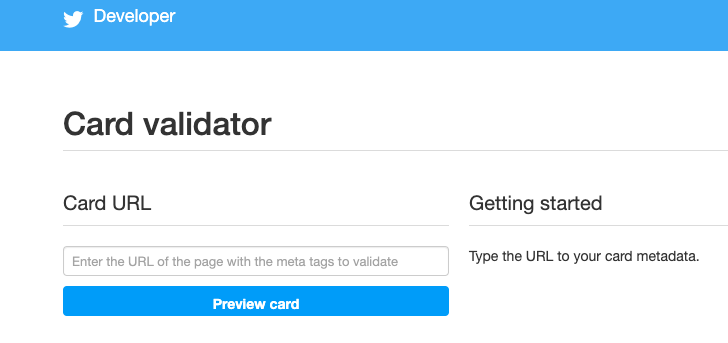
To test your tags, test run the URL through Twitter’s validator tool. Note that if you’re using a Player Card, after this step, you’ll need to request approval for whitelisting. To complete this, a “Request Approval” button will appear on the validator tool.

image of Twitter's card validatorImage Source: Twitter Developer

Once you’ve tested in the validator or had your Player Card approved, tweet the URL and you’ll see the Card appear below your Tweet.

Twitter Card Meta Tags

Meta tags appear in a web page’s source code; they are little snippets of text used to describe what’s on a webpage. These meta tags are used to tell search engines what’s on the Cards, which can optimize website traffic for you. Adding the correct tags is important for SEO. These meta tags are used to describe the card type and username of the website. The third is for the Twitter User’s ID and can be interchanged with the second:

twitter:card, twitter:site, twitter:site:id

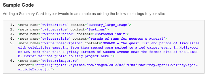
From there, meta tags are a sort of “mix-and-match” deal depending on what you’re using them for. For instance, if you were to implement a Summary Card With Large Image, your code would look like this:

Example code for 'Summary Card with Large Image'

Image Source: Buffer

In this image:

  • twitter:creator was used for the @username of the content creator
  • twitter:title was used for the title of the content (which has a max of 70 characters)
  • twitter:description has a max of 200 characters and describes the content
  • content= needs to be in front of the description, and twitter:image is used to tell Twitter the URL of the image

Supported formats are JPG, PNG, WEBP, and GIF. Only the first frame of the GIF will be imported.

With all this talk of maximum optimization, you’re probably wondering what types of photos are best for Twitter Cards. Do they have a specification? I’m glad you asked.

Twitter Card Image Size: For Summary Cards, the image has to be at least 120 x 120 pixels, but cannot exceed 1MB. This is the same for a Summary Card With Large Image, but the smallest photo size is 280 x 150 pixels. App Cards require images to be 800 x 320 pixels, and Player Cards must have level 3.0, dimensions in 640 x 480 pixels, and 30 frames per second.

Social media channels are a reflection of brands. To some of 330 million users on Twitter, your tweets may be the first interaction they have with your company, so a properly optimized image is key to putting your brand’s best foot forward.

Because these dimensions are slightly different for each type of Card, think about the type of content you’re promoting and which Card will be best for that. If your blog post about eCommerce won’t have the best featured image but has a rich description, go with a Summary Card instead of a Summary Card With Large Image.

Twitter will let you preview your Card before you post it in the validator tool, so you can adjust your image to your desired effect. You can also preview Player content in the tool to make sure it runs smoothly, so be sure to check multimedia content before you post.

Twitter Card Examples

1. Summary Twitter Card example

If you scroll down your timeline for about five seconds, you’ll run into a Promoted Twitter Card, which are very handy if you’re looking for fresh ways to use your Twitter Cards. For instance, let’s look at Merriam-Webster (an account worthy of your follow — and yes, they are the “Dictionary People”).

This is beautiful use of a Summary Card. The title is less than 70 characters, the description is enticing, and the image is larger than 120 x 120. This Summary Card jumps out at you on a timeline and makes you want to read a recap of popular words used in the past seven days.

2. Summary Cards with Large Image example

The Huffington Post used their Summary Card to give potential readers the featured image of their blog post for National Coffee Day. Because the image is high quality, it pulls audience members in, especially those with a thing for latte art, like myself.

3. App Card example

Did you know World Wrestling Entertainment (WWE) knows their way around an App Card?

To promote their app, WWE used this amazing App Card to highlight champion Kofi’s five must-watch matches, curated by Kofi himself. The stunning graphic is an amazing image to use on Twitter because it stands out on timelines, especially on timelines with darker modes turned on.

4. Player Card example

Cartier is embracing the Player Card with this commercial promoting their new digital series.

In the fast paced commercial, the team at Cartier uses video clips old and new, but all are optimized with a clear video format. Even the black and white snippets hold up very well.

Twitter Cards jump out at your audience and, lucky for us, they’re easy to use.. Take 15 minutes out of your busy day, and find your next content marketing obsession.


from Marketing https://ift.tt/2n3qaaV
via

How to Choose a Blog Name That'll Grow With Your Brand

Clothes, food, habits — outgrowing things is a natural part of life. That's true for brands as well. When brands decide they’ve outgrown their current way of doing things, this might call for a rebrand.

Outgrowing a brand, or at least a brand name, is common. Marketing platform Mailchimp used their rebranding to help the company transition to a more "grownup" brand that would allow them to serve more small businesses. Many blogs I read, like “Liv’s Healthy Life,” (Now known as just “Liv B,”) quickly rebrand when they realize their old blog name just doesn’t make sense anymore.

While rebranding a business can be a smart and necessary step to growing a long-lasting business, renaming your blog or business doesn't have to be. To combat outgrowing a blog name too quickly, let’s go over some strategies to use when naming a blog.

How to Choose a Blog Name

1. Identify your niche

What are you doing? What will your blog be about? Will it be an extension of your business or its own project? Identifying what your blog will be about is key to defining a name that’ll expand with you.

The blog name will represent your unique point of view in your industry or niche. It should vibe with the aesthetic of your blog and define the mood you want to give your readers when they visit your blog’s homepage. It should also be descriptive of the type of content you’ll publish.

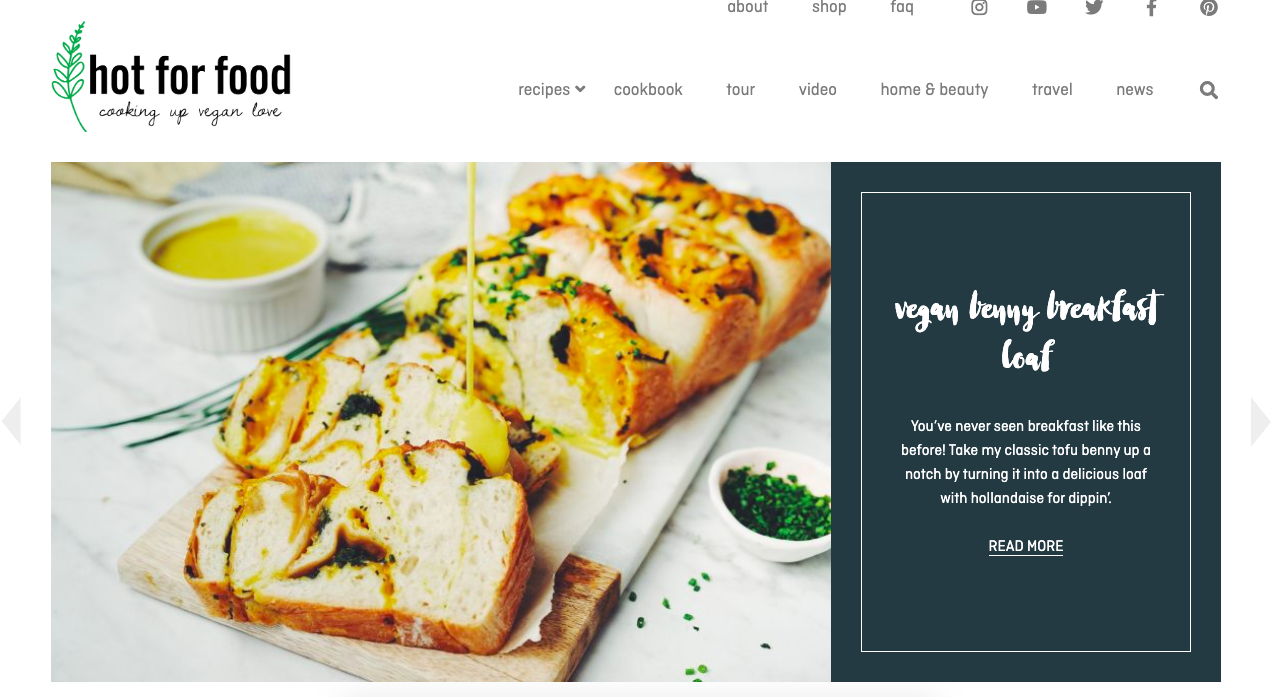
An example of a well-named Blog, 'Hot for Food'

Image source: Hot for Food

I love the blog name “Hot for Food” so much. The blog is a companion to creator Lauren Toyota’s YouTube channel of the same name. It’s a great example of a name that goes well with its cooking niche.

The name is also broad enough that Toyota can grow her brand outward. If she wanted to release a cookware line down the road, “Hot for Food” would still make sense, and have about a million available puns at the ready. How fun would a saucepan labeled “Hot with Sauce” be?

2. Do your research

Look at what prominent blogs in your industry are doing. Take note of what you like and don’t like, and use their blogs as a springboard for what readers in your industry like to see. Look for how these blogs are branding, the names of their blogs, and the responses their content receives.

For example, if you’re starting a blog about technology, look at TechCrunch, a massive blog about startups and technology. Their name is short, memorable, and professes their content strategy all in one: to dissect and disseminate the latest tech news for their readers.

It’s also a good idea to think about how your blog will stand out from others. This is also a good time to find out if any of the blog names you were thinking of are already being used.

Start with a simple Google search and then get a bit more technical by checking LLCs in your state. Once you've found a name that's free, make sure that the domain is also available, and consider registering your chosen name to protect it. That way, you can refine how you want your brand to be perceived, and how you want it to grow within the market you choose.

3. Think about your message

What do you want to communicate? Consider your message now and in the future. When looking over your five-year plan, does your message expand as your company does, and will your blog name still reflect that?

For example, to say media giant Buzzfeed has grown exponentially over the past decade would be an understatement. Buzzfeed’s YouTube channels alone each have billions of views and millions of subscribers. As the company has grown, it diversified and expanded its YouTube content.

Buzzfeed YouTube channels were originally named after colors, for example, Buzzfeed Blue, Buzzfeed Ultraviolet, and Buzzfeed Yellow. Recently, those names have been stripped.

Buzzfeed rebranded their content to grow with their company. Yellow rebranded into Boldly, and later, when Boldly outgrew their name, rebranded into As/Is.

According to founder Jonah Peretti, the rebrand of channel names was to reflect “design and product features that reinforce their unique identities and better serve their many fans.”

Blogs with Growth in Mind

1. LADbible

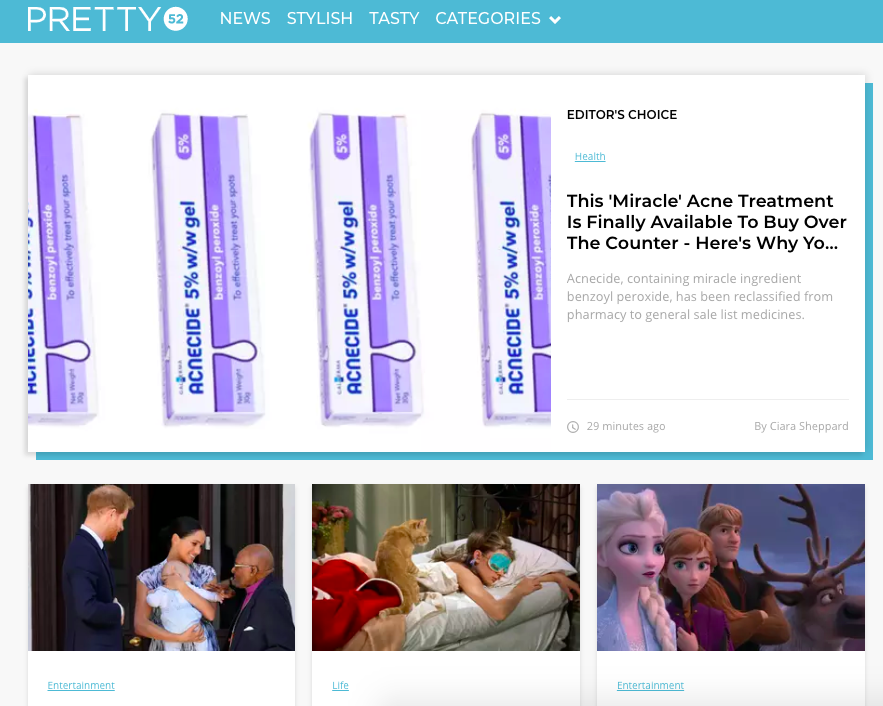
LADbible, an entertainment company, originally had a blog of the same name. Over time, their messages expanded and required different funnels for them. LADbible now has multiple blogs in tandem with the original: SPORTbible and Pretty52.

An example of a blog that changed their name

Image source: Pretty52

2. Contently

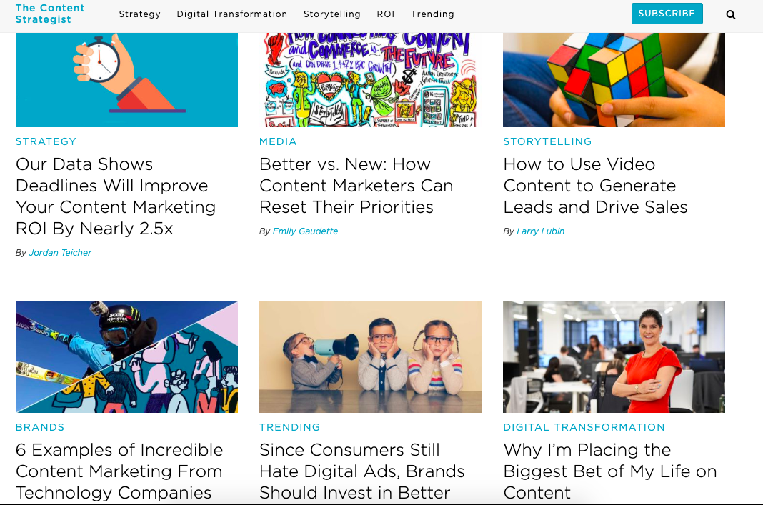
Similarly, Contently’s blog has a named separate from the company: The Content Strategist. This name suggests that the blog is named after their target audience, a clever way reach the readers they serve.

Example of a blog that has a different name than its parent company

Image source: The Content Strategist

3. Whole Foods

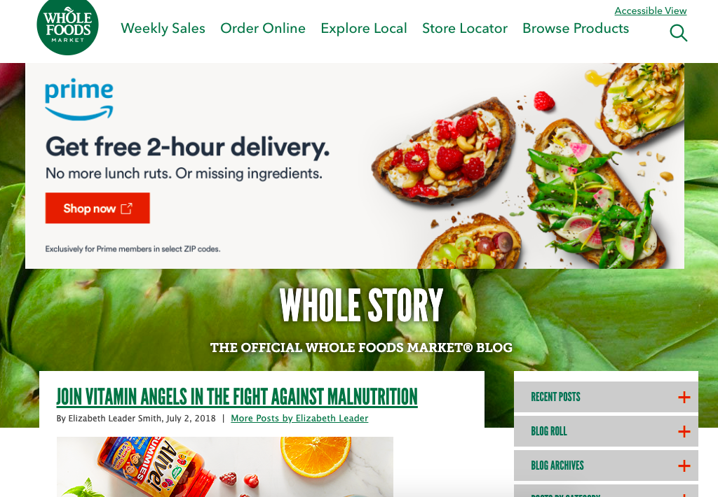
Rather than name their blog “Whole Foods Blog,” the organic food company went with Whole Story. The name connects to its company but also has its own option for diverse content, telling stories of where their products come from and the customers it satisfies. Whole Foods also kept the keyword in the title, so SEO would be a breeze.

Whole Story is an example of a well-named blog

Image source: Whole Story

4. Target

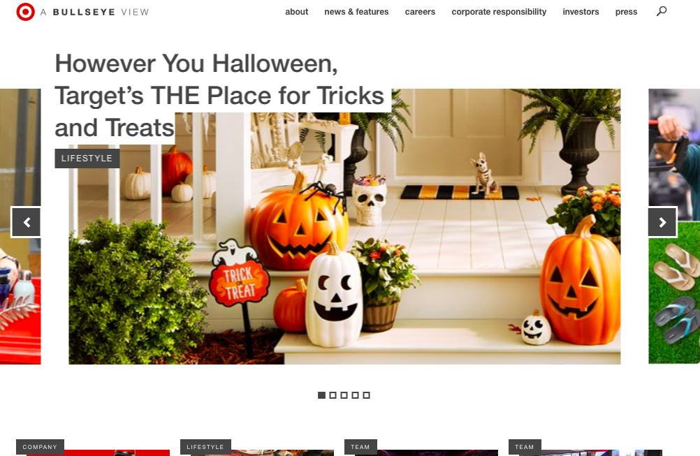
‘A Bullseye View’ is Target’s all-encompassing blog name. Twisting in the logo was Target’s route, which reflects their branding. With a name like that, the opportunities are endless as to what Target can put on their blog as it grows, something the company keeps in mind with categories such as “Lifestyle,” “Team,” and “Company.”

Example of good blog names from Target

Image source: A Bullseye View

5. Pottery Barn

Pottery Barn wants you to know their company, ‘Inside and Out’ with this fun, immersive blog name. The name gives interior decorating buffs a nod, hinting that content will provide deeper information about the people behind the design, as well as the homes Pottery Barn caters to.

Image source: Inside and Out

When choosing a blog name that’s concurrent with the growth of your brand, think about how to be memorable. What’ll stick out to readers and search engines. And make sure the name will resonate with your target audience not only now, but five years from now.


from Marketing https://ift.tt/2llVQTn
via

Inside The Periodic Table of Email Optimization and Deliverability: Q&A with Jennifer Cannon

What’s the most fascinating email marketing element to an expert email marketer? Keep reading to find out.

Please visit Marketing Land for the full article.


from Marketing Land - Internet Marketing News, Strategies & Tips https://ift.tt/2oE8aUF
via

How to Run Facebook Ads: A Step-by-Step Guide to Advertising on Facebook

When setting up a paid Facebook ad, there are a lot of boxes to be checked.

Are you targeting the right people? Are your image dimensions to scale? Are you running the right type of ad? If we're being honest, it can get a little confusing.

With more than 2.3 billion people using Facebook every month, and nearly 1.6 billion users every day, Facebook offers up a unique opportunity for marketers to augment their organic efforts. The trouble is, with both an investment of time and money on the line, there's not much room for oversight.

To help, we've put together a checklist to help you keep all of your campaign details straight. Or watch this short video on how to increase the effectiveness of your ads and budget. These will help ensure that you're tapping into the right audience with the right ad at the right time.

How to Run Facebook Ads

Facebook offers a variety of paid ad options and placements, but all ads can be broken down into three elements:

  1. Campaigns. The campaign houses all of your assets.
  2. Ad sets. If you're targeting separate audiences with different characteristics, you'll need an individual ad set for each.
  3. Ads. Your actual ads live within your ad sets. Each ad set can hold a variety of ads that vary in color, copy, images, etc.

With that terminology out of the way, let's dive in to creating an ad.

Start creating an ad through Facebook's Ads Manager.

You can create a paid ad on Facebook using Facebook's Ads Manager.

Once you log into this page, you'll see a performance dashboard where all of your campaigns, ad sets, and ads will be listed including the results they've driven for your Facebook page. Unless you've already created an ad for your Facebook page, this dashboard will be empty.

To create a new campaign, ad set, or ad through the Facebook Ad Manager, tab over to the type of ad you want to create and click the green "Create" button to far left of these ad types, as shown below. You can see from this screenshot that we're currently set to create a new campaign.

facebook-ad-manager

Choose an objective.

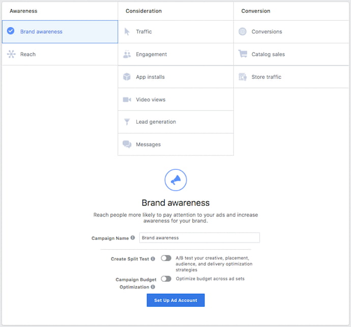
Facebook's Ads Manager, like many social media advertising networks, is designed with your campaign objective in mind. Before getting started, Ads Manager will prompt you to choose an objective for your campaign:

facebook-ad-campaign-objective

There are 11 different objectives to choose from. The list includes everything from general brand awareness, to getting installs of your app, to increasing traffic to your online store.

By choosing one of these objectives, you're giving Facebook a better idea of what you'd like to do so they can present you with the best-suited ad options. As shown in the screenshot above, Facebook's ad options include:

  • Brand awareness
  • Reach
  • Website traffic
  • Engagement
  • App installs
  • Video views
  • Lead generation
  • Messages
  • Conversions
  • Catalog sales
  • Store traffic

Let's say, for sake of this blog post, you're looking to drive more traffic to your website. When you select this option, Facebook will prompt you to enter the URL you're looking to promote. If you're using marketing automation software, be sure to create a unique tracking URL with UTM parameters for this to ensure that you'll be able to keep track of traffic and conversions from this ad. For HubSpot customers, this can be done using the Tracking URL Builder.

Once selected, Facebook will then display the ad option that makes the most sense in terms of achieving this objective.

Choose your audience.

Your next step is to configure your target audience -- you can do this for each ad set that belongs to the same campaign. If you're just starting out with paid advertising on Facebook, it's likely that you'll have to experiment with several different targeting options until you reach an audience that fits just right.

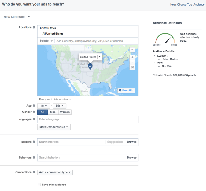
To help you narrow your focus, Facebook's targeting criteria are accompanied by an audience definition gauge. This tool -- located to the right of the audience targeting fields -- takes all of your selected properties into consideration in order to come up with a potential reach number.

If you're wavering between choosing a specific audience over a broad one, consider your objective. If you're looking to drive traffic, you'll probably want to focus on the type of people you know will be interested in your offering. However, if you're looking to build brand awareness or promote a widely appealing offer, feel free to focus on a more general audience.

Audience creation page in the Facebook Ad Manager

Facebook's built-in targeting is vast, including options such as:

  • Location
  • Age
  • Gender
  • Languages
  • Relationship
  • Education
  • Work
  • Financial
  • Home
  • Ethnic Affinity
  • Generation
  • Parents
  • Politics (U.S. only)
  • Life Events
  • Interests
  • Behaviors
  • Connections

You also have the option to select a Custom Audience -- this allows you to target people on Facebook who are in your company's contact database, visited a page on your website that has a tracking pixel, or use your app or game. To learn more about how to set up a Custom Audience on Facebook, check out these instructions. (And for more on the specifics of these criteria, visit this Facebook targeting resource.)

Once you find a group that responds well to your ads, Facebook allows you to save these audiences to be used again later -- so you may not need to dive into this step once you've been running Facebook ads for a while.

Set your budget.

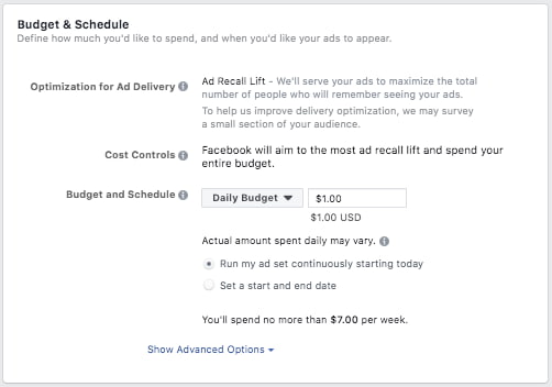
Facebook allows you to set either a daily budget or a lifetime budget. Here's how they differ from each other:

  • Daily budget. If you want your ad set to run continuously throughout the day, this is the option you'll want to go for. Using a daily budget means that Facebook will pace your spending per day. Keep in mind that the minimum daily budget for an ad set is $1.00 USD and must be at least 2X your CPC.
  • Lifetime budget. If you're looking to run your ad for a specified length of time, select lifetime budget. This means Facebook will pace your spend over the time period you set for the ad to run.
facebook-ad-budget

To further specify your budgeting, turn to the advanced options -- this option is linked at the bottom of the screenshot shown above. This section allows you to specify a few things:

Schedule

Choose whether or not your want your campaign to run immediately and continuously or if you want to customize the start and end dates. You can also set parameters so that your ads only run during specific hours and days of the week.

Optimization & Pricing

Choose whether or not you want to bid for your objective, clicks, or impressions. (This will alter how your ad is displayed and paid for.) By doing so, you'll pay for your ad to be shown to people within your target audience that are more likely to complete your desired action, but Facebook will control what your maximum bid is.

If you don't want Facebook to set optimal bids for you, you'll want to opt for manual bidding. This option awards you full control over how much you're willing to pay per action completed. However, Facebook will provide a suggested bid based on other advertisers' behavior to give you a sense of what you should shoot for.

Delivery

Delivery type falls under two categories: standard and accelerated. Standard delivery will show your ads throughout the day, while accelerated delivery helps you reach an audience quickly for time-sensitive ads (Note: this option requires manual bid pricing).

Create your ad.

What do you want your ad to look like? It all depends on your original objective.

If you're looking to increase the number of clicks to your website, Facebook's Ad Manager will suggest the Clicks to Website ad options. Makes sense, right?

This ad option is broken down into two formats: Links and Carousels. Essentially, this means that you can either display a single image ad (Links) or a multi-image ad (Carousel) with three to five scrolling images at no additional cost.

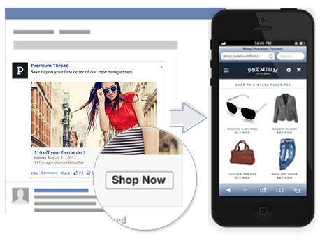
A Links ad will be displayed like this:

Facebook Ad with link to Shop Now

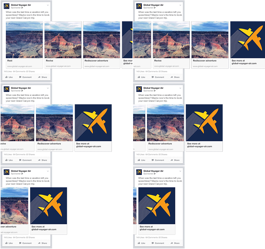
A Carousel ad will be displayed like this:

Example of a Facebook Carousel Ad with images of Grand Canyon

Once you decide between the two, you'll need to upload your creative assets. It's important to note that for each type of ad, Facebook requires users to adhere to certain design criteria.

For single image ads, Facebook asks that users adhere to the following design recommendations:

  • Text: 125 characters
  • Ad Headline: 25 characters
  • Image ratio: 1.91:1
  • Image resolution (including CTA): 1080 x 1080 pixels

For multi-image ads -- also known as Carousel Ads -- Facebook provides the following design recommendations:

  • Recommended image size: 1080 x 1080 pixels
  • Image ratio: 1:1
  • Text: 125 characters
  • Headline: 40 characters
  • Link description: 20 characters
Your image may not include more than 20% text. See how much text is on your image.

Keep in mind that these are the ad options for the "Traffic" objective.

If you selected "boost your posts," you'd be presented with different ad options like the Page Post Engagement: Photo ad. This ad has a unique set of design recommendations. To explore all of the ad options and their design specifics, refer to this resource.

Once you select an ad type, the Ads Manager will prompt you to identify how you'd like to display your ad. The options they provide are as follows: Desktop News Feed, Mobile News Feed, and Desktop Right Column.

Here's how each ad would appear:

Desktop News Feed

Facebook Ad with single image on a desktop news feed

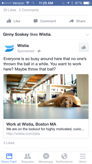
Mobile News Feed

Facebook ad with single image on mobile news feed

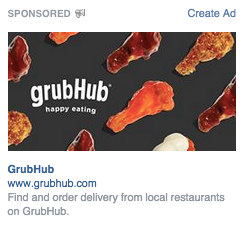
Desktop Right Column

Facebook Ad with single image on desktop right column

Be aware if your ad isn't associated with a Facebook page, you'll only be able to run Desktop Right Column ads. To leverage all three display locations, you can learn how to create a Facebook Page here.

Report on your ads' performance.

Once your ads are running, you'll want to keep an eye on how they're doing. To see their results, you'll want to look in two places: the Facebook Ad Manager and your marketing software.

Facebook's Ad Manager

Facebook's Ad Manager is a sophisticated dashboard that provides users with an overview of all their campaigns.

Upfront, the dashboard highlights an estimate of how much you're spending each day. The dashboard is organized by columns, which makes it easy to filter through your ads so you can create a custom view of your results. Key numbers like reach, frequency, and cost are readily available, making reporting on performance a no brainer.

According to Facebook, here are some of the key metrics to look for (and their definitions):

  • Performance. Can be customized further to include metrics like results, reach, frequency and impressions
  • Engagement. Can be customized further to include metrics like Page likes, Page engagement and post engagement
  • Videos. Can be customized further to include metrics like video views and avg. % of video viewed
  • Website. Can be customized further to include metrics like website actions (all), checkouts, payment details, purchases and adds to cart
  • Apps. Can be further customized to include metrics like app installs, app engagement, credit spends, mobile app actions and cost per app engagement
  • Events. Can be further customized to include metrics like event responses and cost per event response
  • Clicks. Can be further customized to include metrics like clicks, unique clicks, CTR (click-through rate) and CPC (cost per click)
  • Settings. Can be further customized to include metrics like start date, end date, ad set name, ad ID, delivery, bid and objective

Your Marketing Software

While there are certainly a lot of details to keep straight when planning a paid Facebook ad, it's important that you don't lose sight of the big picture. Reporting on clicks and conversions from Facebook is important, however, if you're using URLs with specific UTM codes, you have an opportunity to measure your ads' full-funnel effectiveness using your marketing software.

Tracking URLs will help your marketing software keep track of how many leads, or better yet, how many customers you've gained from your advertising efforts. This information is useful in determining the ROI of this source, and can also be used to inform your overall Facebook marketing strategy.

If you're a HubSpot customer using our ads tool, this process is already taken care of for you. You can also create unique tracking codes for your Facebook campaign by navigating to the Tracking URL Builder on the Reports Home page. All you'll need to do is plug in the URL, attach a campaign, and choose the source you want the URL to be attributed to in your Sources Report. Once your ad launches and you start getting traffic and conversions on your website, you'll be able to easily track how many visits, contacts, and customers you're generating.


from Marketing https://ift.tt/2jgf3ou
via

Pro Tip: Partnerships are critical in securing your martech stack

It’s past time to solidify the partnership with IT and security in your organization.

Please visit Marketing Land for the full article.


from Marketing Land - Internet Marketing News, Strategies & Tips https://ift.tt/2msm9MQ
via

Google Ads enables reporting across accounts in Report Editor

Unfortunately it’s currently limited to Manager accounts with no more than 10 accounts.

Please visit Search Engine Land for the full article.


from Search Engine Land: News & Info About SEO, PPC, SEM, Search Engines & Search Marketing https://ift.tt/2nbZJQ5
via

How to Stand Out in a Crowded Martech Landscape

Live Webinar: Thursday, October 3, at 1:00 PM ET (10:00 AM)

Please visit Marketing Land for the full article.


from Marketing Land - Internet Marketing News, Strategies & Tips https://ift.tt/2nRZz0u
via