Earlier today, I visited Yelp to order lunch. What I always really liked about the site is how easy it is to navigate. If I were accessing the website for the first time, I wouldn't have any worries about how to use it to my benefit.
Have you ever visited a website and noticed small phrases of text that guide you to your goal? Or, when you make an online purchase, is there text on the web page that lets you know your payment information is secure?
That text is called microcopy, and it's a wonderful tool for UX. For instance, let's say I was visiting Yelp for the first time today, without knowing what the website's purpose was. I wouldn't have to worry because the microcopy helps fill in that confusion.

In the search bar, the microcopy tells me the types of things I could search, and where I can set my location. "Burgers, barbers, spas, handymen…" are all examples of what I can find using the site, which is super helpful for a first-time user.
Additionally, the location settings tell me I could search for businesses near me or elsewhere. So when I move in a couple of weeks, I won't have to wait until I arrive to search for restaurants near my new place.
It's likely you've interacted with microcopy before and it gave you useful information, like how to search for something and secure payment information. It's meant to add to the user experience of visitors on websites, and in this post, we'll get into how it works.
Microcopy is a part of almost every website. When you visit a website for the first time and a newsletter pops up, the text you see is an example. When you come across a headline describing the product, or find a sentence that gives a web page more context, you're interacting with microcopy.
But what exactly is microcopy, and how is it helpful?
When was the last time you tweeted or made a Facebook status? Do you remember the microcopy that shows up before you start typing? This short phrases asks you to complete an action — like typing out what's happening, or what's on your mind:

As someone who's been tweeting for years, I don't even notice the microcopy. But let's say I've just joined Twitter and have no idea how to compose a tweet, or what to tweet. "What's happening?" is a useful prompt to help out — I now know I can type what's going on around me and press "Tweet."
In this case, the microcopy tells the user how to do something and inspires action with a button. Even though it's subtle, the addition of microcopy on Twitter gives instructions and answers questions a new user might have before they can ask them.
Microcopy gives extra explanation. For instance, if your website offers a niche product, you can use a microcopy headline to give first-time visitors an idea of why your product is valuable. Alternatively, if you're introducing a new product, microcopy can describe it in more detail.
If you've ever filled in a form, explored a product page, or sourced contact information, you've come across microcopy that supports a brand and its services. For instance, if you forget your login to one of your favorite websites, the microcopy most likely reminded you how to do so.
Microcopy is part of the user experience. It's a tactic you can use to support the overall story as your brand, as well as describe some of the complexities of your product, right off the bat.
To produce great microcopy, you need to have a deep understanding of your target audience. Once you know more about them, the questions they might have, and the information they need to know, microcopy can serve as an effective part of your website.
Let's look at some examples of brands who know how to speak the language of their customers and make use of effective microcopy.
Microcopy Examples
MIcrocopy can come in a few different forms. It doesn't have to be extremely tiny, or fit into a search bar. Sometimes, it's bold. It all depends on the copy's intended purpose and the design of the website.
Let's see how some brands are using microcopy effectively to enhance the user experience.
1. HubSpot
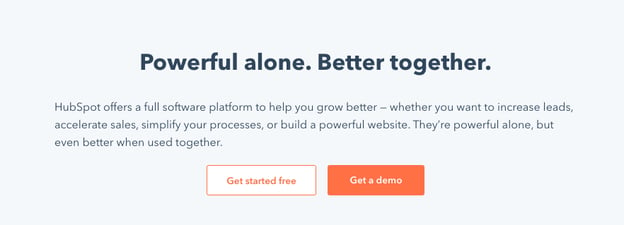
This microcopy example on HubSpot's homepage explains the product. In two sentences, visitors gain an idea of what HubSpot's tools do, and how it can help them.
The language is personable and easy to read. In support of the CTA, the microcopy leads into the value of getting started or trying out a demo. It inspires action. 
Notice how the text isn't necessarily small, either. This is alright if the theme of your website allows for larger text. Microcopy is more about communicating a helpful message to your audience, regardless of text size.
2. Wear Your Voice
Wear Your Voice is an online publication dedicated to bringing a spotlight to marginalized voices, sparking communication about topical issues, and providing a safe space for audiences to learn.
This microcopy is what you see on the homepage as part of a newsletter offer. It lets the reader know that they won't receive spam. Not only that, but the microcopy in the space communicates how to receive the newsletters, by entering an email.

If you want to use microcopy in a subtle way to increase conversions, utilize a strategy that's similar. Include it in a form space or to inform browsers about any concern they may have that would stop them from completing the CTA.
3. Honey
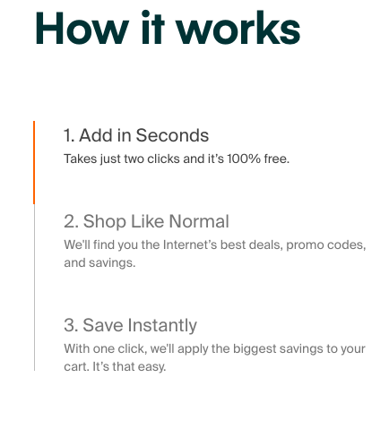
Honey is an app extension that saves its users money every time they make an online purchase. Because this service is niche, the website provides helpful microcopy about how it works.

The headers act as an introduction to the thought, and the microcopy supports the steps. This microcopy is organized, but doesn't take up too much space. Additionally, the phrases are short and easy to comprehend.
For a service that may seem complicated at first, simplified steps are an excellent measure to ensure leads know how Honey can add value to their lives. If your product or service is niche, consider using microcopy to explain how it works in a comprehensible way, like Honey.
4. Shea Makery
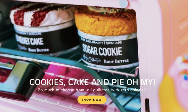
When it comes to branding and brand voice, microcopy is a great asset. Take this example from Shea Makery, a bakery-themed body care ecommerce store. The text used on the site contributes to the overall tone of the brand and ties in a CTA.

"So much to choose from, all guilt-free with zero calories!" Introduces the brand with fun, compelling microcopy. The short, rhyming sentence plays up the whimsical, cheerful atmosphere of the website, and the baking attribution speaks to the overall theme of the company.
Maybe your business is heavily influenced by a theme, like Shea Makery. If that's the case, microcopy with sensory details, like sight, can influence leads to browse your offerings.
5. The Canadian African
Rather than have a separate "About Me" page, this health food blog uses microcopy for the introduction. On the right panel of the website, The Canadian African, you can see a short description of the site and the person in charge.

The copy is short and simple, but still tells the reader what they'll find on the site. By adding a photo, above the text, the website becomes more personable. So if you're running a solo venture and want to appeal to your target audience, consider using microcopy to introduce yourself on the homepage.
We've seen microcopy in action — and how it comes in many different forms. If you're pumped to compose some great copy of your own, that's great! Before you do, make sure you check out these best practices.
Microcopy Best Practices
To make microcopy effective, keep in mind these quick tips before you get going. If you're struggling to come up with copy that works for you, consider these options when you're working through adding it to your site.
1. Understand your audience's needs.
One of the keys to writing great microcopy is understanding your audience. If you know what they're looking for when they visit your website, what you write can help guide them. For instance, if you know audiences will want to know how to log in to your website, use microcopy in those fields to tell them how.
To learn more about your audience and what microcopy will be helpful, refer to your buyer personas. They'll outline the challenges of your ideal customer, so you'll have a clue of how to leverage microcopy. Let's say your persona is the busy marketer looking for an all-in-one CRM — your product page microcopy can allude to that challenge, like "Our tools take the stresses away from what you love doing."
Alternatively, you can run a few heatmap tests for your website to gain insight about where your audience is clicking the most. Could the areas that aren't getting the most traffic benefit from copy that speaks the customer's language?
2. Focus on brief phrasing.
As marketers, know that one of the "don'ts" of website design is to avoid loads of text. After all, very few of us want to read a novel on a website that sells computer software. So when you're writing microcopy, make it brief.
The purpose of microcopy is to guide, inform, or support. Typically, it's no longer than one sentence. This is because it's not supposed to be the star of your website, but rather, a helpful addition.
When you visit a website for the first time and immediately see an offer, notice the microcopy. Does it have a quippy, witty phrase that persuades you to complete the form? That's an example of accurately leveraging microcopy to your advantage.
3. Make your copy actionable.
A great way to use microcopy is to get customers to complete an action on your website. We've briefly talked about how offer and form microcopy can be useful for conversion.
In addition to forms and offers, microcopy can be used in ads, captions, and on product pages. It could persuade audiences to take the intended action. If you use microcopy in tandem with a CTA, for example, you could make an ad incredibly effective — tell the audiences what the benefit will be after engaging.
If there's areas on your website that could benefit from an actionable phrase that's too long for a CTA button, consider making it microcopy instead. That way, it can support the CTA without adding too much text.
4. Add in your brand voice.
Another great use for microcopy is to give more definition to your brand. Maybe you find your website comes off slightly impersonal, but you don't want to crowd pages with extra body text. Try using microcopy to fill in that gap.
Because microcopy isn't a headline or body text, there's more freedom to use it to support your company's mission, vision, and beliefs. Communicate with your audience in a personable way in a short phrase, and you'll have a higher chance of building a solid customer relationship.
This tactic will make your web pages more inviting. It'll spark intrigue with your target audience, and let them know what truly sets your company apart from competitors.
5. Be careful with going overboard.
As we've talked about, too much text isn't appealing. If leads find there's too much to read on your site, they might become disinterested and click to another. The same is true with microcopy.
Microcopy works best when it supports other text or inspires action. It should serve a purpose and be used sparingly. An overload of microcopy can be too hard to read — remember, the text is usually small.
If you're worried you're using too much microcopy, try running an A/B test for your web pages. That way, you can determine the winner based on audience behavior.
from Marketing https://ift.tt/1r0HYyD
via
No comments:
Post a Comment