By 2022, the number of email users around the world is expected to hit 4.3 billion.
Among all of those users are members of your target audience, a.k.a. quality leads and prospects you can work to reach and convert via email.
To ensure your emails stand out and grab the attention of these audience members, your email design needs to be on point.
In this guide, we'll talk about what email design is, cover 13 best practices, examples of successful email design, and offer some tools you may be interested in experimenting with. Let's get started.
Email Design
Email recipients often scan information and abandon emails that don't offer them value or simply appear to be too dense. That’s why having great email design is so important — it'll help you capture the attention of, and engage, your email recipients.
Your email design should be attention-grabbing, aesthetically-pleasing, and on-brand, among other things — let's dive into those things next with these 13 best practices for email deign.
1. Craft a strong subject line.
Your email subject line is the first thing anyone sees when you send them an email. It’s the brief statement that’s supposed to pique the interest of your recipients. It should capture their attention so they want to open your email and continue reading.
Here’s what a subject line looks like in your email inbox:

Here’s what a subject line looks like in your mobile device’s email inbox:

A great subject line will have these characteristics:
- Grab the attention of your readers in as few words as possible (remember: less is more).
- Provide value for the recipient that makes them want to open the email.
- Summarize what recipients are going to read and/ or see once they open the email.
2. Write an attention-grabbing pre-header.
Your email pre-header is a preview of what the email is about, similar to the meta description of a web page. It’s the second thing recipients see.
Rather than rewriting the first sentence of your email, you can customize the pre-header to provide an inside look into what your recipients are about to read in your message.
Here’s what a pre-header looks like in your email inbox:

Here’s what a pre-header looks like in your mobile device’s email inbox:

3. Be concise.
How many times throughout the day do you find yourself opening an email thinking, I can’t wait to sit down and take the next 5-10 minutes to really dive into this email from Business X!
If you're anything like me, your answer is likely rarely or never.
Give email recipients the information they want and need from you without getting into the weeds. This will show them you value their time which has the potential to help you improve email subscriber retainment.
4. Keep your email on-brand.
When your email recipients open your message, they should know the email was sent from your company. Meaning your email should be branded.
To keep your email on-brand, consider using the following tactics:
- Use a tone in your emails that complements your other content and marketing materials (like your website and social media).
- Incorporate the same colors and fonts that you use in your other branding and marketing materials.
- Include your logo, a link to your website, links to your social media accounts, and calls-to-action (CTAs) that are relevant to your products or services. This is a great way to increase brand awareness while also boost conversions.
5. Use the layout to enhance your email’s user experience.
Nobody wants to read a cluttered and unorganized email — this makes recipients feel overwhelmed and can lead to increased abandonment.
Instead, organize your layout with user experience (UX) in mind — meaning, leave empty/ white space and strategically place your written and visual content so it’s organized and easy to consume and navigate.
6. Personalize every email.
When you customize an email and tailor it to your recipient, it'll feel more thoughtful, professional, and personal. Email personalization also helps you humanize your brand. This touch helps you foster a relationship between your business and email recipients and boost retention rates.
7. Incorporate unique visual content.
If recipients open an email and only see paragraphs of information, it’s likely going to be difficult to hold their attention and keep them interested in your message. Rather, incorporate on-brand and engaging images, videos, GIFs, animations, etc. to break up the written content and create a memorable experience.
And speaking of incorporating creative and unique visual content in your emails, let’s talk emojis.
8. Don’t be afraid to use emojis. 🧡
At first, emojis may seem like an unnecessary or unprofessional addition to an email. While this may be a fair assumption, it’s actually untrue in a number of scenarios.
In fact, when you add emojis to your email subject line and/ or email copy, you can increase your open and click-through rates. But remember: When using emojis for marketing purposes, make sure you know the meaning and connotation of the specific one(s) you incorporate. 😃
9. Use a responsive design.
A responsive design means your email changes format to fit the screen it’s being viewed on, whether it's on a desktop, laptop, or mobile device. Recipients will be able to read your emails with ease no matter where or how they’re viewing them. By incorporating a responsive design, you'll be able to enhance UX and improve email retention across all devices.
10. Optimize your email with CTAs.
Calls-to-action (CTAs) are used to convert your email recipients. For instance, you can use a CTA to get recipients to follow you on social media, visit your website, chat with a sales rep, or become paying customers.
CTAs should be visible, enticing, and clearly show why they’re valuable to click. Additionally, you might choose to personalize your CTAs to tailor them towards specific recipients — this tactic has been proven to increase conversions.
11. Add an "unsubscribe" button.
Email marketing is highly effective as long as you’re providing relevant content to your recipients. The unfortunate but true reality of email marketing is that your recipients and customers change over time — especially as your business grows and evolves. Therefore, your content may not always be relevant to certain audience members.
For this reason, allow your recipients to leave (or unsubscribe from your emails) on a good note so they can remember your business in a positive light — who knows, they may need your email content, products, or services again in the future. To do this, simplify their lives with an easy-to-use and visible "unsubscribe” button.
In addition to offering a better experience for users, you're actually required by law to add that unsubscribe button.
According to the Federal Trade Commission and CAN-SPAM Act, you’re legally required to include a “clear and conspicuous explanation of how the recipient can opt-out of getting emails from you in the future”. Meaning, that unsubscribe button isn’t an option.
(If you need some inspiration, check out these effective unsubscribe pages.)
12. A/B test your design.
Similar to most marketing efforts, email design is an iterative process. You might determine you need to make changes and updates to get the most out of your email design.
Whether it’s modifying your CTA, colors, images, layout, or tone, don’t be afraid to A/B test designs to determine which one works best in terms of ability to reach, resonate with, and convert the greatest number of recipients.
13. Design an email signature.
Great email signature design is another way you can establish a professional and personal feel over email. Email signatures shouldn't just include your name — they should contain other defining and memorable characteristics about you, your role, contact information, and company.
Here are some specifics you can include in your email signature:
- First and last name
- Contact information (and secondary contact information)
- Job Title / Role
- Company Name
- Link to your meeting calendar
- Social media links (e.g. LinkedIn profile)
- Pronouns
- Photo
- Industry disclaimer or legal requirements
A great way to streamline the process of working on and incorporate all 13 of the above best practices is to use email design tools and software.
In fact, many of the best practices we reviewed will come up naturally while you’re designing, writing, and planning your messages with email design software.
Email Design Tools
There are a number of email design tools with a wide range of capabilities (some completely unrelated to email design!) — here are some popular examples.
1. HubSpot
HubSpot’s Email Marketing software allows you to create, design, personalize, and optimize all of your emails. You don’t need any IT or coding knowledge, and you can easily customize mobile-friendly emails. The software allows you to A/B test emails to determine which designs work best.
2. BEEPro
As a BEEPro user, you can design responsive emails in just minutes. Smart design tools provide you with a quick way to format your emails and ensure your layout complements your content. You can also customize and save various email design templates so your messaging and branding is consistent.
3. MailChimp
With over 100 templates offered, MailChimp allows you to customize your email design for your target audience. If you’re someone who does have coding experience, and you want to take your design a step further, MailChimp offers you the ability to code your template as well.
4. Stripo
Stripo requires no HTML knowledge to create and design professional email templates. All of their pre-made templates are responsive so readers can easily view them via any device. You can also sync your current email service provider (ESP) with the software to access all of your email and contact information from a central location.
5. Chamaileon
As a collaborative email builder, Chamaileon gives you the ability to invite members of your team to collaborate on your designs. The software ensures your emails will have a responsive design and automatically comes with over 100 pre-made templates to customize for specific recipients.
Email Design Examples
Let’s take a look at some successful email designs to inspire your work.
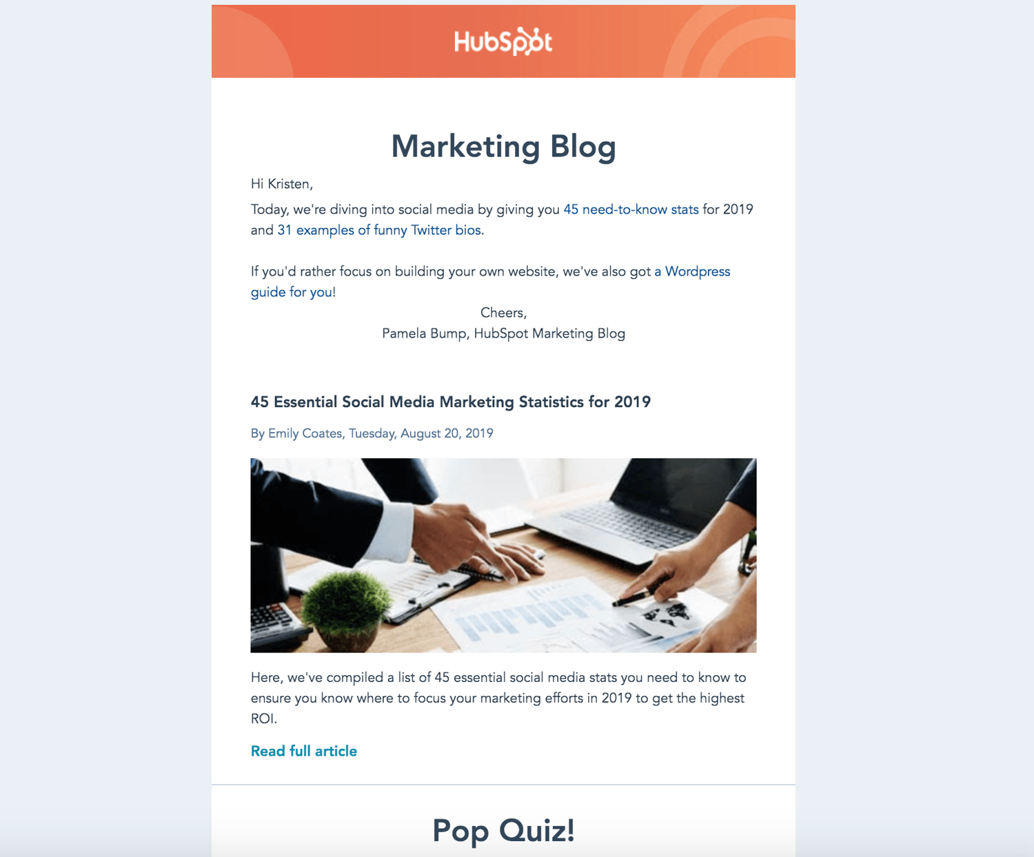
HubSpot Marketing Blog
HubSpot sends subscribers Marketing Blog emails every day. These include a few blog marketing-related articles to read and learn from. If recipients choose, they may also subscribe to HubSpot’s Sales Blog and Service Blog emails.

The emails are branded so readers immediately know who the email is from and what it will include. To make the daily emails engaging and unique, they include previews of the articles and an occasional quiz.
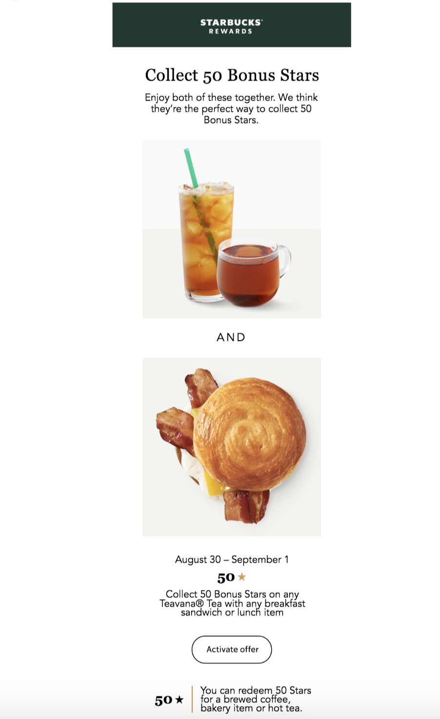
Starbucks Rewards
Starbucks customers and members may have seen this email, or something similar, in their inbox before:

The email complements Starbucks’ marketing and branding, and there’s plenty of white space separating the written information from the engaging imagery. And the CTA that recipients can click on to activate the offer is clearly placed.
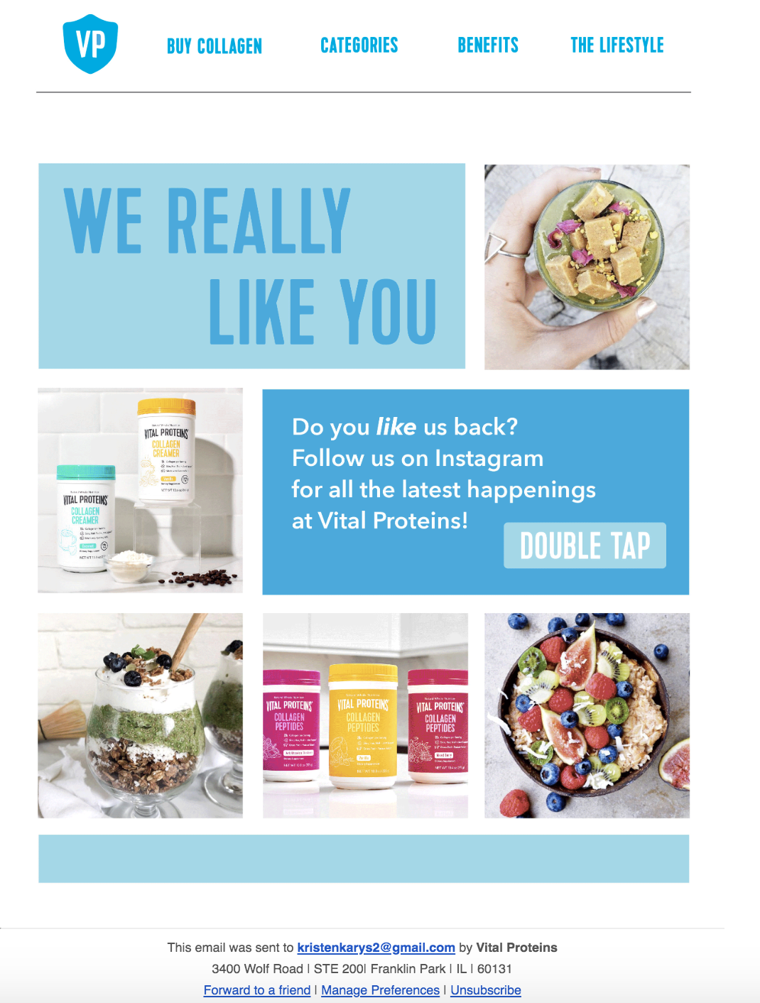
Vital Proteins Email Design
Although Vital Proteins' email design contains many images and a lot of information, it’s neatly organized so it doesn’t feel overwhelming to recipients. The email’s colors, font, and visuals are on-brand and feature the company’s products.

There's an obvious CTA that redirects recipients to their Instagram page — in turn, this type of CTA helps the company increase their follower count and brand awareness on the social platform.
Grow Better With Really Good Email Design
With great email design, you’ll reach and resonate with your audience members more effectively, allowing you to grow better. Eye-catching and impactful emails will help you build long-lasting relationships and convert more people into paying customers and brand advocates. So, begin designing your emails while keeping the best practices and examples we reviewed in mind.
Editor's note: This post was originally published in August, 2017 and has been updated for comprehensiveness.
from Marketing https://ift.tt/2ZWB7fM
via
No comments:
Post a Comment