For most marketers, this will sound familiar. You’re sitting around a conference room, trying to figure out how to best engage your leads and customers, sell more products, or just “stay top-of-mind” for your target audience, and someone decides there’s a solution that can solve all of those problems at once: an email newsletter!
Suddenly you're "volunteered" to do it. And you've got make sure that open and clickthrough rates don’t dip. Oh, and the first one needs to go out tomorrow.
That sound good?
I’ve been in that situation before, and I was terrified. Even though e-newsletters are one of the most common types of emails to send, they are actually some of the hardest to do right.
Want to ace your new email newsletter project, or rejuvenate an old one? Below are 10 things you need to make sure to do. And if you're looking for some inspiration, here are some awesome email newsletter examples you can check out.
1. Evaluate whether or not you need an email newsletter.
I know it can be kind of scary pushing back on your boss about a project you’ve been handed, but if an email newsletter isn’t right for your marketing, you shouldn’t waste your time working on one.
To figure out what you need to do, first do some research. In your industry, are there successful email newsletters that people like to subscribe to? What’s in them? With the resources you have available to you -- budget, time, and internal support -- could you be successful?
Then, re-examine your business’ goals. Are they trying to increase the number of leads? Better qualify leads to speak with salespeople? Close more deals? Retain more customers?
If your industry isn’t really interested in email newsletters, or if your goals don’t line up with what a newsletter could accomplish, your time might be better spent creating something else like a lead nurturing email workflow or content for your blog.
So gather some data, create a plan-of-action (either for a successful newsletter or another activity), and go chat with your superior. Even if you disagree with his or her vision in doing an email newsletter, your boss will be glad you came prepared with a plan for success.
Okay, let’s say you’ve found that you should do an email newsletter. What next?
2. Figure out what kind of newsletter you want to send.
One of the biggest problems with email newsletters is that they're often cluttered and unfocused because they're supporting every aspect of your business. Product news goes right next to PR stories, blog posts go next to a random event week … it’s kind of a mess. Email -- whether it’s a newsletter or not -- needs one common thread to hold it together.
One way to help reduce the randomness of an email newsletter is by keeping it to one very specific topic. So instead of it being about your company in general, maybe it’s dedicated to one vertical.
An example of a great, topic-based email newsletter is BuzzFeed's "This Week in Cats" newsletter. (Don't judge ... I recently adopted a kitten and I've become full-on obsessed with cats.) Though BuzzFeed writes about pretty much everything under the sun, they offer up one specific newsletter for people who love reading about cats. Because the niche is aligned with a specific interest, the articles have an opportunity to get way more engagement than they would in a newsletter featuring content from all over the website.

3. Balance your newsletter content to be 90% educational and 10% promotional.
Chances are, your email newsletter subscribers don't want to hear about your products and services 100% of the time. While they may love you and want to hear from you, there’s only so much shilling you can do before they tune out.
Case in point: I have a thing for shoes, and I especially love this one shoe site. I willingly opted in to the company’s email list, but it now sends me emails 2-3 times a day to buy, buy, buy … and when I see it’s sender name pop up in my inbox, I want to scream. If they sent me educational content -- maybe about the latest styles of shoes, or how to pair certain styles with certain outfits -- I might be more inclined to buy from them, or at least start opening their emails again.
Don’t be that company. In your email newsletters, get rid of the self-promotion (most of the time) and focus on sending your subscribers educational, relevant, timely information. Unless you actually have an exciting, big piece of news about your product, service, or company, leave out the promotional parts.
4. Set expectations on your "Subscribe" page.
Once you’ve figured out your newsletter’s focus and content balance, make sure you’re properly communicating about them on your subscribe landing page.
Get specific. Tell potential subscribers exactly what will be in the newsletter as well as how often they should expect to hear from you. Take a page out of SmartBrief’s book: On the subscribe landing page, it says what'll be in the newsletter and gives potential subscribers a preview link. Check it out:
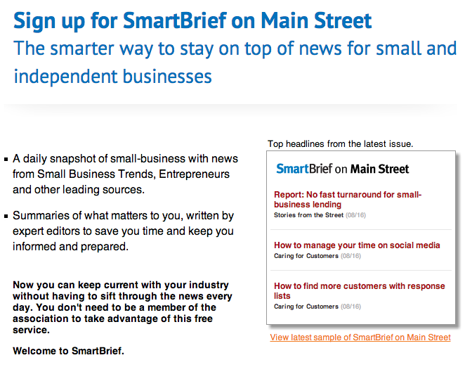
As a subscriber, wouldn’t that be awesome? You’d go in with open eyes knowing exactly who you'll be receiving email from, what they'll be sending you, and how often they’ll be sending it. As a marketer, having this information up front will help diminish your unsubscribe and spam rates as well.
5. Get creative with email subject lines.
Even if your subscribers sign up for your emails, there’s no guarantee that they will open your emails once they get them in their inbox. Many marketers try increasing familiarity with their subscribers by keeping the subject line the same each day, week, or month that they send it.
But let’s face it, those subject lines get old for subscribers -- and fast. Why? Because there’s no incentive from the subject line to click on that specific email right this instant. A better approach would be to try to have a different, creative, engaging subject line for each newsletter you send.
One company who does this really well is Thrillist. Here’s a collection of email newsletters I’ve received recently:
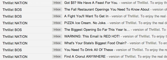
I’ve opened every single one of these because of the company’s subject lines. Even though I know that these emails are coming in my inbox every morning, the subject lines are what entice me to click.
If you need help with your email newsletter subject lines, check out this recipe.
6. Pick one primary call-to-action.
Okay, part of what makes a newsletter a newsletter is that you’re featuring multiple pieces of content with multiple calls-to-action (CTAs). But, that doesn’t mean you should let those CTAs share equal prominence.
Instead, let there be one head honcho CTA -- just one main thing that you would like your subscribers to do. The rest of the CTAs should be “in-case-you-have-time” options. Whether it’s simply to click through to see a blog post or just to forward the email to a friend, make it super simple for your subscribers to know what you want them to do.
Check out Second Glass' email newsletter below, which was promoting their most recent Wine Riot event in Boston. It's colorful and chock-full of information ... but it's also pretty obvious what they want you to do: purchase tickets for the event. By placing this CTA above all the other pieces of information, Second Glass increases the chance that their email recipients will click on it.

7. Keep design and copy minimal.
Like we said before, a newsletter can easily feel cluttered because of its nature. The trick for email marketers to look uncluttered revolves around two things: concise copy and enough white space in the design.
Concise copy is key -- because you don’t actually want to have your subscribers hang out and read your email all day. You want to send them elsewhere (your website or blog, for instance) to actually consume the whole piece of content. Concise copy gives your subscribers a taste of your content -- just enough that they want to click and learn more.
White space is key in email newsletters because it helps visually alleviate the cluttered feel, and on mobile, makes it much easier for people to click the right link.
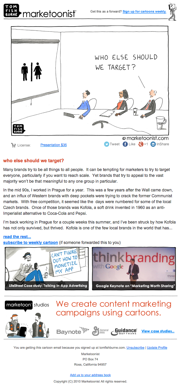
Look to Tom Fishburne's blog post newsletters to see how this should be done. The main blog post has one large comic, a few small paragraphs of introduction, and a link. The rest of the newsletter components are smaller and more visual, making the whole design feel uncluttered an easy to read.
8. Make sure images have alt text.
Given that visual content is incredibly important to the rest of your marketing activities, it’d make sense that you’d want to include them in your emails … right?
Right. But email’s a little bit trickier. Most of the time, people won’t have images enabled, so you’ve got to make sure your images have one essential component: alt text. Alt text is the alternative text that appears when images aren’t loaded in an email. This is especially important if your CTAs are images -- you want to make sure people are clicking even without the image enabled.
Each email marketing program is different, but here is one tutorial for adding alt text to email.
9. Make it easy for people to unsubscribe.
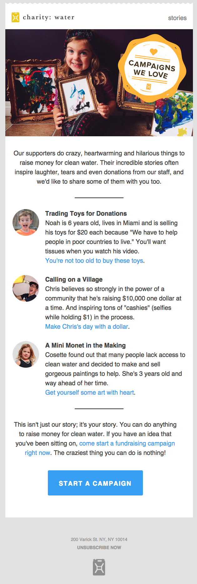
This seems kinda counter-intuitive, but it’s key if you want to maintain an active, engaged subscriber list. Don’t use weird language like “Alter your communication with us.” Don’t hide an unsubscribe button behind an image without alt text. Besides keeping your list healthy, having a clear unsubscribe process will help ensure your email isn't marked SPAM before it hits the rest of your list's inbox.
Take a look at charity: water's newsletter below to see how to do this right. The link to unsubscribe is bolded and capitalized, making it really easy for you to take action on it (if you wanted). No footer hunting required to uncover where the heck you can change your email settings.
10. Test, test, test.
I know I just listed out nine things you should do to make sure you’re doing email newsletters right, but you’ve also got to find out what works for your company and your list. Just like different cultures of people prefer different things, different groups of email subscribers prefer different things.
So use these email newsletter best practices as a jumping off point … and then experiment to find your secret sauce. Here are a few things you can try:
Short, Funny Subject Lines
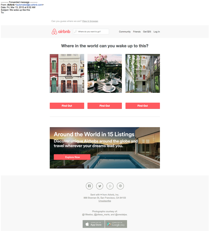
All of your subject lines should be on the short side. (They work better that way.) But have you ever tried infusing a little humor into your copy? It could put a smile on your recipients' faces -- and potentially improve your open and clickthrough rates. Below's a really cute subject line example from Airbnb:
CTA Copy & Design
Maybe your readers like loud, bright colors on your CTA -- or maybe drab, bland ones are the way to go. Maybe they prefer really fun, excitable, action-oriented copy -- or maybe a simple "click here" works. Definitely test out your CTA language and copy to see what resonates.
As a good example to follow, Litmus has a ton of CTAs in their email newsletter, but the way that they use color and copy makes them seem very natural and easy-to-read.

No Images
Most of the emails featured in this post have lots of gorgeous, compelling images ... but that doesn't mean you need them in your emails. Try stripping away images in favor of seriously well-written copy.
Below is a great example of a plain text email with excellent copy from Maple Jeans. I especially love the P.S. bits toward the end. They increase the spacing between the different CTAs, making it even easier to click on mobile and giving the whole email a less promotional feel. 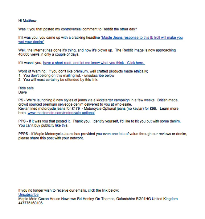
Source: ReallyGoodEmails
Mobile Version
More and more people are surfing the web and checking their emails on mobile devices, so you should make sure that whatever design you work with is both visually pleasing and functional. This will ensure that your mobile email is engaging to both desktop and mobile users.
Want to learn more about this? Here's a detailed guide that walks you through how to optimize your email for mobile devices.
Sender Name
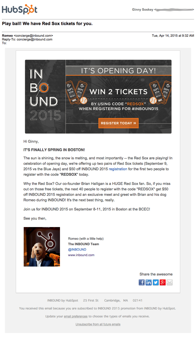
Last but certainly not least is an example from my colleagues running our INBOUND conference. Recently, to alert INBOUND attendees of a special ticket sale, they sent an email from Romeo, our CEO's dog, in honor of the Boston Red Sox's season home opener. And it worked: the email received 7% more opens and 2% more clicks than typical INBOUND emails sent. Even if your CEO doesn't have a dog, running a sender name test could be very worthwhile.
Putting Together Your Newsletter
Once you're ready to put together your newsletter, be sure to follow the above steps. You should also keep a few major things in mind, regardless of your newsletter's formatting:
- Keep things short and sweet. Don't overwhelm people with too much text or imagery. Level things out. Even if you choose a photo-less newsletter, keep your message quick and to the point so the email cuts to the chase and grabs attention the whole time.
- Make your content valuable. No one wants to open an email with a bunch of advertisements in it. So, include gems of wisdom, tips, and helpful blog posts along the way so the reader feels like they're actually learning something. This will make the subscription feel much more valuable to them.
- Always test your emails. It's embarrassing when a link doesn't work or a design aspect looks wonky. So be sure to send test emails to yourself and a colleague who can give you helpful feedback. Check them on both a computer and a smartphone inbox so you can confirm that both the mobile and desktop designs look good.
Want to start designing but aren't sure how? Use a template! Check out our long list of effective email templates that are free or very affordable.
from Marketing https://ift.tt/2i6p9Hu
via
No comments:
Post a Comment