On January 9, 2007, Steve Jobs unveiled the iPhone in one of the most captivating product launches in history. Indeed the iPhone was a revolutionary product, but it wasn’t the iPhone that inspired thousands of people to camp out in the cold over night. It was Jobs’ unique presentation style -- which Apple fans referred to as a “Stevenote” -- that helped make this among the most awe-inspiring, memorable keynotes ever delivered.
As Carmine Gallo puts it in his book, The Presentation Secrets of Steve Jobs, Steve “transformed the typical, dull, technical, plodding slideshow into a theatrical event complete with heroes, villains, a supporting cast, and stunning backdrops. People who witness a Steve Jobs presentation for the first time describe it as an extraordinary experience.”
Steve Jobs was one of the world's most captivating communicators. Even if you're not the star of a highly anticipated product launch or a best-selling author and entrepreneur, chances are, you're going to be standing in front of an audience at some point in your career.
Take these lessons from the world's most captivating presenters and communication experts and apply them to your next presentation.
1. Start with a clear message and purpose.
“If you can't write your message in a sentence, you can't say it in an hour.”
— Dianna Booher, Communication Expert
Chances are, if you don't know what's most important for your audience to know, they won't either.
Don't even begin your presentation without first understanding what, in simple terms, you want the audience to take away. This purpose and message becomes your guiding star. Once you can convey it in the simplest terms, you'll be able to build from that foundation to support your points.
2. Begin on paper, not PowerPoint.
“The single most important thing you can do to dramatically improve your presentations is to have a story to tell before you work on your PowerPoint file.”
— Cliff Atkinson, Beyond Bullet Points
Think back to the last time you prepared for a presentation. Did you start by outlining the story you would tell on paper? Did you then gradually weave in meaningful data, examples, and supporting points, based on that outline? Did you have a clear unifying message that your audience would remember even without the benefit of a transcript or notes?
Chances are, you answered “no” to those questions. If you’re like most people, you probably “prepared” by opening up PowerPoint the night before your presentation, cobbling together a few dozen slides from decks you or your colleagues have used in the past, peppering in a few stock photos, and counting on your ability to “wing it” in person.
The world's most captivating communicators know better. They invest more time in the idea than the slides. Don’t sell yourself short by jumping head-first into presentation software. Take the time to thoughtfully craft your story on paper before you even think about creating a single slide.
3. Think of your presentation as a story.
“Personal stories are the emotional glue that connects the audience to your message.”
— Nancy Duarte, Communication Expert
Expert speakers carefully, painstakingly plan, storyboard, script, design, and rehearse their presentations like an Oscar-winning Hollywood director prepares their film for the big screen. They’ve seen the impact that a carefully crafted story can have on influencing an audience, and they know that skipping this crucial first step is what separates average communicators from extraordinary ones.
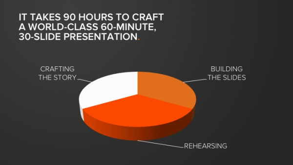
According to Nancy Duarte, the communications expert behind Al Gore’s An Inconvenient Truth, presenters should dedicate roughly 30 hours to researching, organizing, sketching, storyboarding, scripting, and revising the story for a one-hour presentation.
4. Tell your story in 3 acts.
“The way something is presented will define the way you react to it.”
— Neville Brody, Designer
Most presentations follow some variation on the following format:
- Who I am
- What I do (or what my company does)
- How my product/company/idea is different
- Why you should buy/invest/support me now
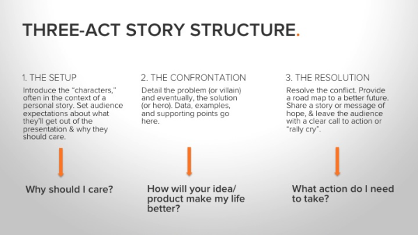
The world’s most captivating communicators typically rely on a three-act structure, more common in modern storytelling than in corporate conference rooms. The narrative is divided into three parts -- the setup, the confrontation, and the resolution -- and comes complete with vivid characters, heroes, and villains.
The following image provides a snapshot of the three-act structure and which critical questions are answered for the audience in each:

Notice that this structure turns the typical presentation “flow” on its head.
Instead of following a WHO > WHAT > HOW > WHY flow, master communicators like Steve Jobs prefer a WHY > HOW > WHAT format:
- Why should the audience care
- How the idea/product will make their lives better
- What action they need to take
This works because expert speakers recognize that the first thing they need to do when standing in front of an audience is get them to care.
By structuring your presentation with a clear and compelling beginning, middle, and end, you’ll take your audience on an exciting journey… the kind that inspires action, sells products, and funds businesses.
5. It's not always about being unique.
“I tell my story, not because it is unique, but because it is not. It is the story of many girls.”
— Malala Yousafzai, Activist and Speaker
Writers and communicators often agonize over how they can be innovative and different. However, sometimes it's better to be universal and resonant.
Malala's story has been described as inspiring, courageous, and touching, yet "Malala does not consider herself extraordinary. That is 'simply Malala,' as she would describe herself" (Source).
Nonetheless, her speaking and advocacy helps to fight for girls' education on an international scale.
If you bring authenticity and passion to your audience, saying something new becomes less of a concern.
6. You don't need to memorize word-for-word.
“People will forget what you said, people will forget what you did, but people will never forget how you made them feel.”
— Maya Angelou, Poet and Activist
It's natural to want to deliver your speech "perfectly" every time. Your inclination might be to memorize each word or read directly from your speaker's notes. This can cause a lot of undue nervousness. But guess what? You can let that all go.
Your audience doesn't know what you were going to say; they only hear what you are saying. And, as Maya Angelou said, they won't remember the exact words you spoke but rather how you spoke them and how it made them feel.
Instead of memorization, rely on the topic you know well. Practice explaining it off the cuff.
7. Speak from the heart.
“Emotionally charged events persist much longer in our memories and are recalled with greater accuracy than neutral memories.”
— John Medina, Brain Rules
Maya Angelou's quote in the previous tip isn't just about memorization, though. There's another point she's making.
While virtually every presentation relies on some form of data to illustrate or emphasize the core point, master communicators like Steve Jobs know that data alone ain’t enough.
Science again comes to our aid in explaining how and why this is important. In his book, Brain Rules, molecular biologist John Medina has this to say about the role of emotion on the human brain:
“An emotionally charged event (usually called an ECS, short for emotionally competent stimulus) is the best-processed kind of external stimulus ever measured.”
Chip and Dan Heath further elaborate on the impact that emotion can have on persuasive communication in their book, Made to Stick: Why Some Ideas Survive and Others Die. The authors describe an exercise that Chip does with his students at Stanford University. The students are tasked with giving a one-minute persuasive speech. Everyone must present on the same topic, with half the class arguing for one point of view and the other half arguing for the opposite point of view.
After everyone has given their one-minute speech, the students are invited to rate each other on the effectiveness of the presentations, and then instructed to write down key points made by each speaker.
Here’s the data they collected from this exercise:
- On average, the students used 2.5 statistics during their one-minute speeches
- 1/10 of the students used a personal story to make their point
- 63% of the class remembered details from the speeches that used stories
- Only 5% remember the statistics that were shared
The Heaths drew this conclusion from the data:
“The stars of stickiness are the students who made their case by telling stories, or by tapping into emotion, or by stressing a single point rather than ten.”
With this in mind, make sure your presentation content goes beyond pure “facts.” Triggering audience emotion is a guaranteed way to increase retention and impact of your core message. You can do that by speaking from the heart.
8. Use compelling imagery as a component in your speech.
“A picture is worth 1,000 words.”
There’s a reason why expressions like, “Seeing is believing” and, “A picture is worth 1000 words” are so universally recognized -- and that reason is based in science.
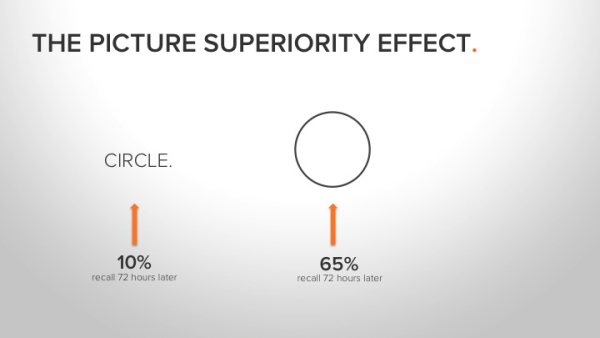
It’s called the Picture Superiority Effect, and it refers to a large body of research, which shows that humans more easily learn and recall information that is presented as pictures than when the same information is presented in words.
In one experiment, for instance, subjects who were presented with information orally could remember about 10% of the content 72 hours later. Those who were presented with information in picture format were able to recall 65% of the content.

Not only do we remember visual input better, but we also process visual information 60,000x faster in the brain than we do text.
Sure, it takes more time to find and select awesome images to replace text, but master communicators know that it’s worth the extra effort to achieve maximum impact and maximum audience retention.
9. Ditch the bullet points.
“The minute you put bullet points on the screen, you are announcing ‘write this down, but don’t really pay attention to it now.’ People don’t take notes at the opera.”
— Seth Godin, Really Bad PowerPoint
Seth’s right. Researchers have demonstrated time and time again that text and bullet points are the least effective way to deliver important information. Yet despite clear evidence that wordy, bullet-point-heavy slides don’t work, the average PowerPoint slide has 40 words. No wonder SlideRocket has found that 32% of people fall asleep during PowerPoint presentations, and 20% would rather go to the dentist than sit through another one!
This may be hard to believe, but Steve Jobs never used a single bullet point. Not once. His presentations were always remarkable spare, relying on a few powerful images and carefully selected words or phrases.
Even during product demos where Jobs explains or demonstrates key benefits of a new product, his slides are refreshingly devoid of bullet points.
Our short-term memory can hold onto fewer than 7 items for no longer than 10-15 seconds.
So, imagine you’re introducing the world’s thinnest notebook. Replace the bulleted list of techie product features with a photograph of a large, manila office envelope.
Or perhaps you’re trying to inspire an audience to help your nonprofit end the water crisis? Skip the bulleted list of statistics in favor of a short, powerful video that shows rather than tells why everyone in the room should care.
10. Spend time rehearsing.
“Spending energy to understand the audience and carefully crafting a message that resonates with them means making a commitment of time and discipline to the process.”
— Nancy Duarte, Communications Expert
Creating a presentation that informs, entertains, AND inspires an audience takes a lot of time. The first 30 hours will be spent researching, sketching, planning, and revising your story. The next 30 hours will go toward building simple, highly visual slides with very few words and NO BULLETS.
But the final 30 hours will go toward rehearsing the delivery.

When was the last time you spent 30 hours rehearsing for a presentation?
Of all of the lessons revealed above, this one is undoubtedly the most often overlooked. Don’t be the person who does everything by the book, only to blow it all at the very end by failing to practice. A lot.
30 hours of rehearsing may be painful. It’s definitely time-consuming. But there are no shortcuts to excellence.
11. Use plain English.
“iPod. One thousand songs in your pocket.”
— Steve Jobs
When Steve Jobs introduced the world to the iPod, he could have said something like this:
“Today we’re introducing a new, portable music player that weighs a mere 6.5 ounces, is about the size of a sardine can, and boasts voluminous capacity, long battery life, and lightning-fast transfer speeds.”
But he didn’t. Instead, he said: “iPod. One thousand songs in your pocket.”
Jobs could have described the MacBook Air as a “smaller, lighter MacBook Pro with a generously-sized 13.3-inch, 1280- by 800-pixel, glossy LED screen and a full-size keyboard.”
Instead, he walked on stage with an office-sized manila envelope, pulled the notebook out and simply said, “What is MacBook Air? In a sentence, it’s the world’s thinnest notebook.”

Unlike most of his contemporaries, Jobs generally avoided complicated stats, technical data, buzzwords, and jargon in his presentations. Instead, he relied on simple, clear, direct language that was easy to understand, easy to remember, and better yet, extremely “tweetable.” Jobs frequently used metaphors and analogies to bring meaning to numbers.
A closer look at some of Jobs’ most famous keynotes reads like a presentation in “headlines” -- powerful, memorable, specific statements that consistently add up to fewer than 140 characters.
Now take a look at one of your recent presentations. Is it buoyant with simple, specific, tweetable headlines? Does the script read like plain English that a 7-year-old could understand? Do you put data and stats in context so their meaning is clear and easy-to-digest? Have you ruthlessly pruned out all of the jargon, including overused, meaningless terms like “integrated,” “platform,” “leading-edge,” “synergy,” and so on?
If you want to improve your ability to persuade an audience, do your best Steve Jobs impression. Use simple language, free of jargon. Make sure your key messages are concrete and consistent. And don’t forget to use vivid metaphors or analogies to provide context and clarity around big numbers and complex ideas.
Final Thoughts on These Public Speaking Tips
On September 28, 1997, Apple debuted its now famous “Think Different” ad campaign, which featured a series of black-and-white images of iconic figures like Albert Einstein, Martin Luther King Jr., and Amelia Earhart. While their images flashed on the screen, the following words were spoken:
“Here’s to the crazy ones. The misfits. The rebels. The troublemakers. The round pegs in the square hole. The ones who see things differently. They’re not fond of rules. And they have no respect for the status quo. You can quote them, disagree with them, glorify or vilify them. About the only thing you can’t do is ignore them. Because they change things. They push the human race forward. And while some may see them as the crazy ones, we see genius. Because the people who are crazy enough to think they can change the world are the ones who do.”
The goal of the “Think Different” campaign was to sell computers. Notice how the word “computer” didn’t appear even once in the script.
I point this out as a final thought, because it summarizes a crucial, remarkable quality shared by most of the world’s most captivating communicators. They may have wildly different presentation styles, but they all have this in common:
They don’t just provide “information;” they convey meaning -- and they do it with passion.
Editor's note: This post was originally published in March 2013 and has been updated for comprehensiveness.
from Marketing https://ift.tt/38t5aOd
via
No comments:
Post a Comment