According to the National Retail Federation, eCommerce accounted for 20.9% of total holiday sales in 2019, and that number seems to increase every year. As a result, you have the opportunity to position your online shop in front of a huge base of consumers who are actively browsing the web with intent to purchase goods.
The smartest marketers prepare for website traffic increases not only by prepping their website for higher-than-normal traffic and optimizing it for mobile devices, but also by giving their website design a dose of holiday cheer.
It all starts with the homepage: The first page many people will see when they come to your website.
Holiday Homepage Designs to Get You in the Spirit
How have other companies redesigned their homepages for the holidays? Let's take a look.
Note: Businesses change their homepages on a regular basis. The examples below may not be current.
1. Free People
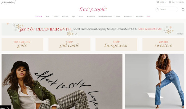
When your business has a loud personality like American bohemian retail company Free People does, making a big first impression on your homepage can be a great thing. Free People's redesign is all-encompassing, starting with a large banner promising free express shipping, which appeals to any buyers concerned about delivery times when doing their last-minute shopping.
Underneath the main banner are four navigational calls-to-action emphasizing gifts and festive products. This directs holiday shoppers to the pages of their site they'll find most useful.
2. PayPal
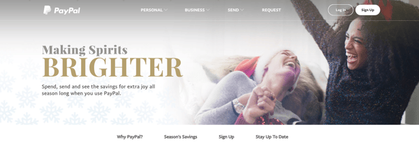
Who ever said online money transfer websites can't have fun at the holidays? After all, sometimes the best gift is a little more padding in your bank account, and PayPal acknowledges this with the slogan: "Making Spirits Brighter: Spend, send and see the savings for extra joy all season long when you use PayPal."
This holiday design from PayPal works because it still looks like PayPal -- just a little more festive. It's still easy to navigate but adds seasonal flair with a clever spin on a lyric from "Jingle Bells" as its holiday slogan. The whitespace encourages visitors to focus on the happy models in the image, putting human faces to an industry that's businesslike and technical.
3. Sephora
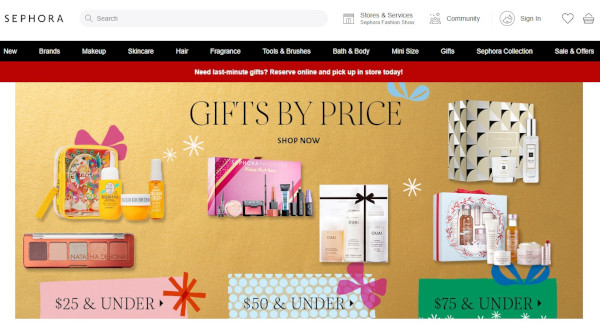
Like PayPal, Sephora didn't make many changes to the overall look and feel of its website. What it did do was feature a holiday edition of its highest-rated products and editors' picks, specially curated for different gift recipients, price ranges, categories, and so on.
By putting editors' picks front and center, Sephora is reminding customers how much the company values customers' success. Plus, we love the gold background color -- it's a cute, festive way to make the homepage cheery and bright.
4. Baudville
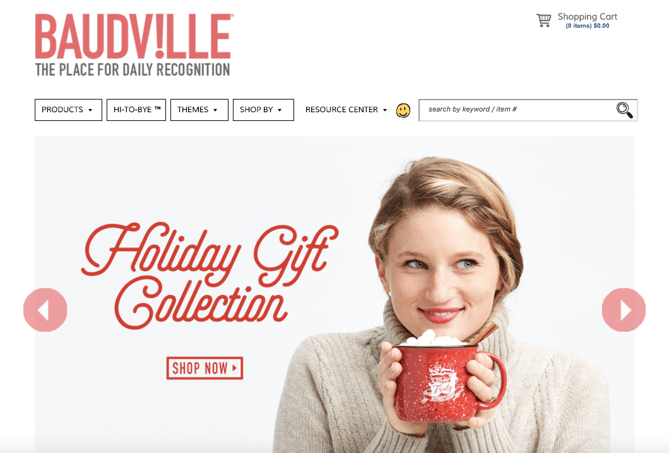
While seasonal website redesign is often dominated by B2C companies, a few B2B businesses have been known to dress up websites a bit too. Baudville, an employee recognition solution, is one.
While some web designers like to add a ton of new elements to their holiday designs, Baudville's design below shows you don't have to. Something as simple as adding a holiday gift shop slide to your homepage photo banner can be enough to warmly welcome users to your site during this time of year.
5. La Colombe
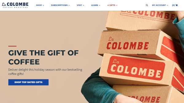
La Colombe's holiday homepage design features soft, warm hues and with festive red accents. Visitors are greeted with an image of La Colombe coffee products in boxes, a call-out to the idea that many shoppers are sending gifts through the mail. The slogan "Give the Gift of Coffee" is a great example of a business staying true-to-brand with an added holiday touch.
6. L.L. Bean
For a U.S. outdoor retail company like L.L. Bean, the holidays mean winter... which means cold. (For most of us, unfortunately.)
This design keeps the holidays out of the seasonal redesign completely: The featured photo on the homepage is a model wearing apparel in front of pine trees covered in show, which is in keeping with the brand's outdoorsy theme.
L.L. Bean shares a list of holiday gift ideas featuring some of its most popular and beloved products. The seasonal homepage slogan -- "Gifts That Last Beyond the Present" -- reminds visitors of L.L. Bean's amazing satisfaction guarantee.
If you're more attracted to a winter-themed seasonal redesign, consider using winter-themed stock photos for your homepage. You might also consider cooling down the color scheme of your whole site for the holiday season. This means using cooler tones like blues, purples, and greens to give it a more "wintry" feel.

7. The Container Store
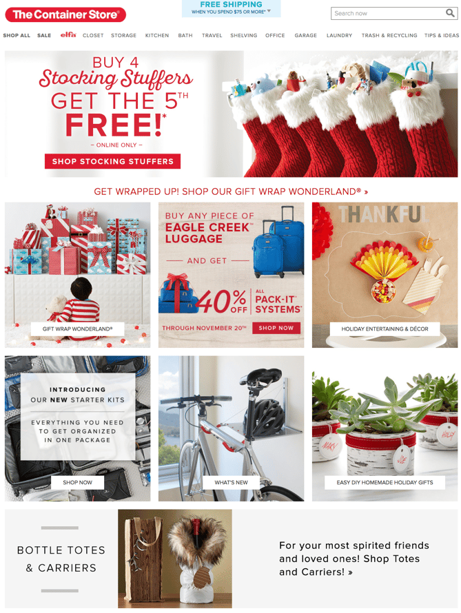
The Container Store's homepage design below is a fantastic move for the holidays because it is chock-full of goodies for visitors. Every module on this homepage has something helpful to offer customers -- stocking stuffers, gift ideas, luggage for holiday travel, party favors, and DIY projects.
The various CTAs on the homepage are clear and tell visitors everything they need to know about what's on the rest of the site. The geometric shapes organize all of the content cleanly, so despite the fact that the homepage has several different offers on it, it's not cluttered.
8. Base Butter
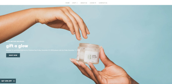
Instead of tapping into the greens, reds, and golds that you'd typically expect on a holiday homepage, Base Butter keeps to their cool color palette and foregoes the pine trees, ornaments, and other holiday imagery. Instead, they use a minimalistic image of their product being gifted from one person to another with the headline "Gift a Glow." This is significant because it's emphasizing the act of giving.
Notice also that it's "Gift a Glow" rather than "Gift Skin Care Products." They are selling the outcome rather than their product, enhancing the idea of giving a gift that truly matters.
9. J. Crew
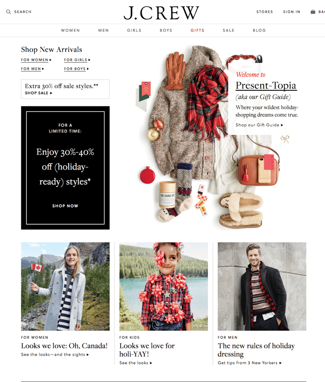
This J. Crew holiday homepage design goes above and beyond expectations for a clothing store. The whitespace on the page is simple and lets the clothing and accessories stand out to prospective shoppers while keeping the website true to brand.
Its homepage advertises "Present-Topia," a Gift Guide that breaks down J. Crew products by age, gender, and price for ease of shopping. The black callout box advertises a sale it's running that includes seasonal clothing. J. Crew also published curated looks that visitors can browse or directly shop from to make the shopping experience easier and more visual. This homepage redesign prioritizes the user experience while still keeping the site beautiful and on-brand.
10. Lume
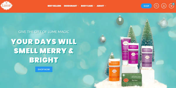
Like the rest of Lume's advertising, they take a humorous spin with their homepage.
As a natural deodorant company, Lume flips expectations of "Your Days Will Be Merry and Bright" in their hilarious and witty copy, which instead says "Your Days Will Smell Merry & Bright." This falls in line with the tone of their brand, pushing the benefits of their product with entertaining jokes.
Paired with the copy is attractive imagery of their products along with a snowy pine tree spread and ornaments in the background.
11. Fitbit
The dark background of this Fitbits homepage design lets the festive gold color scheme and the products shine. The photography styling positions Fitbits as a gift similar to jewelry in beautiful boxes, rather than a piece of sporting equipment, to make Fitbit products appeal to a wider variety of shoppers and not just athletes.
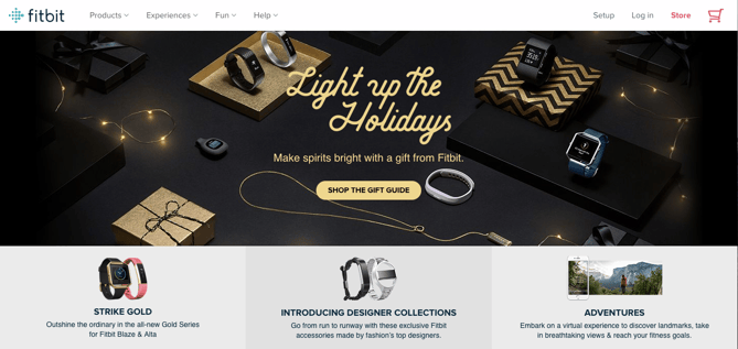
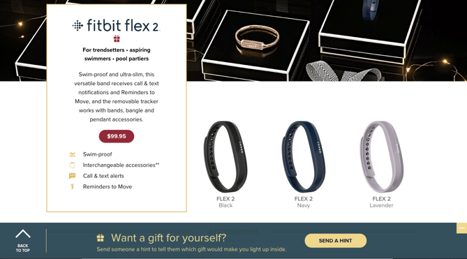
The primary CTA -- "Shop The Gift Guide" -- serves to lead visitors through all of the products with descriptions that suggest who they might purchase it for, making it easy for shoppers to imagine their family and friends using the product.
Fitbit included a neat feature where visitors can hint to someone that they themselves want to get a Fitbit as a gift.
12. Peloton
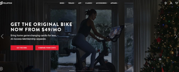
Peloton doesn't change much by way of copy, choosing instead to highlight membership information and their most important CTAs. However, here they do include several videos in their full-page slider that are quite festive. Happy Peloton users exercise in front of decorated Christmas trees, in cozy living rooms, or in front of snowy windows. The focus stays on the bike and its benefits, but the setting is one of holiday cheer.
13. HP
Instead of the traditional holiday homepage layout presenting products as potential gifts, this HP design kept the page minimally decorated with only their featured video, "Reinvent Giving," above the fold.
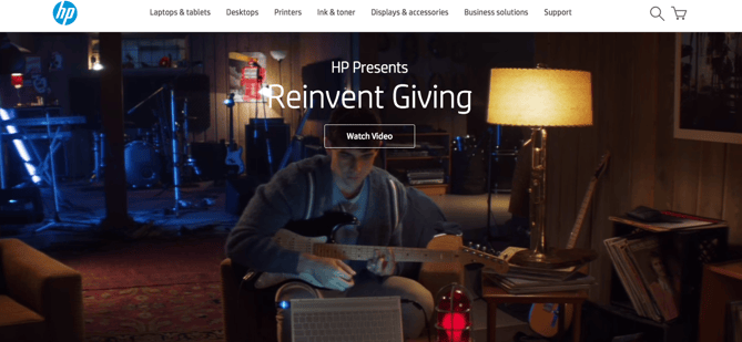
The touching video features a brother using HP technology to come up with the perfect gift for his brother, who is hearing impaired -- a guitar set that displays flashing lights when played so his brother can see himself playing music, even if he can't hear it.
HP - BROTHERS REINVENT GIVING from 151 Awards on Vimeo.
Emotion in advertising is effective, especially around the holiday season -- everyone has a friend or family member they want to find the perfect gift for. We can't guarantee that HP's holiday homepage video won't make you cry, but we can say that it's a unique and heartfelt spin on traditional holiday marketing.
14. Madewell
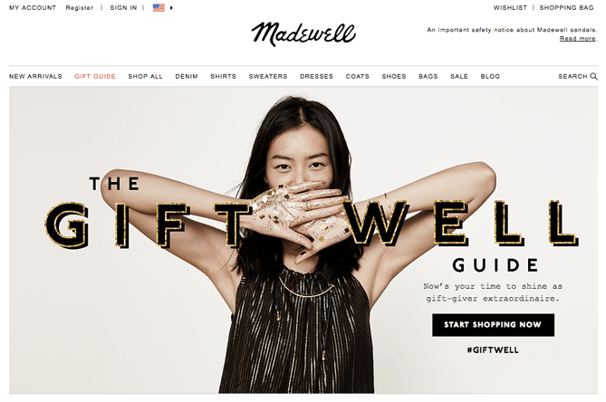
The image and header on Madewell's design are very much in line with the company's typical branding: a model wearing a gorgeous dress in front of a neutral background, accompanied by a holiday spin on their name in festive, embellished font.
This is both attractive to first-time visitors who are greeted with simple imagery and user experience as well as returning users who expect a design like this but still appreciate the added holiday touches. The #giftwell hashtag prompts visitors to start a conversation about their shopping experiences on social media, which fosters a sense of brand loyalty.
15. Pholk
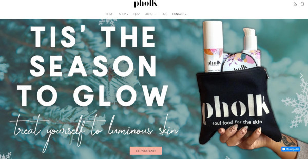
Pholk also uses the word "glow" on their homepage, pairing this benefit-driven copy with a seasonal touch: "Tis' the Season to Glow." However, their focus is on treating yourself, which is a refreshing angle when other websites are hoping to attract shoppers that are getting gifts for others.
What makes this holiday homepage especially attractive is the typographic style paired with a soft, cool pine background image. Of course, it wouldn't be complete without an image of a bag of their products advertised on the opposite side of the text.
16. Pillow Cube
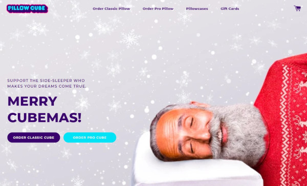
Pillow Cube is... pretty much what it sounds like: A cube-shaped pillow designed for side-sleepers. On their homepage, they use imagery to bring up an important question: What if Santa was a side-sleeper?
The copy then calls the website visitor to consider buying a Pillow Cube for the side-sleeper in their life: "Support the side-sleeper who makes your dreams come true." Support being a sneaky way to talk about the product's big advantages.
In addition, the big heading "Merry Cubemas!" is just adorable.
As you plan your own marketing strategy and website design for the holidays, be sure to plan and prepare your site for higher-than-normal traffic. The last thing you want is for your site to go down during a time when you hope to be doing great business.
Editor's Note: This post was originally published in November 2015 and has been updated for freshness, accuracy, and comprehensiveness.
from Marketing https://ift.tt/2gOT0mA
via
No comments:
Post a Comment