There are a lot of things I used to buy in person that I now buy online. I wouldn't call myself lazy, but it's just so much easier to carry a box of paper towels from my doorstep into my apartment than it is to carry it down the street from my local grocery store.
And I'm not alone. Whether it's because of the larger selection, better pricing, convenience, or something else, a lot more people are buying stuff online nowadays instead of in person. Despite the growing number of online shoppers, people are still wary of the setbacks of paying for stuff online. In particular, people still get nervous about giving their personal and credit card information to online retailers.
If you're an ecommerce business, a big part of attracting and delighting your customers will be providing them with a stable, reliable, secure, and smooth online shopping experience. That starts with creating your payment gateway.
How to Create a Payment Gateway
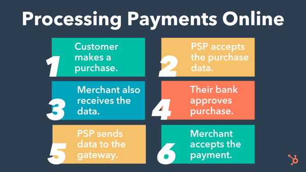
A payment gateway is a technological front-end component of payment processing that bridges the gap between your business's financials and the customer's financials during a transaction. To get an understanding of what I mean, it helps to know how payment processing works.

On one hand, the customer's financial institution must approve or deny the purchase. On the other, your payment service provider (PSP) and merchant account need this data to process the transaction and receive payment. Coordinating these moving parts is your payment gateway.
Here's how to set it up.
1. Open a merchant account.
A merchant account is a type of business account that accepts payments of multiple types, including credit cards. Funds from online purchases land in your merchant account after they've been processed, and you'll then be able to transfer them into your business banking account.
In order to create a payment gateway, it helps to already have a merchant account set up as it will be the final destination for funds from successful transactions.
2. Choose a payment service provider (PSP).
While the gateway acts as the front-end of payment processing for a transaction (i.e. the interface that customers directly interact with), the payment service provider facilitates the transaction on the back-end, passing financial data across all the moving parts. In order to create a payment gateway for your customers to interact with, you must first set up a PSP to hook it up to.
3. Decide whether you want to build or buy your payment gateway.
You have the option to build a payment gateway yourself (custom) or partner with a provider to get one "out of the box."
Custom builds may be able to suit a wider range of your unique needs and save on transaction fees. However, it may be costly to develop and maintain.
An "out of the box" payment gateway is quicker to set up, but you'll want to ensure that it comes with all of the features that you need. Some may even come with PSP functionality, which saves you time during the setup.
Top gateway providers in the industry include Authorize.Net, Stripe, and PayPal.
If you plan to take payments on your website, then be sure you're checking everything off from the list below.
Essential Features for Taking Payments on Your Website
1. Multiple Login Options
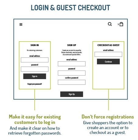
While it's more convenient for your marketing to require shoppers to create an account before placing an order, it doesn't always benefit your customers. You might lose people along the way if you don't give them the option to check out as a guest. Remember: You can always ask them to create an account once they've bought from you and feel a little closer to your brand.

Image Credit: VWO
You should also think about offering shoppers the option of logging in with one of their social media profiles, like Facebook or Twitter. This can reduce registration friction because it makes the login process a lot faster. Make sure you add that you'll never post without the customer's permission, if applicable.
The caveat of allowing a social login? It's the one connection shoppers will have to log in -- and if anything changes about that connection (the terms of service for the social network change or they delete their account on the network), their ability to log into your site will change, too. So if you're allowing people to authenticate with social logins, figure out other ways ask for more contact information.
2. Authentication/Login Layers
Customers who do have an account with you want to know that their information is safe -- even if they forget their login information. To give them peace of mind, be sure to require several verification layers before you restore their login information. For example, if a customer forgets her password, your site could require various security questions before sending an email to a pre-determined email address.
3. PCI Compliance
The PCI Security Standards Council (PCI SSC) defines a series of specific Data Security Standards (DSS) that are relevant to all merchants, regardless of revenue and credit card transaction volumes.
If you host and manage your own ecommerce platform, it's your responsibility to ensure PCI compliance at the required compliance level, which is based on credit or debit card transaction volume over a 12-month period. Most SaaS shopping carts will have PCI compliance built in.
4. Integrated Payment Processor
While you can get away with payment processors like PayPal, Stripe, Google Pay, and Amazon Pay if you have a very small website and a low number of transactions, it's much better to integrate a payment process directly into your website.
With some processors, online shoppers get redirected off your website to a pay site that doesn't look like yours -- which disrupts their experience, visually disconnects them from your brand, and can be confusing or nerve-racking and prompt them to abandon their cart.
An integrated payment solution that processes your customers' information on your own server allows for more flexibility and customization. Plus, it's a much smoother experience for your customers.
An integrated payment page will require an SSL certificate to ensure a secure connection. Which brings me to my next point...
5. SSL Certificate
Every ecommerce website needs an SSL certificate to protect customers' personal and credit card information. SSL is the standard security technology that makes sure all data passed between a web server and a browser remain private.
Without it, hackers can steal your customers' information -- and online shoppers won't feel safe submitting their information on your website. Online shoppers will be able to tell your website's secure when they see an "https://" at the beginning of your URL, as opposed to just "http://".
Read our article to learn how to get an SSL certificate on your website.
6. Credit Card Logos and Security Seals
Speaking of keeping online shoppers at ease, you might want to add credit card logos and security seals to your website to reassure shoppers that your site is a secure, trusted place to do business. Make them visible at least in the shopping cart and checkout phases of your site, or even try integrating them into the footer of your website.
7. Checkout Buttons
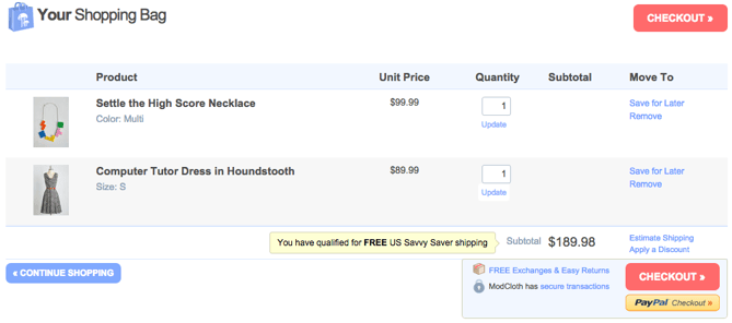
The less time customers have to spend looking for an option to check out, the sooner they'll take action and buy. We recommend putting checkout calls-to-action -- in a color that really stands out -- at the top and bottom of your web pages.
Check out this checkout button example from ModCloth (no pun intended):

Want a little button design help? Click here to see get free call-to-action templates.
8. Visual Checkout Process
If you need to spread the checkout process across multiple pages, give shoppers a visual indicator of how far they've progressed and how long they have left to go. Again, ModCloth does this particularly well:

9. Return & Refund Policy
Shoppers don't get to physically look at or feel a product before they purchase it online, which can make some people nervous and disincentivize them to buy. To help mitigate this, make your return and refund policy readily available. Consider making it part of the checkout process and even putting it in the footer of your website.
Be sure your policy is succinct, informative, engaging, and easy to understand. Say whether the customer will get a refund or an in-store credit, stipulate a timeframe for returns, define the condition you expect the product to be in, and disclose any fees up-front -- like who will cover the cost of shipping.
10. Clear Path to Your Contact Information
Online shoppers want to know they can easily reach your company for support -- especially if they're first-time customers. If you don't give them a clear path to your contact information, they may either hesitate to buy from you, or they may not get the support they need to complete a transaction.
Include contact information like a phone number (with availability hours), email address, street address, and social media accounts. Preferably, list this information as text (not as an image) so it'll get picked up by search engines in local searches. Some retailers also like to offer live chat options -- just be sure that you've integrated it with your customer records so you can build smarter marketing campaigns in the future.
11. Detailed Confirmation Page Before Checkout
Before allowing online shoppers to check out, you'll want to take them to a detailed confirmation page before finishing the transaction. This page should let them review their cart, give them the option to change the quantity or remove items, include a final price (including tax and shipping), and indicate when the items will be shipped.
12. Optimized Checkout Page Design
The best checkout pages are functional, secure, attractive, and easy to use and navigate. The last thing you need is someone with purchasing intent getting cold feet at the last moment simply because they can't use your system or don't have faith in it.
13. Mobile Payments
Buyers don't just buy on desktop. They also buy on mobile, so your payment gateway must be responsible and easy to navigate for mobile users too. If your have a mobile app, you may also need additional functionality to process payments on iOS and Android.
14. Confirmation Email
Finally, you'll want to create a confirmation email that includes the order number, the product, payment, and shipping information, and your return and refund policy -- just in case. If possible, use a real "from" email address (instead of noreply@company.com) that can be answered by a member of your customer support staff. You'll also want to make the order confirmation page easy to print. This is the time when you can offer guest customers the option to sign up for an account, too.
Setting up your ecommerce business is exciting, even if all the details can be a little overwhelming. With a little bit of planning, you'll be well on your way to processing ecommerce transactions left and right.
Editor's note: This post was originally published in September 2015 and has been updated for comprehensiveness.
from Marketing https://ift.tt/3bTHmqh
via
No comments:
Post a Comment