To understand the "rule of thirds" as it relates to web design, let's start with an example.
Consider this image of a bull in a field:

Not too interesting, right? As the center of the image, the bull image feels a little bland and predictable. I'm willing to bet if you saw this image on a website, you wouldn't dwell on it too long.
Now, consider what changes when we use the rule of thirds to place the bull away from the center:

A little more interesting, right?
The rule of thirds can help make your designs feel less predictable and more intriguing. And, ultimately, it has the power to capture the viewer's attention for longer — which is critical when you're trying to capture new audiences and convert those audiences into leads for your brand.
Of course, there are exceptions to every rule. Perhaps you'll decide your designs are more compelling when they're symmetrical. Still, you can only make the intentional decision for your own website after you've explored your options.
Here, we'll learn how to use the rule of thirds in design and UI design to take your images to the next level.
How to Use the Rule of Thirds in Design
Simply put, the rule of thirds posits that designs are more interesting and visually appealing when you place the main object(s) of your design on one of the four intersections of a rule of thirds grid, or in one of the thirds sections.
It's no secret that art is more than just guesswork. Dating back to Ancient Roman times, geometry has always had a place in significant artwork.
To understand the rule of thirds, let's look at an example.
The rule of thirds draws two lines perpendicular to a page, and two lines horizontal to a page, to create a grid of nine boxes.
This divides your page into three one-third sections, regardless of whether you're slicing the image horizontally or vertically:
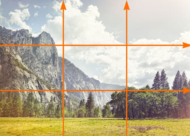
Next, to use the rule of thirds in design, you'll simply want to place your object(s) off-center by putting them into one of the thirds sections:
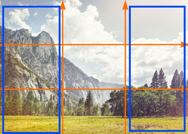
… Or on one of the intersecting points:

In the example shown above, the main focal point — the mountain top — is off to the left-side of the center of the image, in the first-third of the photo.
Fortunately, it's easy enough to use the rule of thirds in your own images using a design tool like Photoshop, which offers a grid feature so you can ensure you're accurately using the rule of thirds to create a more harmonious, interesting design.
Let's dive into how you can create the rule of thirds grid in Photoshop in four quick steps, next.
How to Create Rule of Thirds in Photoshop
1. To use Photoshop's rule of thirds tool, simply open a blank page in Photoshop and click "View" → "Show" → "Grid":
2. Next, go to "Preferences" → "Guides, Grid & Slices":
3. Next, choose the color of the grid lines, along with the solid line. Then, change "Gridline Every" to "100 Percent", with Subdivisions of "3". When you're done, click "OK".
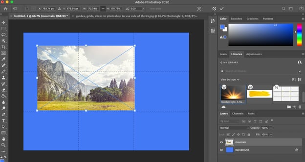
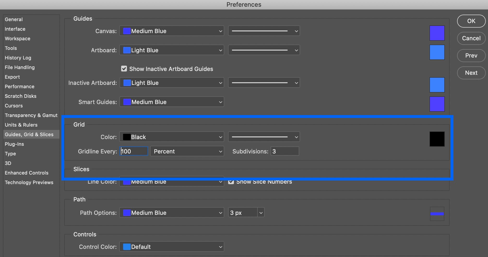 4. And there you have it! You now have a rule of thirds grid. To add your image, simply drag-and-drop the image onto the existing layered grid, expand it to fill the grid, and then move your focal object until it's either in one of the thirds sections, or on one of the four intersecting points.
Examples of Rule of Thirds in UI Design
To consider the power of rule of thirds in user interface design, let's take a look at some website examples, with a particular focus on which websites use the rule of thirds.
1. Soulful Vibes Co.
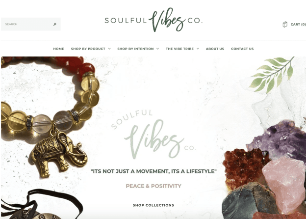
Here, the designer puts the main focus — on the crystal rocks, and the beaded bracelet with an elephant — on the left and right thirds sections, ensuring the visitor's focus is on the center text itself: "It's not just a movement, it's a lifestyle."
The designer uses the rule of thirds to create a peaceful, harmonious, casual aesthetic that looks more open and welcoming than it would if both objects were front-and-center on the page, which would likely feel more crowded and hectic.
2. HubSpot

HubSpot uses rule of thirds to draw immediate attention to its slogan and "Get HubSpot free" CTA on the homepage, as most visitors' attention will start on the left side of your website. Then, the cartoon images are placed on the right thirds section, to balance out the page. This helps create a user flow — from left to right — which would be more difficult to achieve with a symmetrical design.
3. Frans Hals Museum
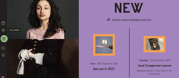
This Netherlands museum website uses the rule of thirds to draw attention to the photo of the woman, located in the left-thirds section. The page is unique, engaging, and cohesive, and uses counter-images to balance the asymmetrical structure of the page — for instance, while the larger image of the woman is towards the left of the screen, there's texts and additional images to the right to balance it out.
When to Break the Rules (of Thirds)
It's important to note — in design and art, there are no strict rules you need to follow, and there are exceptions to every design rule or trend.
Once you understand the rule of thirds and how it can impact a user's experience, you can break that rule when you see fit.
For instance, you might find it's more compelling to keep your images at the center of your screen, like shown on Tone Dermatology's homepage:
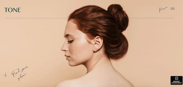
Here, the center focus on the woman is compelling and bold, particularly since she's looking towards the left of the screen, so it's still an asymmetrical image (you only see her eyes and nose on the left, and you only see her hair on the right).
This design layout works well to draw the visitor's attention in — and likely wouldn't have been as powerful if the designer had used the rule of thirds to place the woman towards the left or right side of the screen.
Ultimately, you'll want to choose design elements that work best for your own brand's needs. When in doubt, experiment with both more symmetrical designs and rule of third designs, and consider A/B testing to figure out which performs best with your audience.
from Marketing https://ift.tt/3xAQLLJ
via


No comments:
Post a Comment