As a Millennial, my experience with email has been quite interesting.
For a while, it's where I received chain mail that I was forced to forward unless I wanted something terrible to happen to me or my family. Then, it was where I sent junk emails from brands I didn't care about.
Today, I look forward to checking my email and hearing from my favorite brands on everything from the news and the marketing world to product launches and sales.
As this marketing channel continues to evolve, one thing users are looking for is interactivity. It makes emails more fun to read, and on the brand side, is a great way to convert users.
Let's dive into how to use interactive elements in your emails and examples of brands getting it right.
So, why the push for interactive emails? Ashley Riordan, growth marketing manager at HubSpot says nowadays, users expect more.
"When you think about your own inbox – work or personal – the amount of emails we get in a day is a lot," said Riordan. "Interactive emails, whether it's a personalized element or multimedia feature, help attract readers' attention, set your email out from the crowd, and cut through that noise."
She suggests calling this era: email 2.0. Interesting email content isn't enough – now it's about taking it one step further to involve your audience in the emails they receive.
Studies show that consumers are welcoming this change, it's marketers who are reluctant.
"91% of consumers want interactive content, but only 17% of marketers provide it," said Megan Moller, director of content marketing at Litmus. "That could be a missed opportunity as competition for subscribers' attention is at an all-time high, and marketers report seeing a 200% improvement in click-through rates when using interactivity."
The possibilities are not exactly endless, but they're pretty extensive. You can add interactivity in email by adding a form, faux video, embedded video, animated GIFs, or carousel.
However, Moller adds that you have to make sure these elements will work for your audience.
"Don't just add them for interactivity's sake. Not all email clients support interactivity – though there is growing support of AMP for email," she added. "Discover what environments (email clients, devices, and more) your subscribers are on with a tool like Litmus Email Analytics, so you can know which interactive strategies are possible with your subscribers."
3 Reasons to Create an Interactive Email Newsletter
We know interactive elements make emails more engaging and can increase your conversions. But when do you usually use them? Technically, you can use them anytime but here are some of the most popular ways to use interactive elements.
1. Highlight new product features.
Want to announce updates to your products or tease upcoming products? Why talk about it when you can just show it.
Look at this example from Canva.
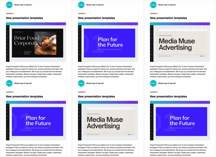
The graphic design platform regularly sends out emails to subscribers to share new features. By adding a simple GIF like this, users can quickly understand the new feature and get excited about what they could create on the platform.
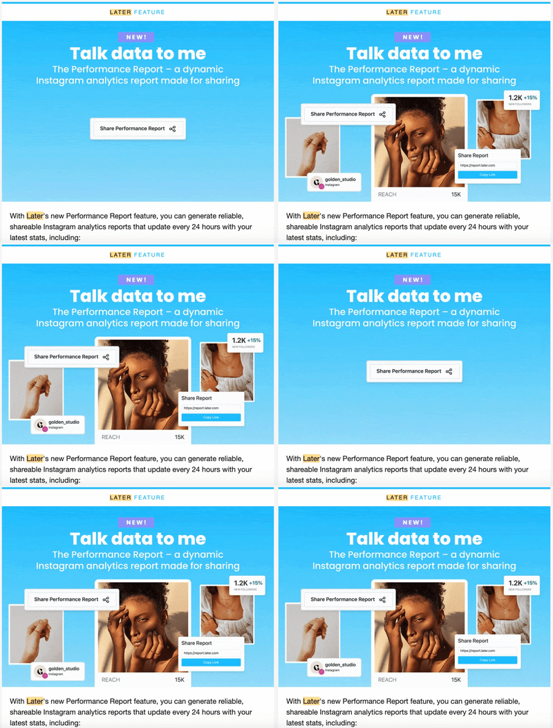
Here's another great example from Later.
2. Tease an upcoming event or announcement.
Let's say you're preparing for a big sale or upcoming event, you can use interactive elements to create some buzz and anticipation around your offers.
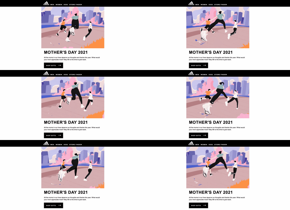
Adidas created an awesome GIF in honor of Mother's Day, which shows a woman running with her two children in some Adidas gear.
It's a great illustration of how to use GIFs in emails to pull the reader in while staying within your brand's visual identity.
3. Increase your email engagement.
Sometimes, you may not have anything special to promote, but you want to improve your metrics.
Perhaps your clickthrough or open rate is low, and you want to encourage your subscribers to participate. That's a great reason to add some interactivity to your newsletter.
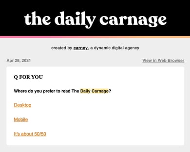
Take The Daily Carnage, a daily newsletter that covers all things marketing.
With every newsletter comes a question of the day that relates to a topic covered in the email. Once you submit your answers, you can see how other subscribers answered the question.
This accomplishes two things: It gets users engaged and excited about the content and it helps the team at Carney learn more about their audience.
Interactive Email Examples
GIFs
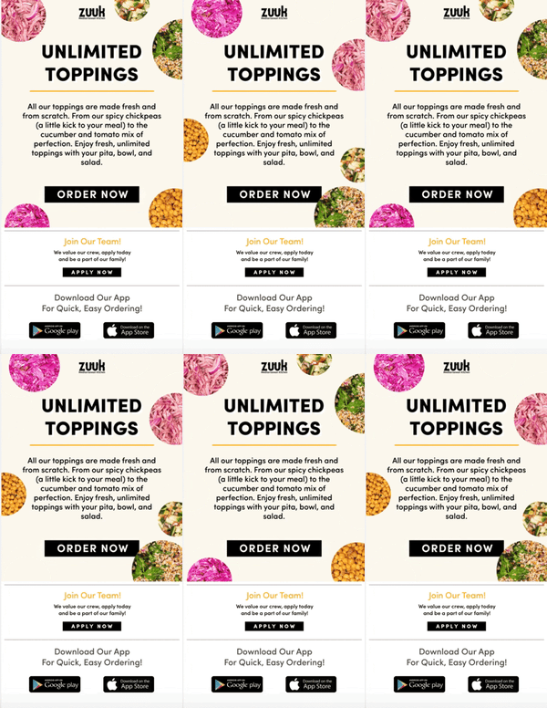
GIFS are the perfect middle point between images and videos.
A video can weigh down your email and make your loading speed slow. If you want to add some movement to your email but don't want to go as far as embedding a video, GIFs are the way to go. Plus, they're attention-grabby.
"Compared to a static image, GIFs are more eye-catching and therefore more click-catching," said Riordan.
At HubSpot, we've had great success using them.
When sending out welcome messages for new contacts, we've found that emails featuring GIFs have a clickthrough rate that's twice as high as emails without.
In addition to capturing subscribers' attention, they also convert.
Quizzes
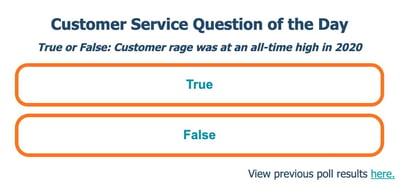
As we covered in the previous section with The Daily Canage, you can increase your newsletter's engagement rate by including quizzes and polls.
At HubSpot, we saw a 5% increase in open rate and a jump in unique clicks after adding a "Question of The Day" poll to one of our newsletters.
Here's how it works: Users have to answer today's "Question of the Day" to see the poll results from yesterday's question. This approach, says Marketing Manager at HubSpot Clint Fontanella, creates this cliffhanger effect that keeps users engaged.
"This was our most successful test because it gave readers something in exchange for nothing. It gave them information and a little excitement and competition, in exchange for them visiting our blog," said Fontanella, who used to manage the Service Blog newsletter. "It also gave them a reason to come back every day. By participating in today's question, they could see yesterday's results."
Countdown Timers
Want to get your audience excited about an upcoming event or sale? Consider countdown timers.
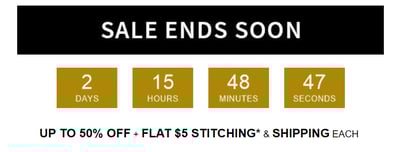
A countdown timer is a great way to create a sense of urgency and build anticipation. While this may require some HTML knowledge, it can be well worth the time.
In 2020, Riordan wanted to boost registrations and build some buzz around a webinar series. She ran a 50/50 test variation with one email including a countdown timer in the header image and another without.
The version with the countdown timer drove 30% more registrations.
A timer isn't only useful for upcoming events or sales, you can use them for:
- Product or website launches
- Free trial notifications
- Milestone celebrations
Personalized Calculators
When we think of personalization in email, we usually think of adding the subscriber's name in the subject line and email body. However, there are ways to take it one step further. 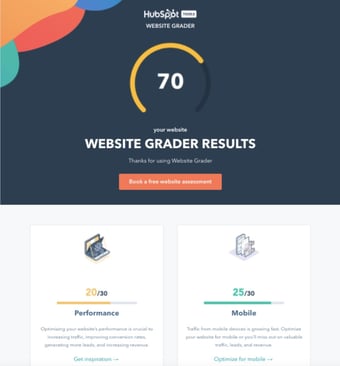
This website grader by HubSpot, for instance, is an interactive tool that sends prospects a customized report of their website performance along with specific recommendations and resources for improvements.
This is a great lead generation tool that can bring you one step closer to turning a subscriber into a customer.
Interactive Email Design Dos and Don'ts
Do keep it to one interactive element per email.
While it may be tempting, make sure you don't overdo it with your interactive elements. A good rule of thumb is one per email.
"Your email recipients will likely be drawn to the interactive element which is the goal, but also means that other parts of your email might be overlooked," said Riordan. "Try to center your email around one interactive factor, whether that be a poll, video, or GIF."
She adds, "You don't want to compete for attention in your own email – the interactive part should be the main message."
Don't be afraid to experiment.
With any new strategy you implement, there will be a learning curve.
You may have to try out a few interactive elements before you figure out what works best. And even when you determine the right strategy, it may change depending on the type of email you're sending and the goals you want to achieve.
For instance, let's say you want to generate more sales for a product. You've tried embedding videos of satisfied customers and adding photos of positive reviews but it doesn't yield positive results. Then, you find that creating lifestyle GIFs of the product increase conversions by 10%. You use that strategy from then on.
However, as your goals change, so will the methods you try. Be flexible and always be willing to test out various strategies.
Do prioritize accessibility.
As you incorporate interactivity into your email, don't forget to keep accessibility in mind. This ensures that visually impaired, deaf, and hard-of-hearing users can enjoy your emails without any trouble.
Here are some tips to keep in mind:
- Include descriptive alt text in every image, GIF, or any interactive element.
- Use colors that contrast well. Use this tool to check if you're on the right track.
- Design your email with "Dark Mode" in mind.
- Add captions and transcripts to your videos.
Interactive Email Templates
1. Litmus
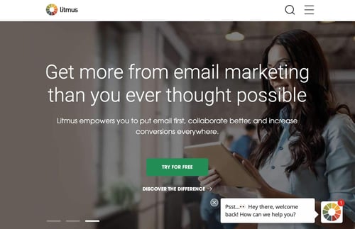
Litmus makes email marketing easy.
The platform offers a ton of interactive features and tools that you can customize based on the viewport (i.e. device) and email service. This includes hover effects, animated PNGs, and dark mode targeting.
In addition, the platform works for small to midsize businesses as well as enterprise-level companies. Pricing ranges from $99/month to $199/month, with custom pricing available for larger-scale organizations.
2. MailChimp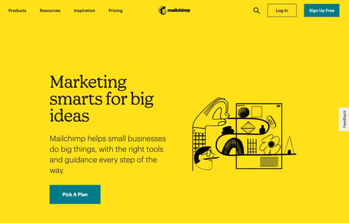
MailChimp is one of the top email marketing platforms on the market, known for its user-friendly interface.
On the platform, you can find over 100 campaign templates designed by professionals. All you have to do is fill in the gaps and hit "send."
You can use the drag-and-drop feature to add interactive elements anywhere in your email and even import custom HTML templates.
MailChimp offers a free version for those who are just getting started with email marketing and goes all the way up to $299/month.
3. Stripo
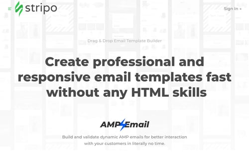
If you want to skip coding when creating your email newsletter, find the templates you need at Stripo.
All you have to do is head to the website, find a template you like and customize it. It integrates with over 60 email service providers, making it easy for you to transfer your design.
You can start using Stripo for free. To take advantage of their premium features, you must subscribe to a monthly or yearly plan for $10/month to $34/month.
from Marketing https://ift.tt/3wcIagE
via
No comments:
Post a Comment